6
you are viewing a single comment's thread
view the rest of the comments
view the rest of the comments
this post was submitted on 31 Oct 2024
6 points (87.5% liked)
No Stupid Questions
2174 readers
5 users here now
There is no such thing as a Stupid Question!
Don't be embarrassed of your curiosity; everyone has questions that they may feel uncomfortable asking certain people, so this place gives you a nice area not to be judged about asking it. Everyone here is willing to help.
- ex. How do I change oil
- ex. How to tie shoes
- ex. Can you cry underwater?
Reminder that the rules for lemmy.ca still apply!
Thanks for reading all of this, even if you didn't read all of this, and your eye started somewhere else, have a watermelon slice 🍉.
founded 2 years ago
MODERATORS


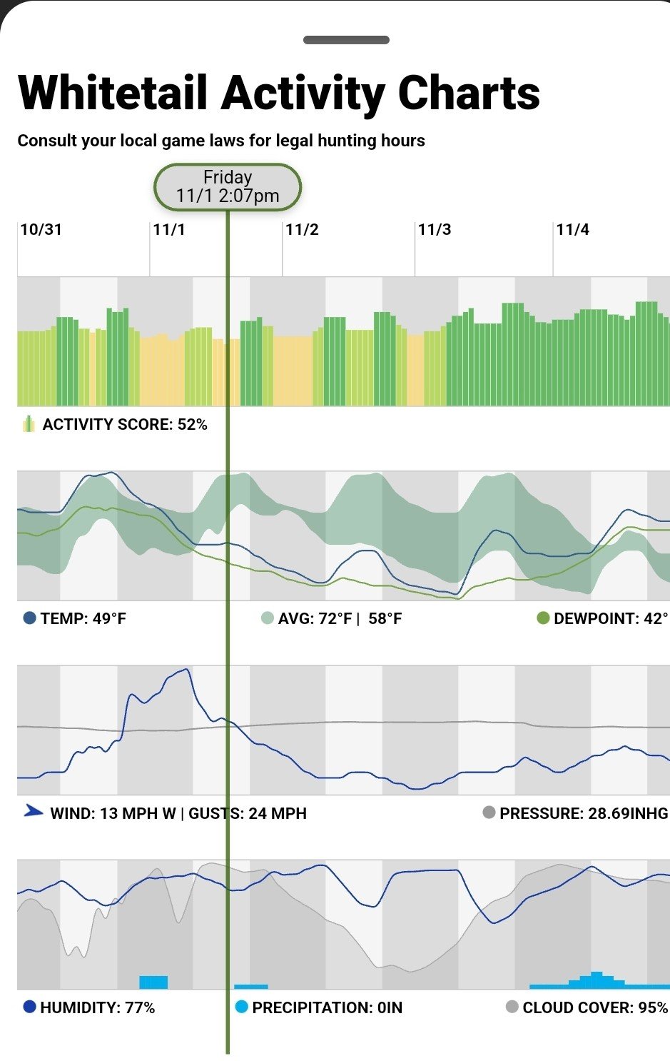
Ya, that one isn’t quite clearly labeled. The rest of the charts and data points make sense. Since it looks like this is a 5 day forecast I am guessing that the shaded green area is the historical average high/low temperatures for that date/time wherever this is in the world. The forecast is saying that the temp is expected to be 49°F on 11/1 at 2:07pm which is 9°F lower than the historical average so there looks like there will be a lesser chance of spotting deer according to the top graph. I guess? It would help to see the source page for context/additional info.
It's the Huntstand app. I haven't used the desktop/browser app in a long time but will have to see if there is more information there. This is a brand new feature that gives an index for expected rut activity based on temp, wind, barometer, location and day of year. All using historical studies of each that give windows of when deer move and when deer bed down.
Your guess is very good, dot dot dot lol, if it weren't for this being Western New York where we usually have 1 snowfall every year in Oct even with global warming. So the running averages of past years would all be drastically lower than this heat wave we got these past 3-5 days. It was 40's before this week and will be back to 40's by Sunday.
They have been excellent at creating new features/functions, listening to feedback or field testing themselves and making tweaks or updates for improvements. So maybe I'll just reach out to them. Was hoping this was just a common meteorologist metric I just wasn't familiar with.
Lol - ya, location makes a difference. I am now also curious what that is supposed to represent. I looked on their website but since I don’t have an account all I could see was mostly marketing and sales info. There was a FAQ about that feature with a youtube video that might explain the data points but the video opened with a 2.5 minute ad so I bailed… can’t believe there are 3rd party adds on a video from a company’s help section! The iOS app store lists the rut map/forecast as a feature but that’s it. The app does look pretty sweet though - I’ll have to tell my brother about it.
If your brother uses trailcams it also importa their photos and GPS locations along with each pictures Metadata that includes temp, time, moon cycle and creates heat maps on your hunting property for when and where deer are depending on the variables you adjust. Cool way of figuring out like what food plots or feeding areas they go to when it's hotter and shit like that. It never occurred to me that the deer were eating on top of the valley days it was cooler and ate down in the creek valley on warmer days until I saw the heat maps and made so much sense.