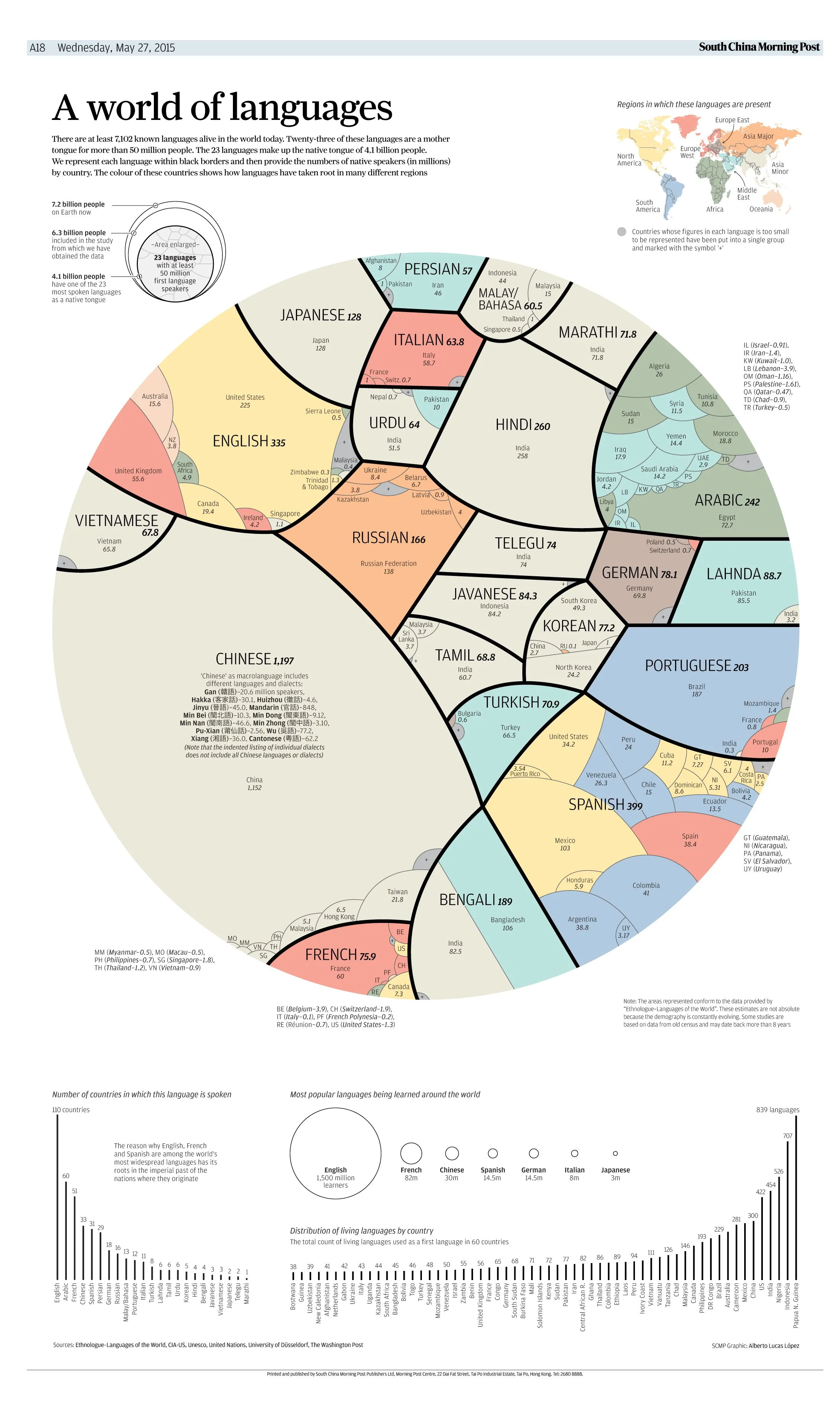
198
Languages' population
(lemmy.eco.br)
A place to share and discuss data visualizations. #dataviz
I don't think you understood my point. Total should be way higher than global population. They also have very wrong figures and country knowledge
I was actually just adding more criticism. They obviously negated that people can have more than one native language. There is a lot to criticize on that presentation. I'd file it under "Data can be ugly" tbh.
On the other hand, doing this "cleanly" is near impossible. The language situation is way to complicated to present "the demographic of languages of the world" in a single graph without oversimplifying and misrepresenting stuff.
Oh sorry for misunderstanding
I also agree this is an insanely complex task to do. That's why I wouldn't try and release something that false