80
[-] Zeus@lemm.ee 58 points 1 year ago
37
[Untitled] by Ralph McQuarrie (64.media.tumblr.com)
submitted 1 year ago* (last edited 1 year ago) by Zeus@lemm.ee to c/imaginarystarships@lemmy.world

i love everything ralph mcquarrie has done. for those who don't know, he did most of the star wars concept art, but he's also done his own pieces too. i have seen unreliable sources claim that this is an early bespin or coruscant concept, but take that with a pinch of salt

higher quality image, but cropped (and with the signature removed):

main image source || hq image source || ralph mcquarrie on wikipedia

47
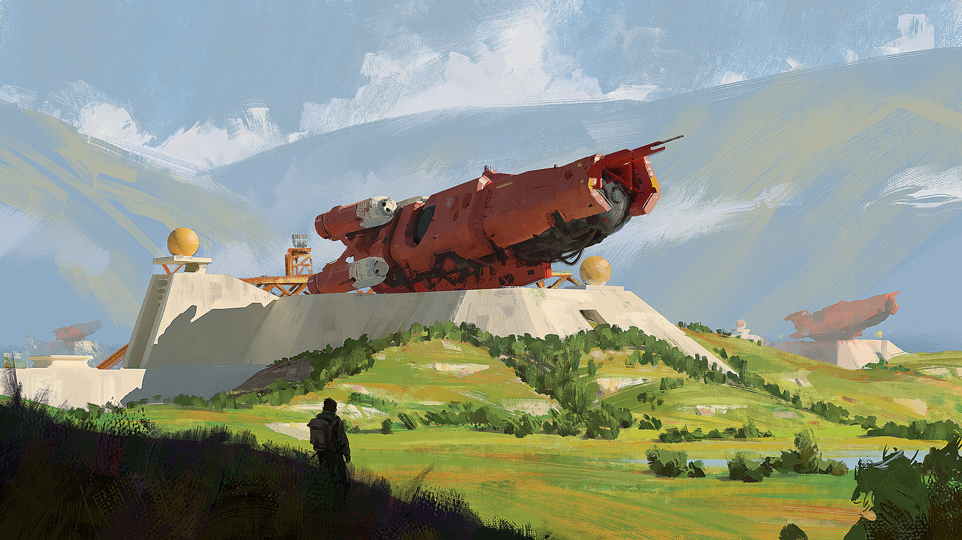
"Launch site" by Martin Parker (cdna.artstation.com)
27

it's cool to see two ships meeting at an oblique angle! normally in space they just conveniently happen to align with each other

used as an alternative cover of "Ethan of Athos" by Lois McMaster Bujold

source

49
25

used for the cover of vernor vinge's "A Deepness in the Sky"

now to me this looks quite a bit older than 2000; but that's what isfdb says, and who am i to argue?

image source

47
submitted 1 year ago* (last edited 1 year ago) by Zeus@lemm.ee to c/imaginarystarships@lemmy.world

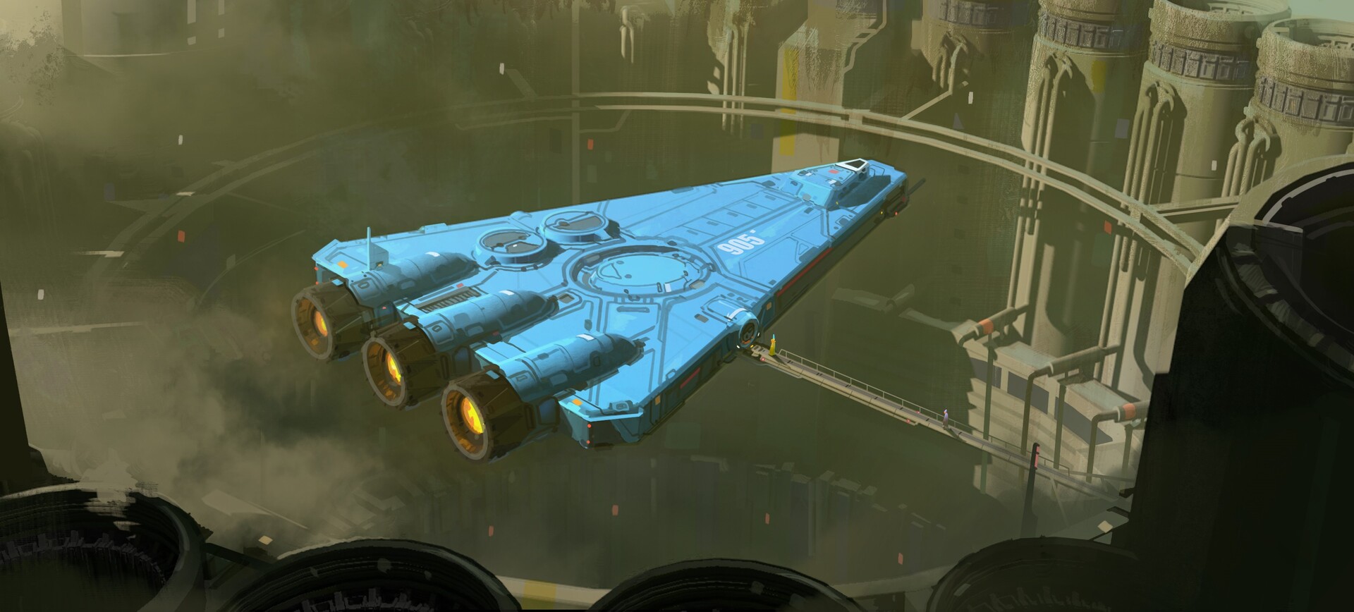
such a nice shade of blue. i like ships that have a bit more of an interesting palette than silver or white (like the freighters in ftl)

artstation site || artstation page || instagram source

artist's artstation site || artstation page || artstation rss feed

transcript

a flat blue triangular ship with three rear booster engines hovers above a round hole in the earth surrounded by pumping stations. it is attached to a long gantry, across which walk two people

16
10
submitted 1 year ago by Zeus@lemm.ee to c/imaginaryportals@lemm.ee
43
16
submitted 1 year ago* (last edited 1 year ago) by Zeus@lemm.ee to c/imaginarywastelands@lemm.ee
15
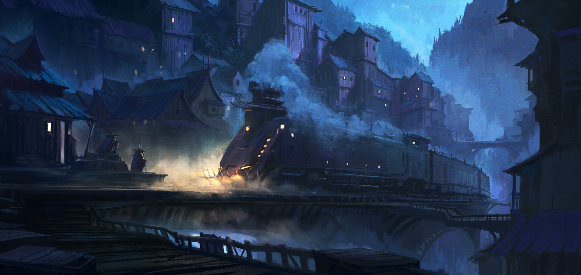
submitted 1 year ago by Zeus@lemm.ee to c/imaginarytrains@lemm.ee

My second piece for West town series.

artstation site || artstation page

[-] Zeus@lemm.ee 52 points 1 year ago* (last edited 1 year ago)

who even decides what's "modern" anymore?

can anyone, honestly, without reading the article (or guessing from the headline), tell me which of these is the "modern" design?

screenshot of the nautilus file manager in light mode screenshot of the nautilus file manager in light mode

edit: people are getting confused by the fact that one is tree view, not icons view so i changed the image. old image here

[-] Zeus@lemm.ee 27 points 1 year ago* (last edited 1 year ago)

thank you for your work sunaurus, and i'm sorry you had to sort through this

(particularly annoying though, as i never got around to adding a user banner; and i had one in mind as well. i wish there was some way to externally host avatars and banners)

[-] Zeus@lemm.ee 22 points 1 year ago

i think randint is talking about the lemmee megathread where we were discussing whether to defed hexbear. i have no idea why he'd post this on your megathread

[-] Zeus@lemm.ee 46 points 1 year ago* (last edited 1 year ago)

okay but here's the thing - you commented on cth. what did you expect

this is like going on to 4chan /r9k/ or /pol/, being offended, then writing a letter to your isp saying "can you block access to 4chan for your customers"

don't ask lemm.ee to defederate, just block the community


also the megathread is probably locked for a reason

[-] Zeus@lemm.ee 27 points 1 year ago

but what if going away makes it worse? .world's downtime has only increased since i made my l.ee acct

[-] Zeus@lemm.ee 118 points 1 year ago* (last edited 1 year ago)

goddammit

i joined dxcomplex because it was the smallest instance i was confident wouldn't fold (and i liked the name);
then it folded so i joined .world because it was the smallest instance i was confident wouldn't fold (and i liked the name);
then it got massive so i joined lemm.ee because it was the smallest instance i was confident wouldn't fold (and i liked the name)

i'm starting to wonder if i'm cursed

[-] Zeus@lemm.ee 123 points 1 year ago

i'd never noticed how much the twitter logo looks like an upside-down sonic the hedgehog

one colour sonic silhouette logo upside-down twitter logo being impaled by the new x logo

[-] Zeus@lemm.ee 32 points 1 year ago

The three patents relate to “a system for presenting and controlling content on a display device.”

ah, so you mean all computing devices

[-] Zeus@lemm.ee 29 points 1 year ago* (last edited 1 year ago)

lemmy also (unofficially) supports footnotes.[^1] you may want to view this in a browser^[as it currently doesn't render in any mobile clients]^[also note the differing positions of the caret]

additionally, with no markdown linking at all, the web interface^[and i believe most apps] automatically turns [!community@instance.tld](/c/community@instance.tld) into a link

[^1]: with two different syntaxes

[-] Zeus@lemm.ee 39 points 1 year ago

this seems like a really odd choice. admittedly the old name wasn't great, it sounded like spreadsheet software.

but they've gone from a name that was the top search result to one that will never be, because the current top search result for "firefish" is a recruitment company that can put a lot more money into seo than they can; and a name that most people who would use it (techies & early adopters) will immediately assume is a firefox fork or mozilla product

in isolation it's not a bad name, and i really like the new logo; but it just seems like a poor choice

[-] Zeus@lemm.ee 35 points 1 year ago

i personally would be reticent to move anything to lemmy.zip, given the issues with .zip domains. especially on lemmy, with the @'s in the urls

but i don't have a ps5, so i don't have a horse in this race

view more: next ›

Zeus

joined 1 year ago
MODERATOR OF