I use OneCommander and it works pretty well. The dev just added a single window mode with tabs as well.
Someone already mentioned Logseq, but I'm really enjoying Obsidian for my note taking needs. It's similar, but I have found Obsidian to be very nice. Not FOSS, but I really like what the devs are doing.
I really like it. I think it's on the right path as a competitor/successor to latex. I would agree with some of barbara's comments on it's age and maturity. It's being worked on by a lot of people and is open source which is cool. https://github.com/typst/
Overall it's easy to get started but there's a decent bit to learn like with any language. Creating templates like this is much, much easier though than it is in latex IMO. Overall I'm a fan and I'm slowly phasing out everything I've written in latex and am replacing it with typst.
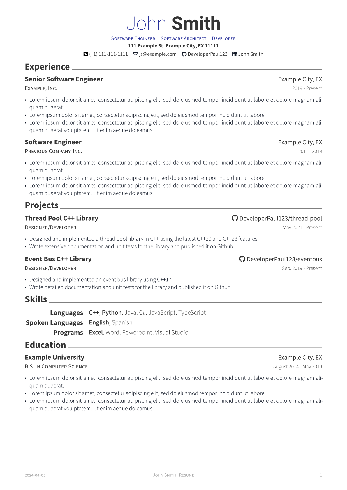
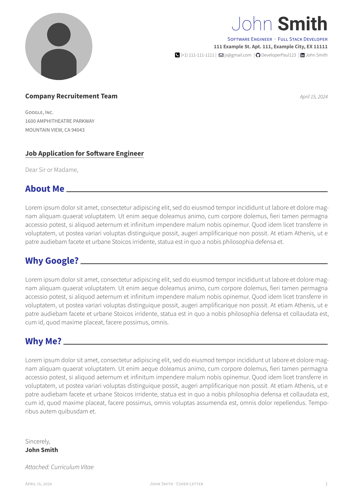
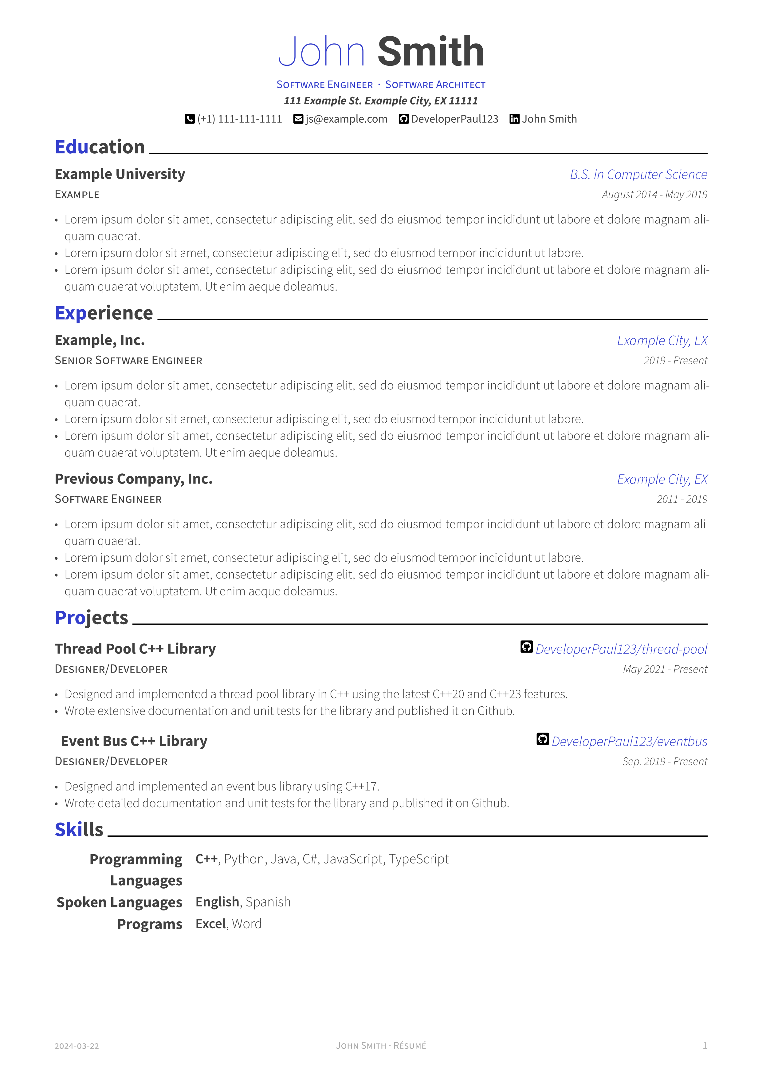
I'm working on some of the changes your suggested. Here are screenshots of the adjustments. I'm curious to hear your thoughts. Thanks!
Here is a monochrome version without colored headers. I also adjusted the default accent color, but this is user configurable as well.
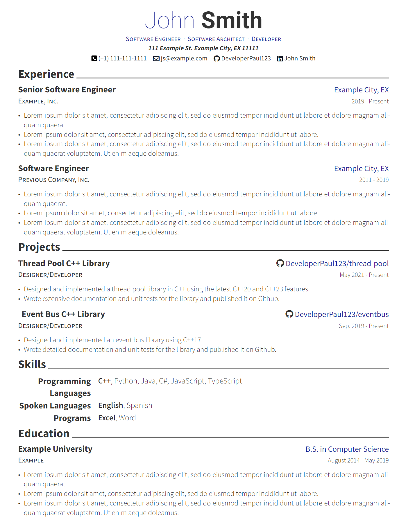
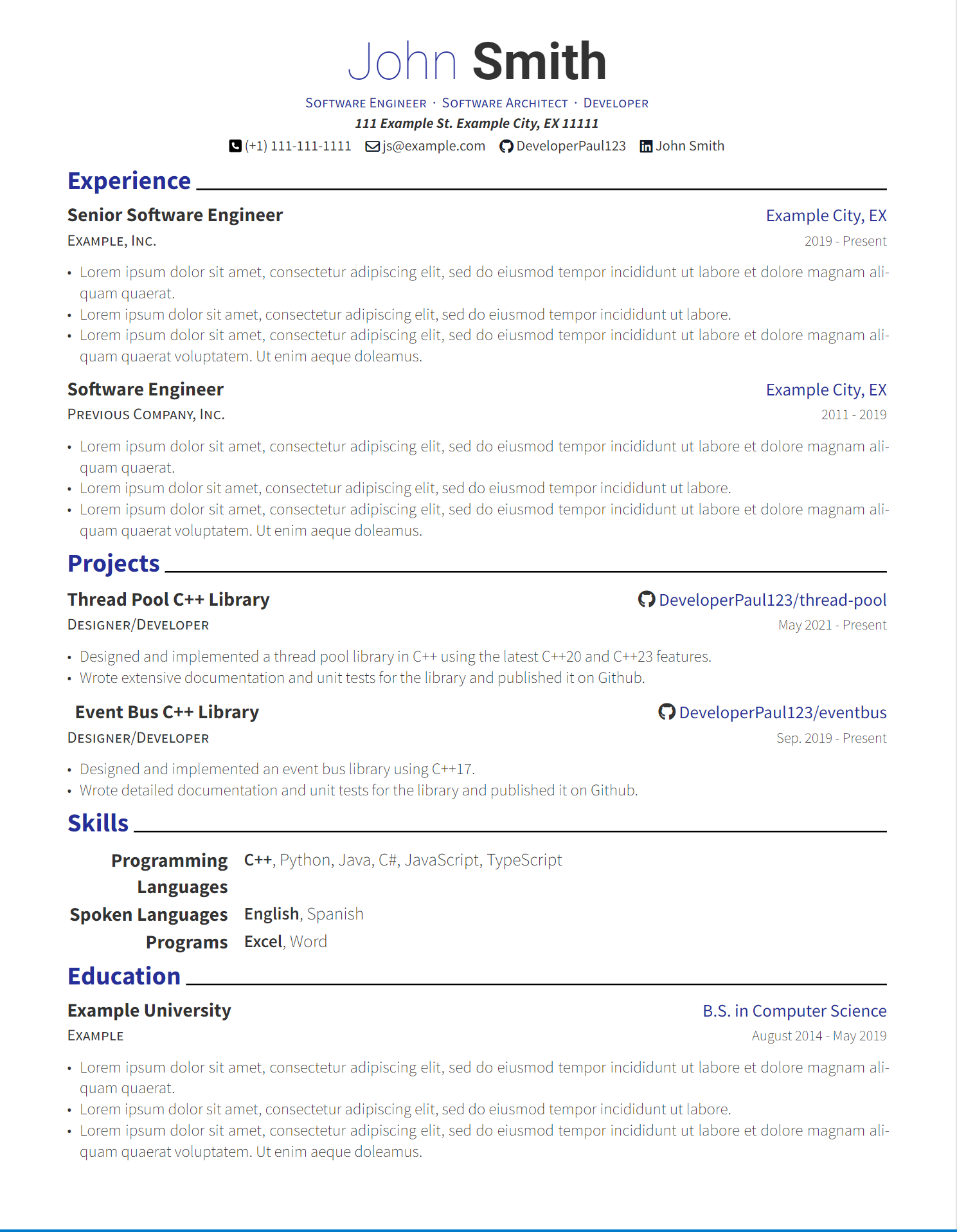
Thanks for all the feedback! I'll take each point into consideration as I work on the next version of the template :)
Overall it was pretty nice honestly. Especially coming from Latex. Creating a template in Latex was very difficult but in typst it's way more intuitive (at least to me) and it's easy to control every aspect of the text and its layout.
I put this together in a few minutes using my template. Does this address what you meant?
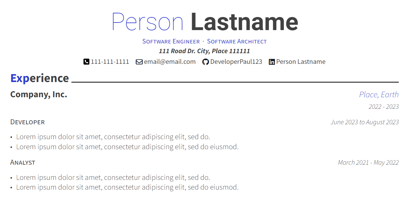
Here's the typst code:
#import "@preview/modern-cv:0.1.0": *

#show: resume.with(
  author: (
      firstname: "Person",
      lastname: "Lastname",
      email: "email@email.com",
      phone: "111-111-1111",
      github: "DeveloperPaul123",
      linkedin: "LinkedIn Name",
      address: "111 Road Dr. City, Place 111111",
      positions: (
        "Software Engineer",
        "Software Architect"
      )
  ),
  date: datetime.today().display()
)

= Experience

#resume-entry(
  title: "Company, Inc.",
  location: "Place, Earth",
  date: "2022 - 2023"
)

#secondary-justified-header(
  "Developer",
  "June 2023 to August 2023"
)

#resume-item[
  - #lorem(10)
  - #lorem(11)
]

#secondary-justified-header(
  "Analyst",
  "March 2021 - May 2022"
)

#resume-item[
  - #lorem(10)
  - #lorem(11)
]
This is interesting as I simply copied the same styling as the previous template I was using. Would it be better to highlight the entire first word instead of the first n letters?
Thanks for the feedback! I think this makes sense for those who do have work experience. Do you think this should still be the case for new graduates?
Also I should note you can easily change the order of things in your own CV.
Are you saying it's not worth becoming a freelancer if you don't already have connections ?
If you're using Visual Studio take a look at these:
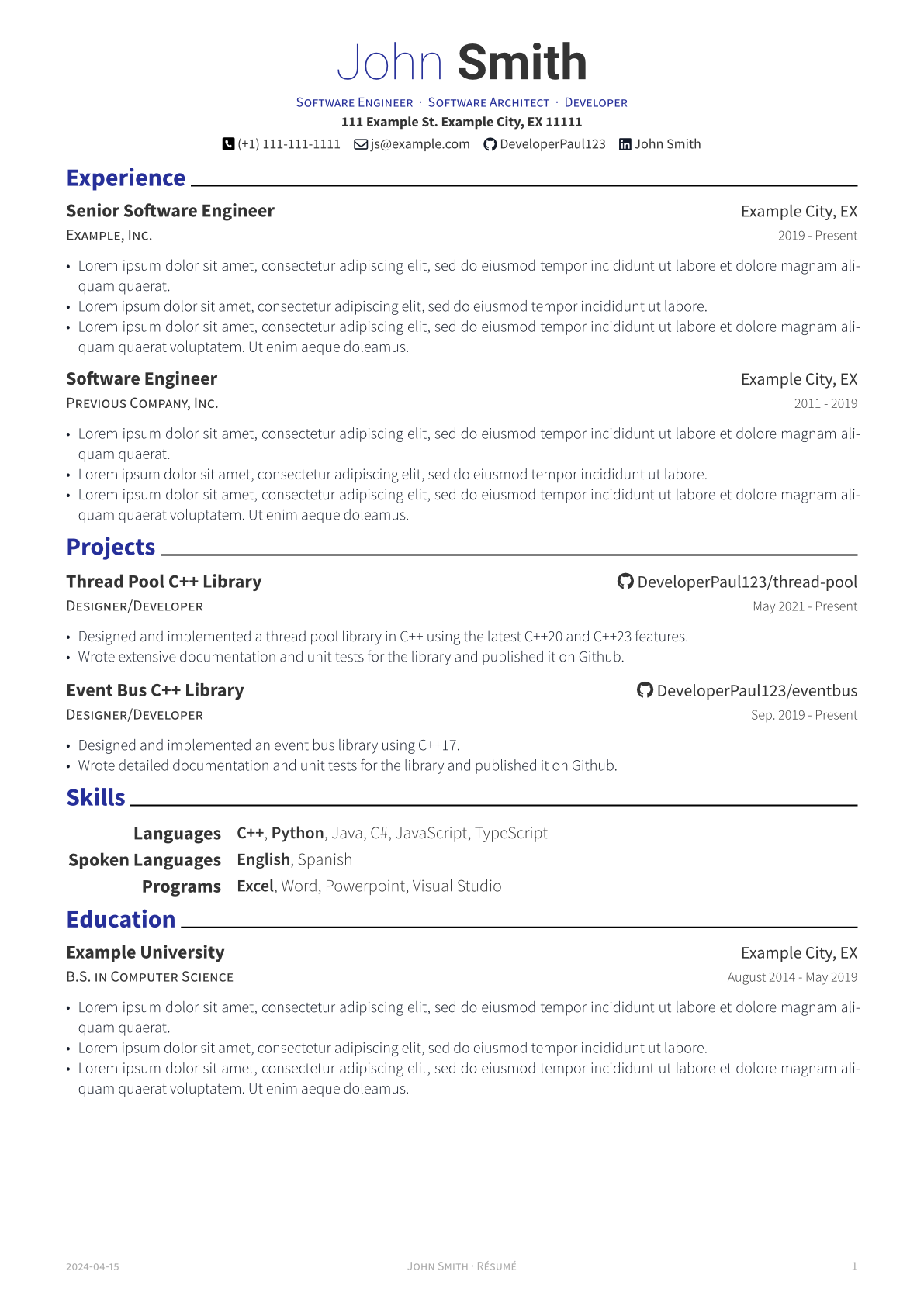

I will likely ditch Vivaldi for this one tab groups gets implemented. It has all the features I need and I've been looking for a non-chromium browser to switch to for a while. Floorp was close but missing critical features. Zen is very exciting for me.