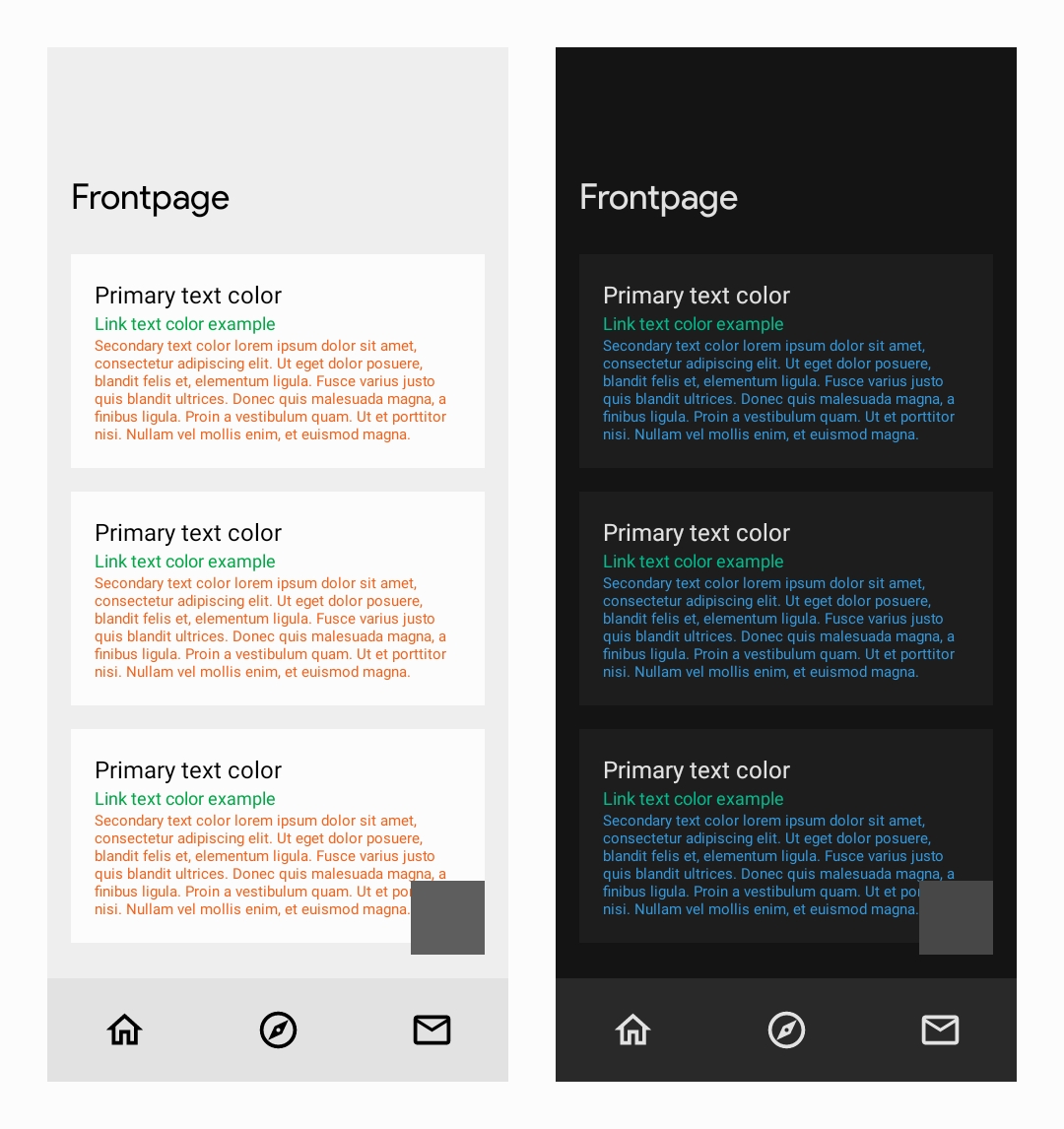
That's cool if you like it, but I prefer text to be much higher contrast against the background than that. Color is meant to highlight and accent IMHO.
Yea the options are kinda minimal, but maybe future updates will provide more fine-tuning options
How does it look in practice, could you send a screenshot?
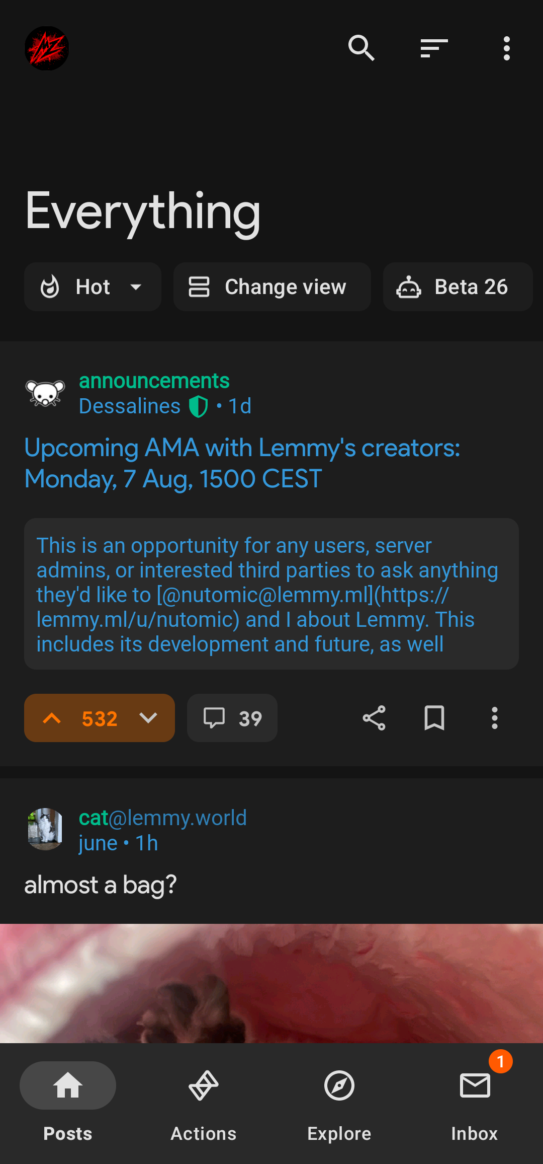
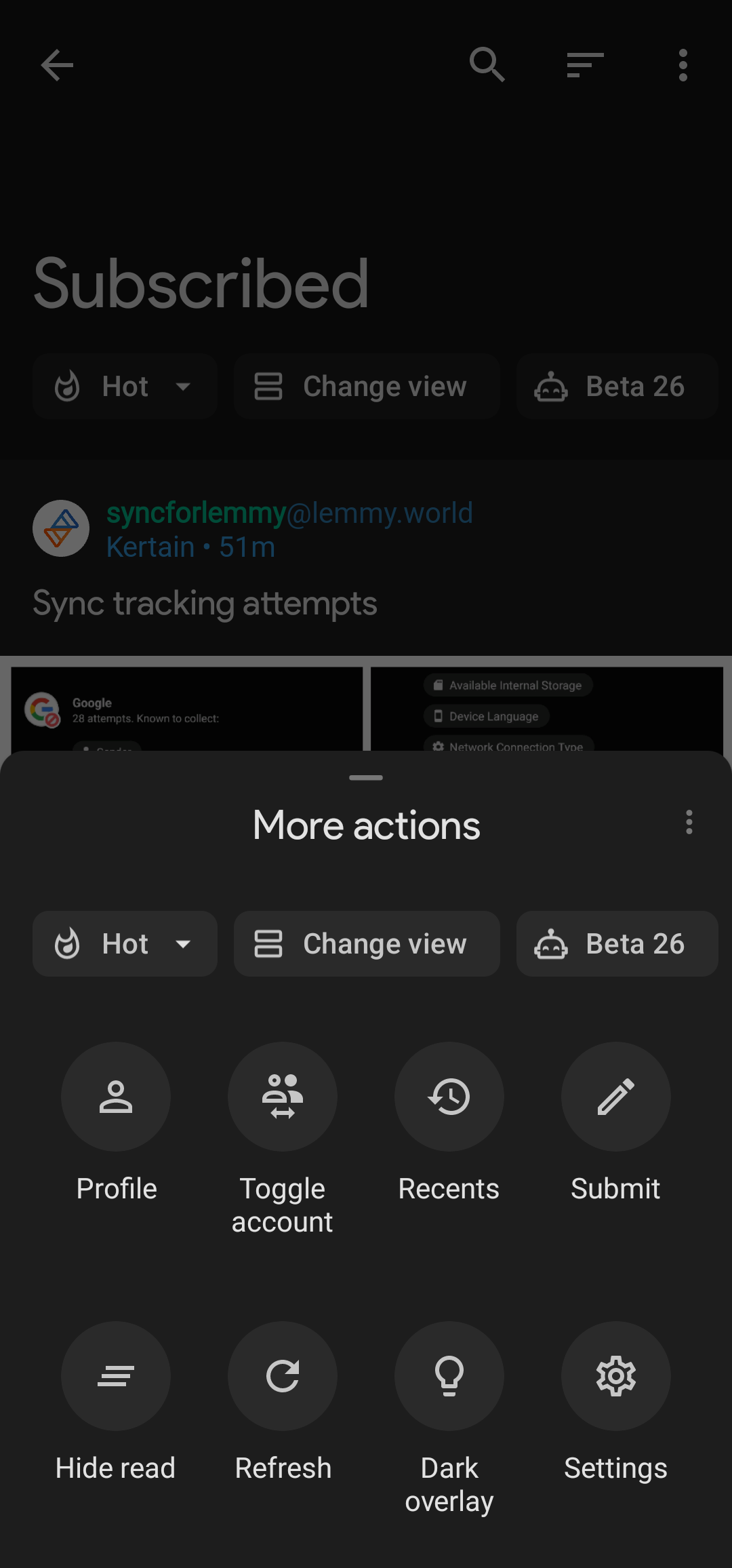


*not a fan of the green highlight

Thanks
Sorry, forgot light mode
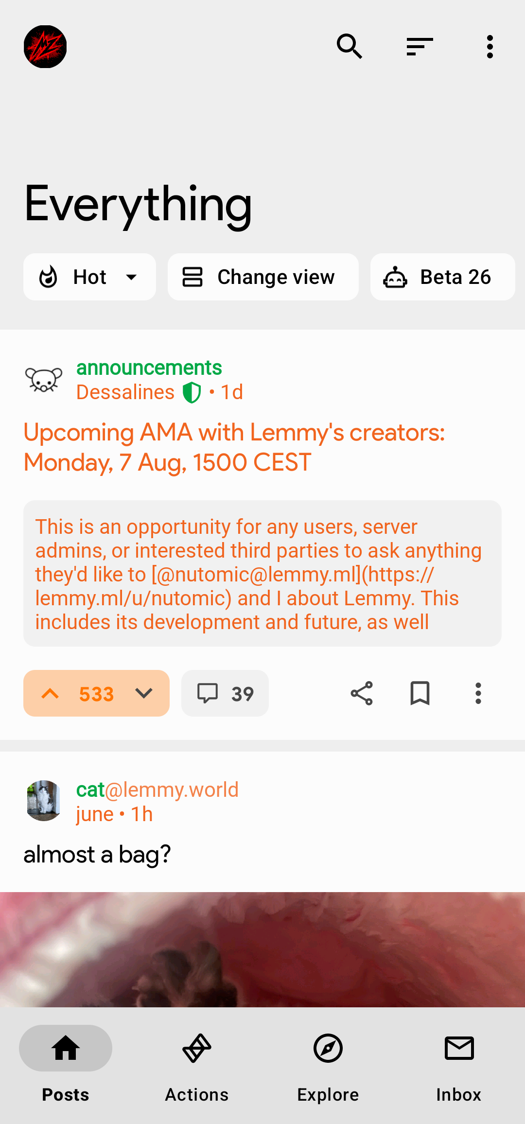
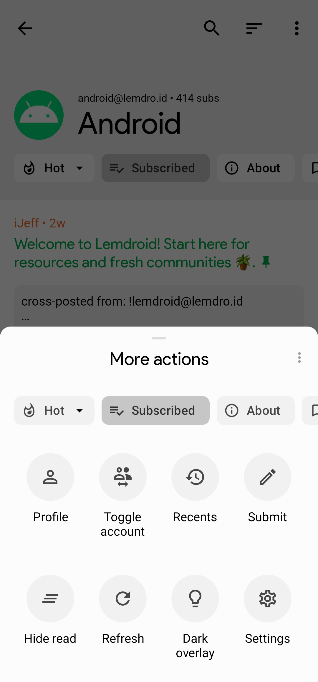
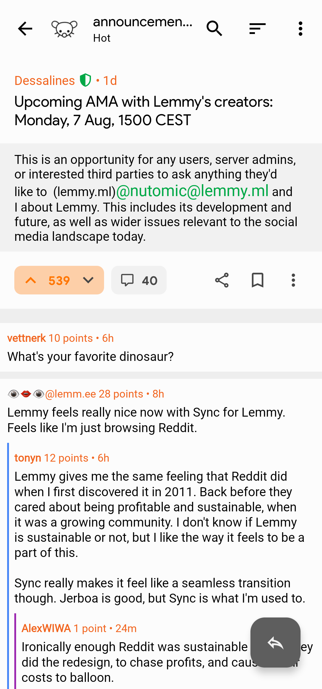

i'm not sure i understand - it looks great, but how are you applying these?
It's in theming options. You have to choose manual to adjust some colour options.
Settings shortcut: Settings > Theme management
Actually, to be more precise, you need to copy all that code, then go to the Theme management section and choose load, then paste that code into the area that appears. That should then apply the theme. Just tested it and it worked for me.
I do like that! Great theme!
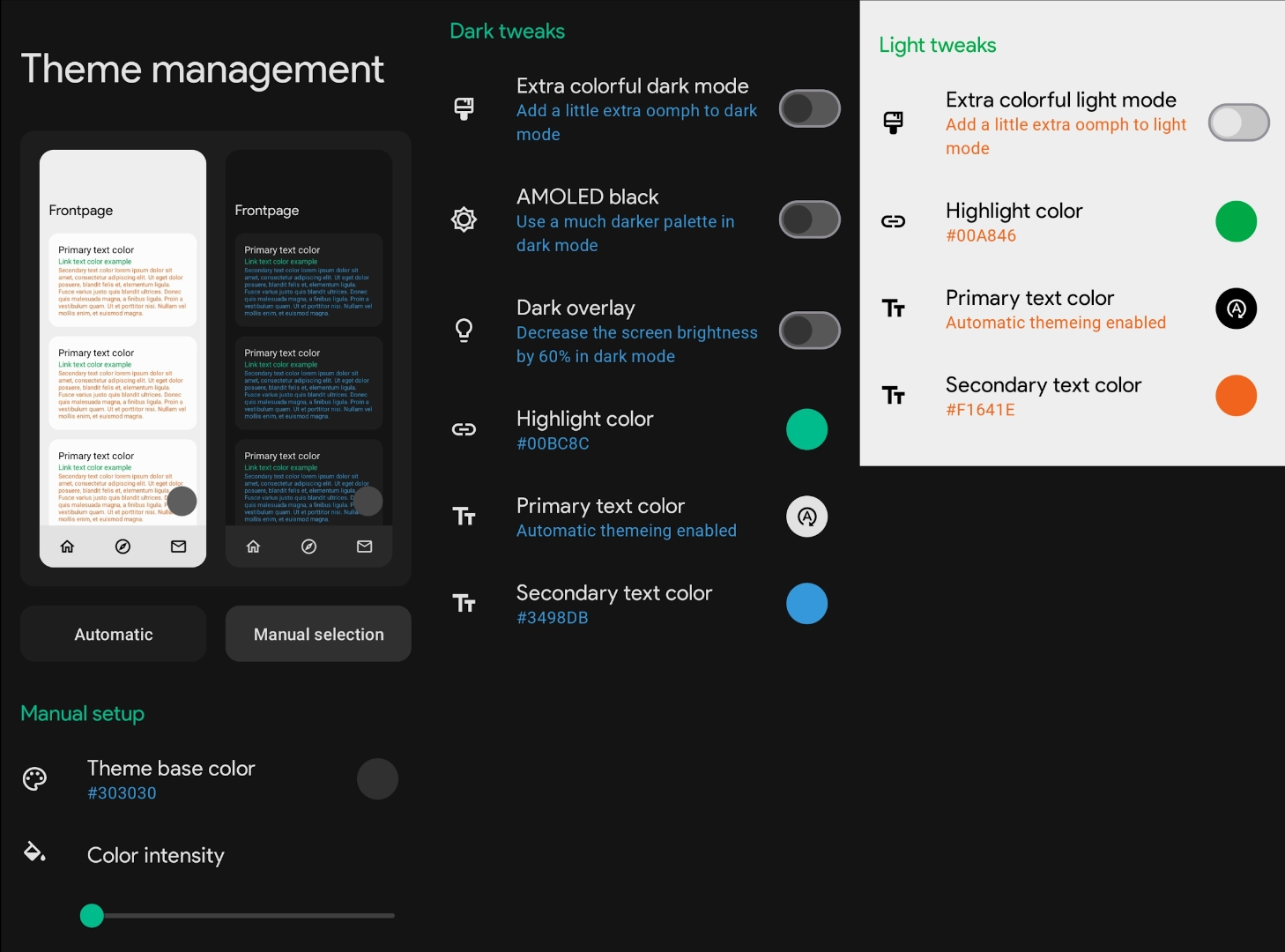
Heres a screenshot of the settings, if you'd rather input them manually.
Theme Base Color:
303030
Dark Mode
Highlight Color:
00BC8C
Secondary Text Color:
3498DB
Light Mode
Highlight Color:
00A846
Secondary Color:
F1641E
not gonna lie, I wish sync allowed me to set different base tones so I could set up my favorite colorscheme
Sync for Lemmy
👀
Welcome to Sync for Lemmy!

Welcome to the official Sync for Lemmy community.
The rules for posting and commenting, besides the rules defined here for lemmy.world, are as follows:
Community Rules
1- No advertising or spam.
All types of advertising and spam are restricted in this community.
Community Credits
Artwork and community banner by: @MargotRobbie@lemmy.world
