You can select the whole table and copy/paste it into a spreadsheet program. Then you have all the spreadsheet tools to use. I just tested in excel and Google sheets and both loaded the data correctly.
Thanks for taking the time! But it doesn't properly reproduce the content.
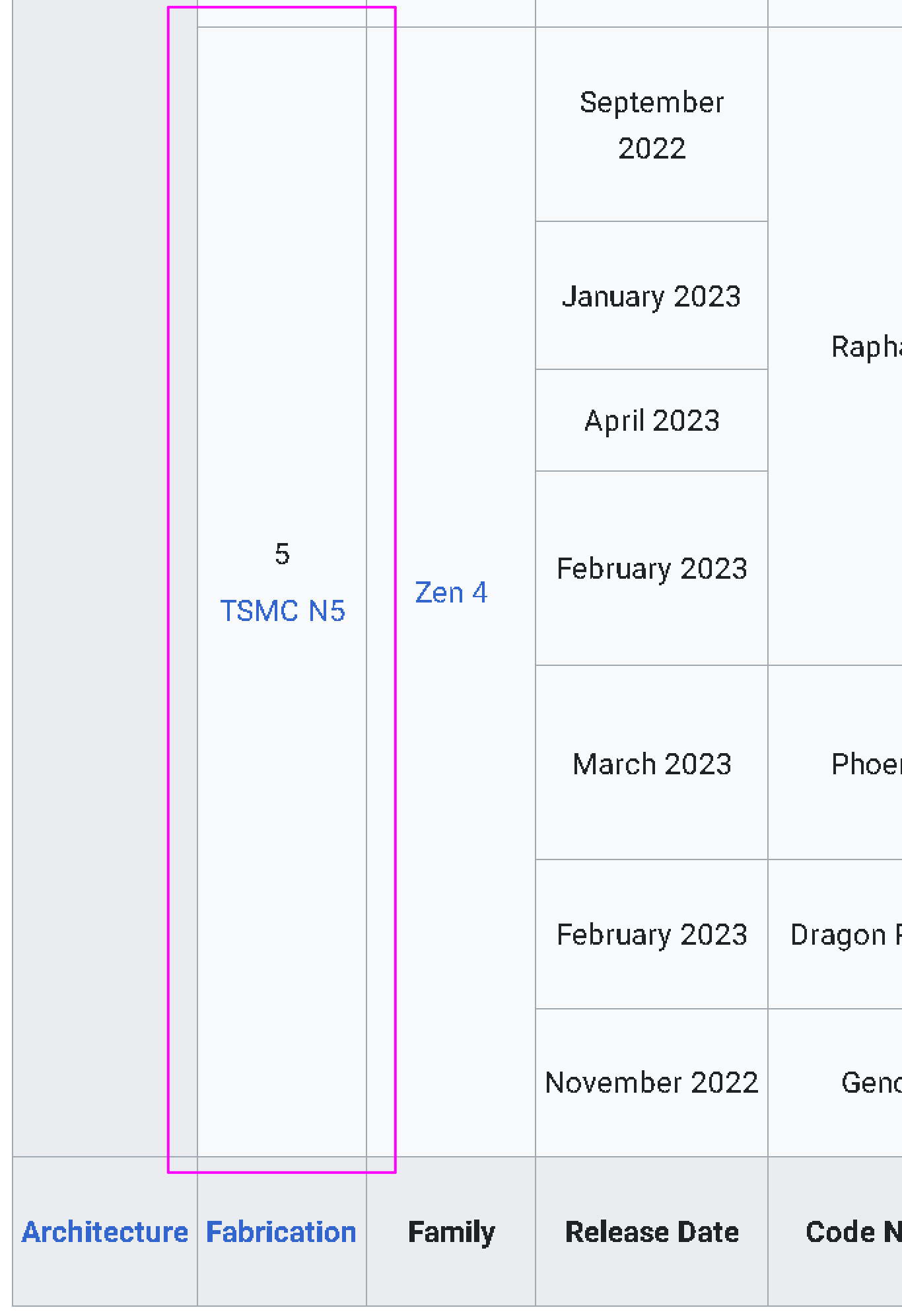
As an example, here is the very bottom left corner from the wikipedia:

there is a merge row with content "5 TSMC N5". Same height as merged row in next column, with content "Zen 4".
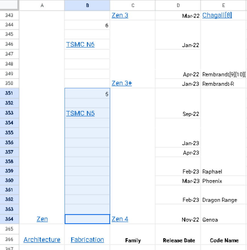
But in the google sheet:

those row containing "5 TSMC N5" have all be un-merged into 14 separate rows. However for some reason "Zen 4" has been properly copied?
I would need 2+ very large displays to compare the two documents side by side but from what i can see on my 1 small display there are many such inconsistencies. My experience is that cleaning up the data is impossible.
Google sheet's =importhtml function might do a better job than copy paste. (maybe) https://support.google.com/docs/answer/3093339?hl=en-GB
Freezing top row would be my #1 pick, followed by the ability to use the full width of the browser window for the table (rather than forcing horizontal scroll at a fixed table width), and the ability to hide columns.
Ideally without using an external interface.... But I think the exporting to spreadsheet trick will absolutely be handy.
Freezing the top row (when wanted by the user) would be an actual legitimate use of that annoying thing where websites have their navigation bar persistently at the top of the window.
Multiple tabs, or multiple windows
I can sort by the "Platform" column, or by "Latest release: Date" but not both.
My biggest usability pet peeve of Wikipedia. Othewise, I think they've done a fine job on site design.
It sucks because the info is all there! Someone has gone to the trouble to put it in and everything.
Like I said in the top post I honestly don't understand how these large tables even get updated... How do the authors know what they are even editing?? There has to be a trick.
50" monitors.
must be

I've seen websites where if you scroll down a table and cut off the heading, the heading detaches and follows your view so you can always see it. Why can't Wikipedia do that?
Could be using CSS position: fixed. But idk there could be other more sophisticated ways to accomplish the same thing.
In terms of why to not use it, I can think of reasons to avoid it by default. Like it could be very annoying on some devices in some situations. If the page authors made the table headings really long, it could obscure the content. I know I have been annoyed by this sort of thing when websites use position: fixed for their navigation or other elements. When I've snooped around the backend of wikipedia I see that they are contending with a wide variety of contributors and users and whatever they do needs to accommodate everyone.
What I find surprising is that there is (apparently) no 3rd party browser extension, userstyle or userscript that allows enabling this.
Asklemmy
A loosely moderated place to ask open-ended questions
If your post meets the following criteria, it's welcome here!
- Open-ended question
- Not offensive: at this point, we do not have the bandwidth to moderate overtly political discussions. Assume best intent and be excellent to each other.
- Not regarding using or support for Lemmy: context, see the list of support communities and tools for finding communities below
- Not ad nauseam inducing: please make sure it is a question that would be new to most members
- An actual topic of discussion
Looking for support?
Looking for a community?
- Lemmyverse: community search
- sub.rehab: maps old subreddits to fediverse options, marks official as such
- !lemmy411@lemmy.ca: a community for finding communities
~Icon~ ~by~ ~@Double_A@discuss.tchncs.de~