57
submitted 10 months ago by qaz@lemmy.world to c/opensource@lemmy.ml

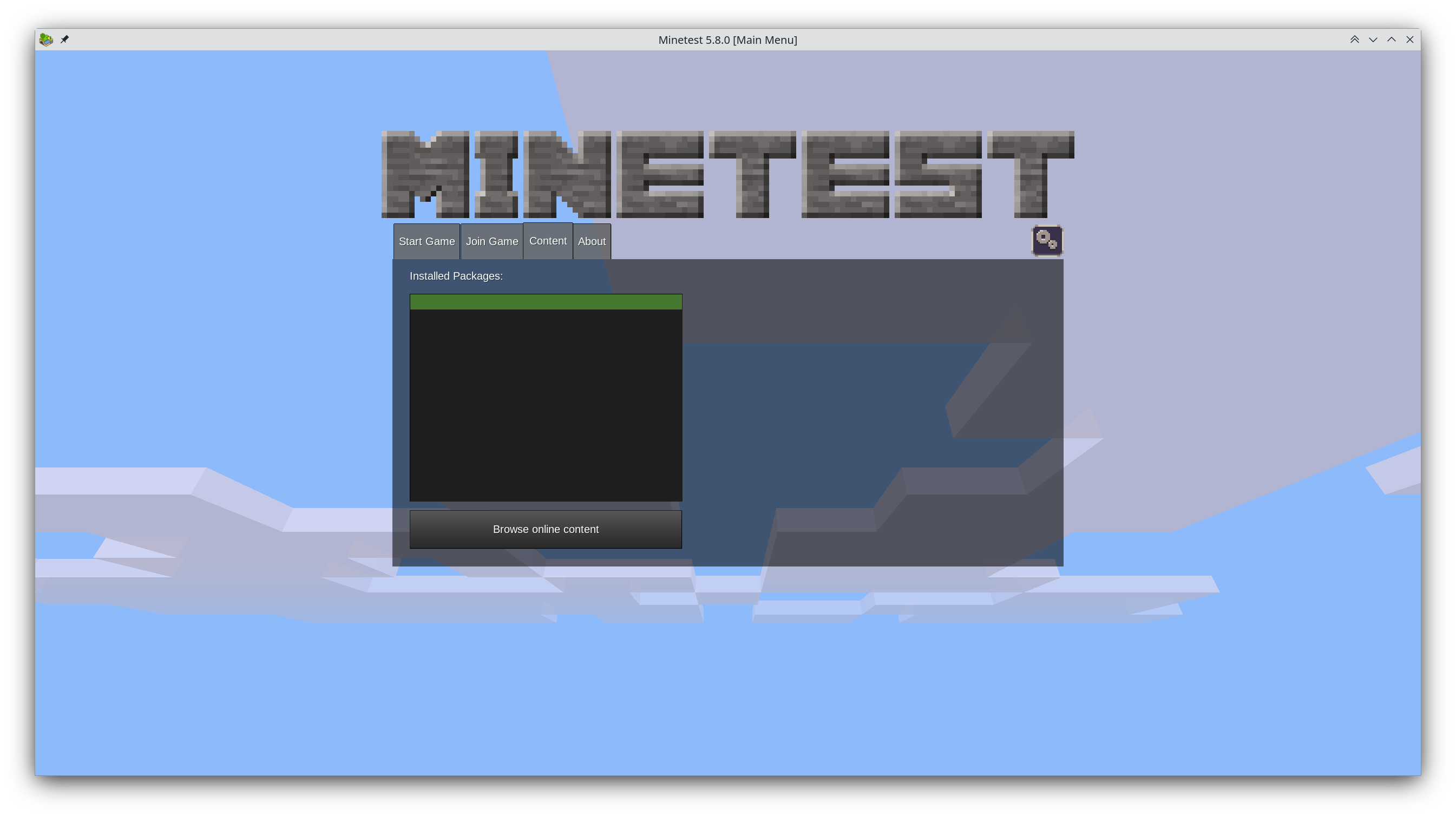
Years have gone by and hundreds of comments have been written about the proposal, but the main screen still looks like this:

minetest main menu

What do you guys think is the cause of this stagnation? Too much discussion? Too few people willing to fork it?

I've thought about it myself and why I didn't contribute a new main menu and came to the following conclusion: It requires understanding Minetest's codebase and the libraries it uses, it requires C++ experience (which I don't have), and after all that effort there's zero guarantee that it ever gets used.

all 11 comments
sorted by: hot top controversial new old
[-] rufus@discuss.tchncs.de 9 points 10 months ago* (last edited 10 months ago)

I think it's just a larger undertaking. Like mentioned in the last comments. People either need to address that as the main focus for some new major release and work on it. Or subdivide it and find people to work on the individual components to make it happen (gradually).

Also there is always the thing with hobby / free software projects. Sometimes people focus on functionality and features and not so much on asthetics and the first impression. I agree the welcome screen is somewhat important as it's the first thing a new player sees. But I also like the developers to work on features which enhance the actual gameplay because I just see that screen for 10 seconds and it's kind of a waste of time to improve it for someone like me. The current screen works alright. There are several dynamics affecting projects: "Perfect is the enemy of good" (don't make it too complicated) but also sometimes a makeshift solution or something that works "okay" stays inplace indefinitely because "it works" and people concentrate on other stuff. That's just how things work. It takes deliberate effort to work against those dynamics.

So I'd say the cause is, their focus is somewhere else.
[-] Snoopy@jlai.lu 5 points 10 months ago

As a minetest player, the main menu screen work very well and only lack some option to filter servers by game and language.

So i understand if they prefer to focus on other issues.

[-] Ephera@lemmy.ml 5 points 10 months ago

I read up on it at some point and it was essentially a matter of their UI framework just being custom-implemented. Any advanced UI concept would need so much overwhelming support from the community, that a core dev then sits down for a few months to dish out the necessary UI components, that this is just not really happening. The core devs aren't exactly bored most of the time anyways.

Having said that, they did recently renovate the settings menu using the UI components they already had, and that turned out really cool.

Also, I do feel like some smaller improvements could be made without big code changes, but yeah, those then end up in too many discussions.

The font has been discussed many times. To give you a taste:
Many want a font with fantasy style, but Minetest can also depict a futuristic setting. Others want a blocky font, but those usually aren't very legible (i.e. accessible) and often only support a narrow range of languages.
I think, just a font, which looks less serious and less thin, already improves it massively, but you can't even get folks to agree on that, because well, if the font is tweaked, you might need to adjust lots of UI components and mods and such to work with the different font dimensions. So, if a font change is made, people want to get it perfect from the start.

The button gradients are another case, where most people agree that something else would look better and it could be easily changed, but discussions just never end.
The community is just so big and so public, that there's always someone new joining into the discussion, so that no consensus can occur...

[-] amio@kbin.social 4 points 10 months ago

Diffusion of responsibility, nobody wanting it enough to force the issue or shepherd it through committing to it/planning it/developing it, and/or not knowing if the considerable amount of effort will "pay off" in the sense of actually getting merged.

Note that I have no clue about Minetest specifically, I'm just guessing

[-] Enkers@sh.itjust.works -1 points 10 months ago* (last edited 10 months ago)

I'm a long time heavily modded minecraft player, and I've never heard of this issue. If you want proper feedback, I'd suggest adding more context. (That is to say, an outline of the feedback, so we don't have to wade through 6 years of discussion.)

Minecraft has always had a janky aesthetic, so this doesn't seem like it's particularly out of the ordinary.

[-] Rocketpoweredgorilla@lemmy.ca 23 points 10 months ago

Wrong game. Minetest, not Minecraft.

[-] Enkers@sh.itjust.works 7 points 10 months ago* (last edited 10 months ago)

Ah, I assumed it was part of some sort of OSS mod suite for minecraft. My mistake.

[-] rufus@discuss.tchncs.de 7 points 10 months ago

Hehe, this is about MineTEST, a "clone" of Minecraft. So it's probably understandable you've not heard of the issue. ๐Ÿ˜

[-] Enkers@sh.itjust.works 6 points 10 months ago

That explains it! Lol.

[-] django@discuss.tchncs.de 4 points 10 months ago

I am somewhat of a Warcraft player myself and have played lots of custom maps. I too never heard of this issue.

this post was submitted on 19 Jan 2024
57 points (95.2% liked)

Open Source

31223 readers
261 users here now

All about open source! Feel free to ask questions, and share news, and interesting stuff!

Useful Links

Rules

Related Communities

Community icon from opensource.org, but we are not affiliated with them.

founded 5 years ago
MODERATORS