809
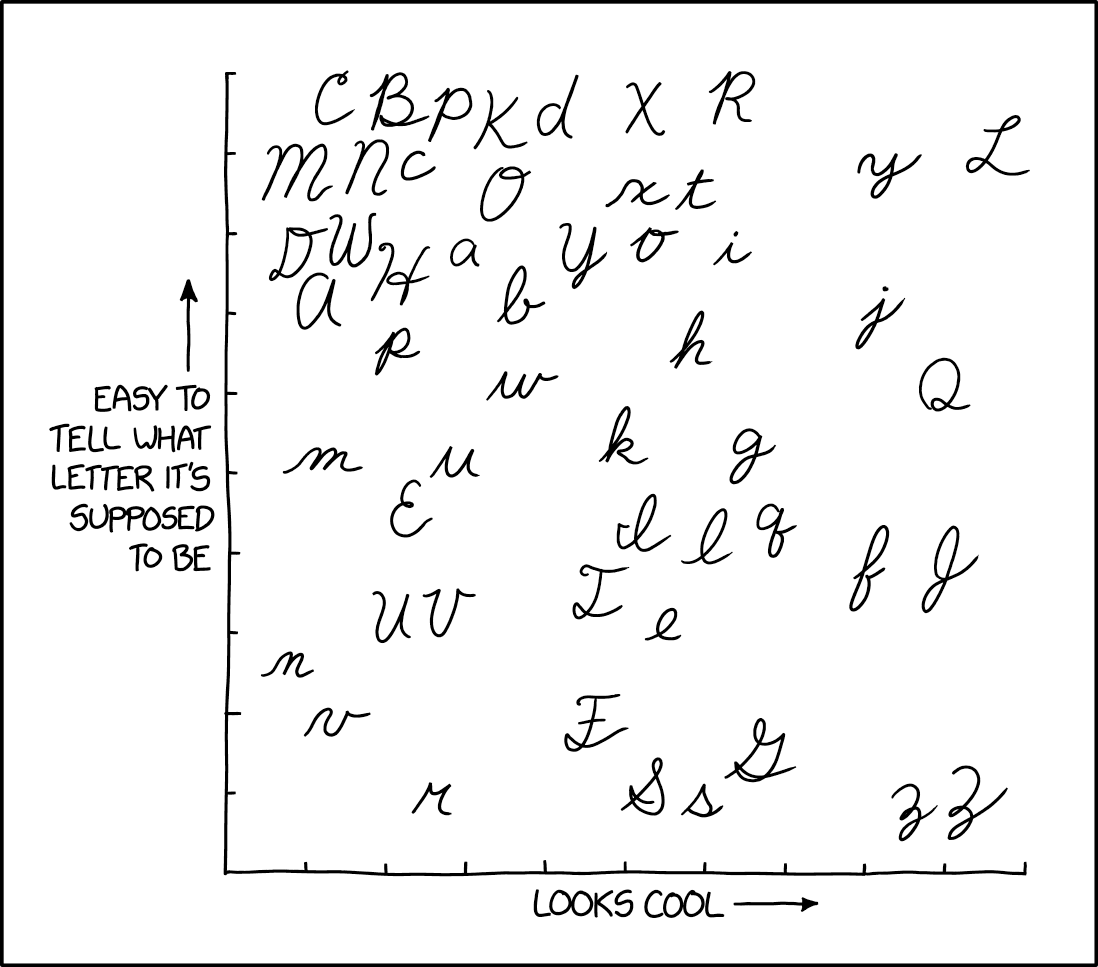
xkcd #2912: Cursive Letters
(imgs.xkcd.com)
Hard disagree on this one, the lowercase k needs to be way more to the right, or at the very least should have h i and l to the left of it. k looks so kool.
I never liked the lower case "r" and "s." They're so awkward to make.
A community for a webcomic of romance, sarcasm, math, and language.