I thought jack dorsey bailed on blueskyy
He did but he was never fully in charge of it, and him leaving was an improvement to it tbh (full disclosure I don't use bsky)
I wonder if he played this song on a loudspeaker as he left the building
You made me think of the Boombox Serenade.
I found a YouTube link in your comment. Here are links to the same video on alternative frontends that protect your privacy:
I found a YouTube link in your comment. Here are links to the same video on alternative frontends that protect your privacy:
I don't like bluesky, there's no support for quoting in a post (>) and posts are too short so it just looks like shit
there's no support for quoting in a post (>) and posts are too short so it just looks like shit
Ditto. I'm the uncool kid of the class...
> 𝙸 𝚎𝚗𝚍 𝚞𝚙 𝚍𝚘𝚒𝚗𝚐 𝚝𝚑𝚒𝚜.
And I want four other things: italics, bold, bold italics, and a monospace font. Using online generators are a pain in the ass but they give me 3 out of 4. There is no Unicode for bold italics. : (
Venmo does this, too. Why would I want people not involved in my transaction to see it?
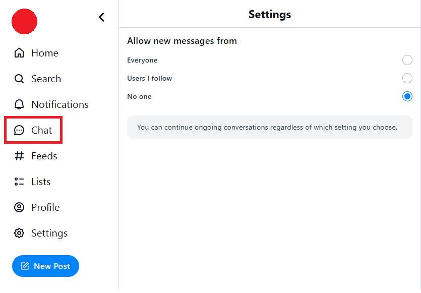
How is this an annoying default setting? It feels like the correct one. Having it set to None for everyone would be annoying and unusable
Here's an idea. The default is "followers" but the first time you log in - you get a pop-in and you can reset it then before you click a "continue" button. I've never even heard of an app or site doing that. They just always set the default silently which I really hate.
That could be a good idea to address this. I think most product teams want to make the onboarding simpler and simpler and are not found of new pop ups when opening the app. As users it can also be annoying. I guess there is a middle ground to find
A pop-in was an idea off the topic of my head. It's certainly not best. The reason tech companies don't give people choices is that they don't want to. The companies love the default settings and without a prompt - most people leave things as they are.
i have an account that ive made like two posts on there
Oh neat
technology
On the road to fully automated luxury gay space communism.
Spreading Linux propaganda since 2020
- Ways to run Microsoft/Adobe and more on Linux
- The Ultimate FOSS Guide For Android
- Great libre software on Windows
- Hey you, the lib still using Chrome. Read this post!
Rules:
- 1. Obviously abide by the sitewide code of conduct. Bigotry will be met with an immediate ban
- 2. This community is about technology. Offtopic is permitted as long as it is kept in the comment sections
- 3. Although this is not /c/libre, FOSS related posting is tolerated, and even welcome in the case of effort posts
- 4. We believe technology should be liberating. As such, avoid promoting proprietary and/or bourgeois technology
- 5. Explanatory posts to correct the potential mistakes a comrade made in a post of their own are allowed, as long as they remain respectful
- 6. No crypto (Bitcoin, NFT, etc.) speculation, unless it is purely informative and not too cringe
- 7. Absolutely no tech bro shit. If you have a good opinion of Silicon Valley billionaires please manifest yourself so we can ban you.
