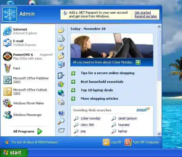
What's it called when you backport modern features to retro systems like this mockup? I swear there's a word for this...
It would be awesome if there was a community focused on that
Be the change you wish to see in the world
Backporting
Demake?
Ok...someone do this but in an Atari 2600 theme. I wanna see what loot boxes and modern gaming shit would look in 160x192 128 color resolution.
I think you're looking for "anachronism": A thing belonging or appropriate to a period other than that in which it exists.
I’d call it techlapse
I like THIS Windows
That's kind of overwhelming to me. It's like there's no bottom to that rabbit hole. I love it and I have so many questions.
Woah cool website, I don't how'd you know about this but thanks you
Nice, even moving the computer into the trash worked as expected.
Even a community in GitHub with forks, mods and plug-ins.
I love this, I wasted so much time on my phone. The Playstation start up sound was amazing. I need to open it on a conputer
The little shield next to the turn off computer icon implying it'll update it without asking is a nice touch
Looks like ads in the start menu aren't anything new.
Edit: I'm dumb, but I'm leaving my comment here.
Surfing away with an administrator account.
Trying to teach my in-laws not to do that was impossible.
Maybe it was just easier to install those browser bars as admin.
windows has normalized all that shit so well that this image is genuinely disturbing compared to the win 11 start menu. I am glad my windows days ended years ago
What the fuck is wrong with you... No... Don't you dishonor my house like that...

Thanks, I threw up a little.
Those msn searches 🤣
You could substantially de-uglify XP with a different theme, but, damn....that ugly
Thanks!
I hate it.
Since at that time these shits weren't really normalized, I can imagine some people would actually like these things and maybe even use them. It would have feel... kinda modern? If that makes sense... (tho when I first saw XP after using 95 and 98 in my life at that point, it felt absolutely super-duper modern x3)
I like this image - it is really nicely done. I don't like what it represents, but the image itself is decent.
Given that this was the prime time for Bonzi Buddy, I'm inclined to say I agree with you. People chose these things years ago, because it added more to the experience outside of "here is your word processor, here is notepad, here are the three games you have to play".
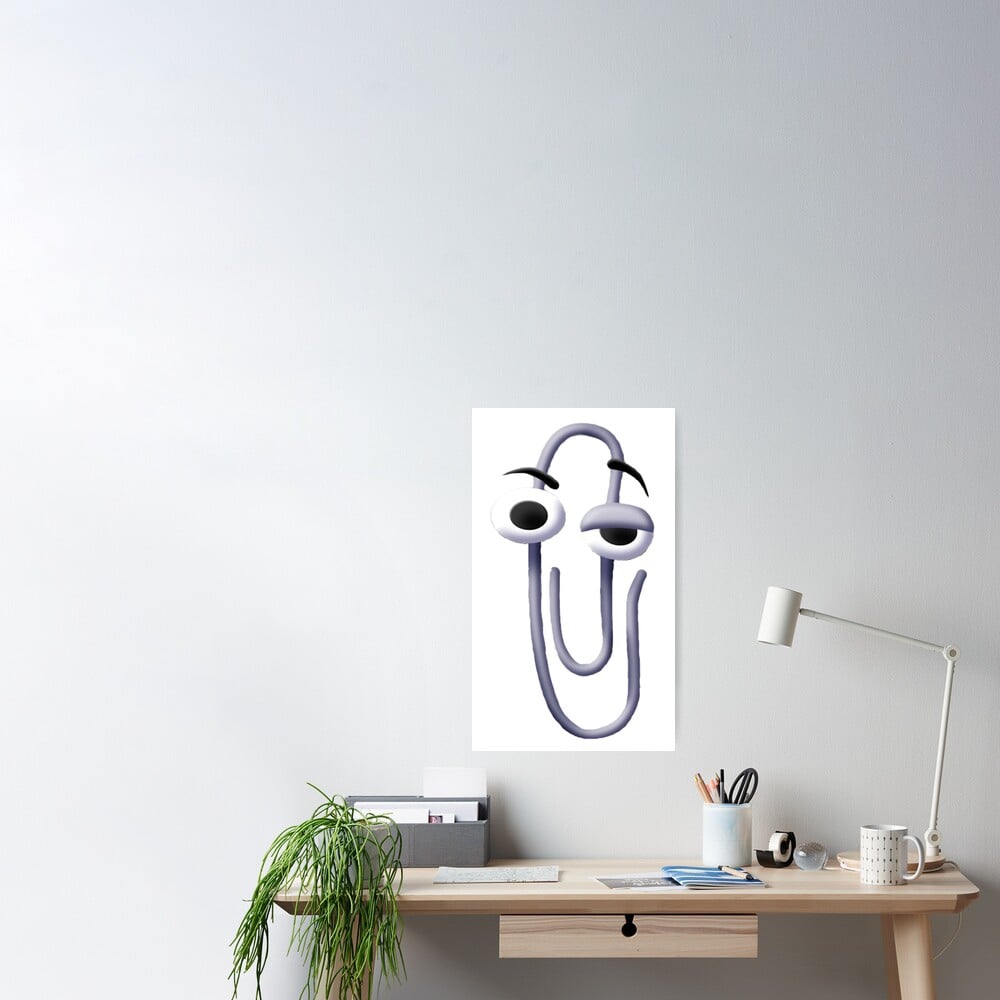
It's missing filling the start bat with a massive Copilot box and weather/news widget. Or maybe missed an opportunity to make Clippy the AI assistant.
I love-hate it.
I preferred Yahoo Messenger to Windows solely due to the ROTFLMAO emoji… it kicked ass. Made me giggle every time I used it.
tihi
but it's also a very good visualization what windows user got slow boiled into
Look how they massacred my boy...
Make thyself scarce, cur, less ye see the back of my hand.
I love the attention to detail, putting the upsell “30days of msn premium” between the “start” and “all programs” buttons, beautiful.
I crave retro futuristic. The flesh craves nostalgia. Also... pentiums and 512mb of ram would have fucking been cooked if they tried this lmao
I don't remember seeing all the internet links in the start menu.
Windows is ideal for experts, Twilight Zone lovers and desire for adventure, for the rest Linux is better (In the beginning it was the other way around, the first Distros even caused some suicids)
Memes
Rules:
- Be civil and nice.
- Try not to excessively repost, as a rule of thumb, wait at least 2 months to do it if you have to.


