1531
I hate these icons (gregtech.eu)
submitted 2 months ago by gregor@gregtech.eu to c/memes@lemmy.ml
(page 3) 50 comments
sorted by: hot top controversial new old
[-] 0ops@lemm.ee 3 points 2 months ago

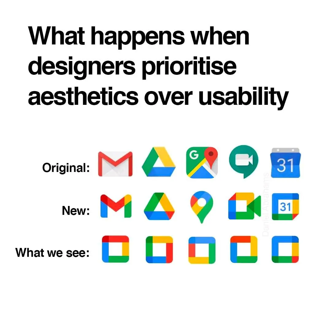
Color is the first thing the eyes tend to notice, then shape, then lines and details. The new icons all look the same at the edge of my vision, I have to look at them straight on to distinguish them. Individually each one is fine but together, like what the hell?

I don't rawdog Google icons anymore anyway, I use an icon pack
[-] Mwa@thelemmy.club 3 points 2 months ago

i see the new icons wanna intergrate googles colors ngl

[-] SolarPunker@slrpnk.net 1 points 2 months ago

One more reason to uninstall these app

[-] Xylight@lemdro.id 1 points 2 months ago

For mostly all of my app-launching things I always prefer searching for text than searching for an icon. In pixel launcher, I always use the app drawer search, but an even better solution is in something like Niagara launcher.

[-] Reddfugee42@lemmy.world 1 points 2 months ago

Uh, are you geometrically dyslexic?

[-] ngwoo@lemmy.world 2 points 2 months ago

Yeah these icons are all distinctive

load more comments (2 replies)
load more comments
view more: ‹ prev next ›
this post was submitted on 30 Aug 2024
1531 points (96.9% liked)

Memes

45660 readers
463 users here now

Rules:

  1. Be civil and nice.
  2. Try not to excessively repost, as a rule of thumb, wait at least 2 months to do it if you have to.

founded 5 years ago
MODERATORS