Saved you a click: In a lab.
I'm pretty sure Saunas have existed for a long time.
Alright, but imagine saunas that don't have an exit.
Damn but then how will I jump in the snow before coming back?
You don't, and it's summer outside, no snow.
Bad headline but interesting article. Definitely shows that some of the reporting on this topic has been very misleading—especially the suggestion that drier climates won’t experience these dangerous conditions.
Will look forward to a new map beyond just wet bulb temperatures that shows the real distribution of future heat danger.
Ah, fuck it, I can't stand this format of reading.
The take-away is that higher temperatures with low humidity are more deadly than previously thought, so that you can have deadly heat below the wet bulb threshold.
Climate - truthful information about climate, related activism and politics.
Discussion of climate, how it is changing, activism around that, the politics, and the energy systems change we need in order to stabilize things.
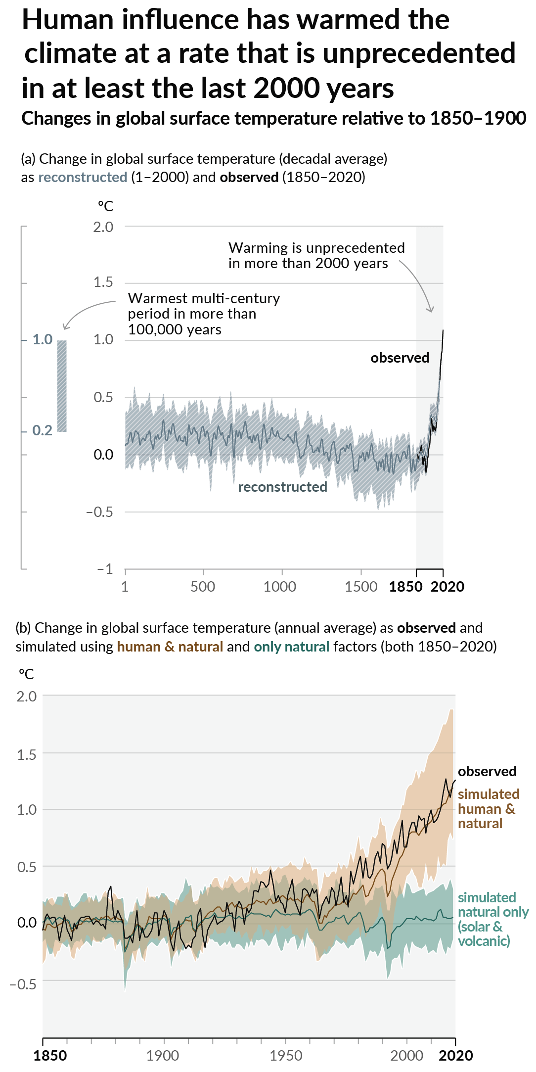
As a starting point, the burning of fossil fuels, and to a lesser extent deforestation and release of methane are responsible for the warming in recent decades:

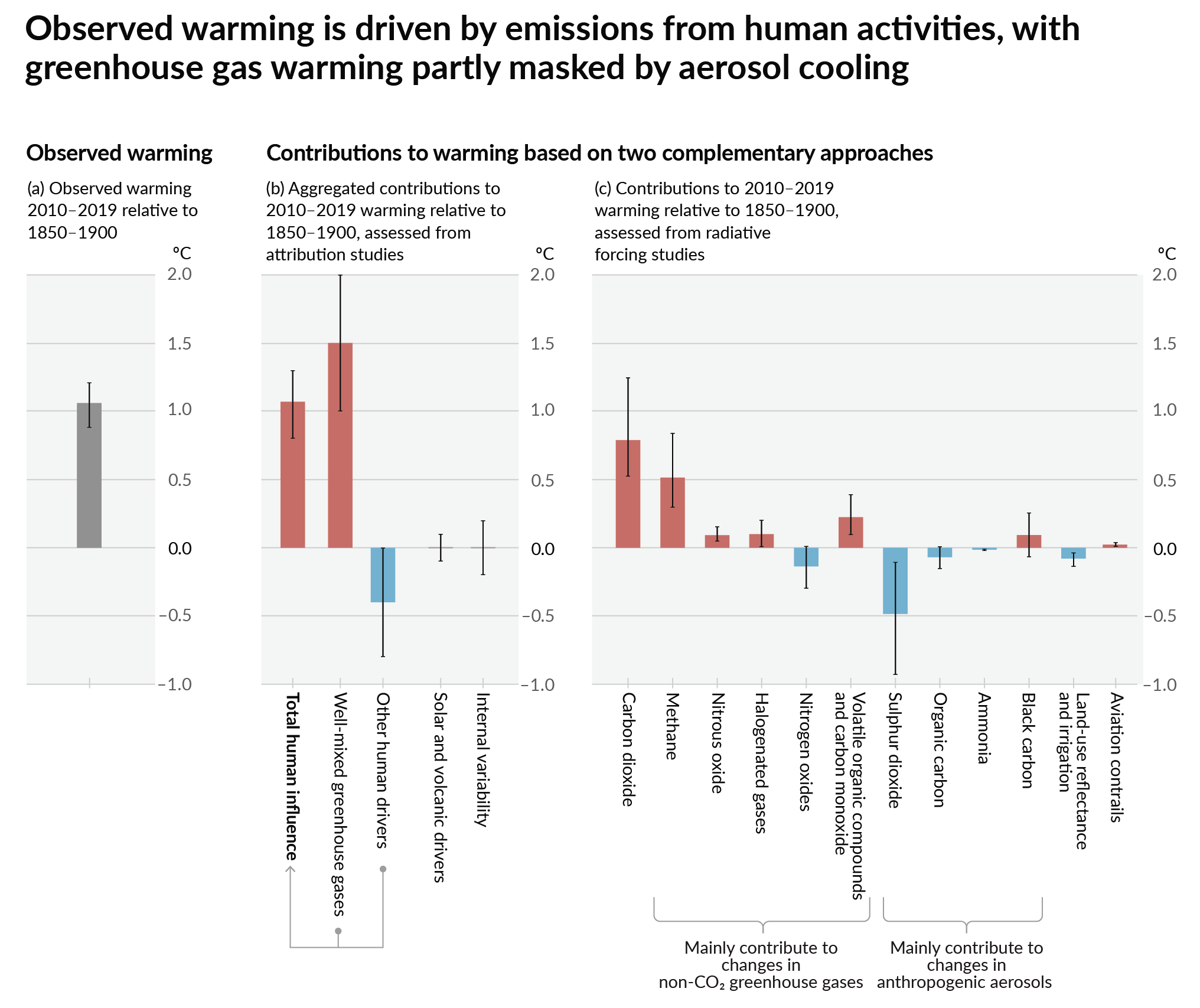
How much each change to the atmosphere has warmed the world:

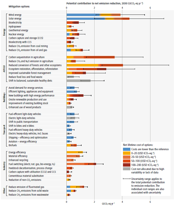
Recommended actions to cut greenhouse gas emissions in the near future:

Anti-science, inactivism, and unsupported conspiracy theories are not ok here.