[-] erogenouswarzone@lemmy.ml 12 points 1 year ago* (last edited 1 year ago)

Great meme, and I'm sure op knows this, but for anyone else who is curious...

007 in theory means:

  • 00: you have already committed your code to your local code base
  • 7: When you try to merge your code with everyone else's there are 7 files that others have worked on since you last refreshed your local code base.

To resolve this, you need to go file by file and compare your changes with the changes on the remote code. You need to keep the changes others have made and incorporate your own.

You can use git diff file_name to see the differences.

If you have made small changes, it's easier to pull and force an overwrite of your local code and make changes again.

However multiple people working on the same files is usually a sign of organizational issues with management. Ie, typically you don't want multiple people working on the same files at the same time, to avoid stuff like this.

If you're not sure, ask someone that knows what they're doing before you follow any advice on Lemmy.

[-] erogenouswarzone@lemmy.ml 9 points 1 year ago

If you don't have apt backups, that is a failure of the process, not yours.

[-] erogenouswarzone@lemmy.ml 11 points 1 year ago

It is 2023 my brother in christ! We deserve better error outputs than a stack trace.

  1. Tell me what line in my file caused the error,
  2. Tell me the values of the variables involved,
  3. Then you can have the stack trace.

Why are we pretending like these error messages are acceptable in 2023?!

[-] erogenouswarzone@lemmy.ml 11 points 1 year ago

Bro, trying to give padding in Ms word, when you know... YOU KNOOOOW... they can convert to html. It drives me up the wall.

And don't get me started on excel.

Kill em all, I say.

[-] erogenouswarzone@lemmy.ml 11 points 1 year ago

No way anything about that was an accident.

66

The Red Vineyards near Arles​, a painting made by Vincent van Gogh in November 1888, in Arles, when Vincent was living in relative happiness with Gauguin (but only a month before he would cut off his left earlobe in a fit that has never been fully understood).

The Red Vineyards near Arles was sold by Vincent’s brother Theo, in February 1890, for 400 francs. As far as is known, it is the only painting of Vincent’s that was sold in his lifetime. It is now in the collection of the Pushkin Museum, Moscow.

http://www.stmonica.ca/painting/red-vineyards-near-arles

45

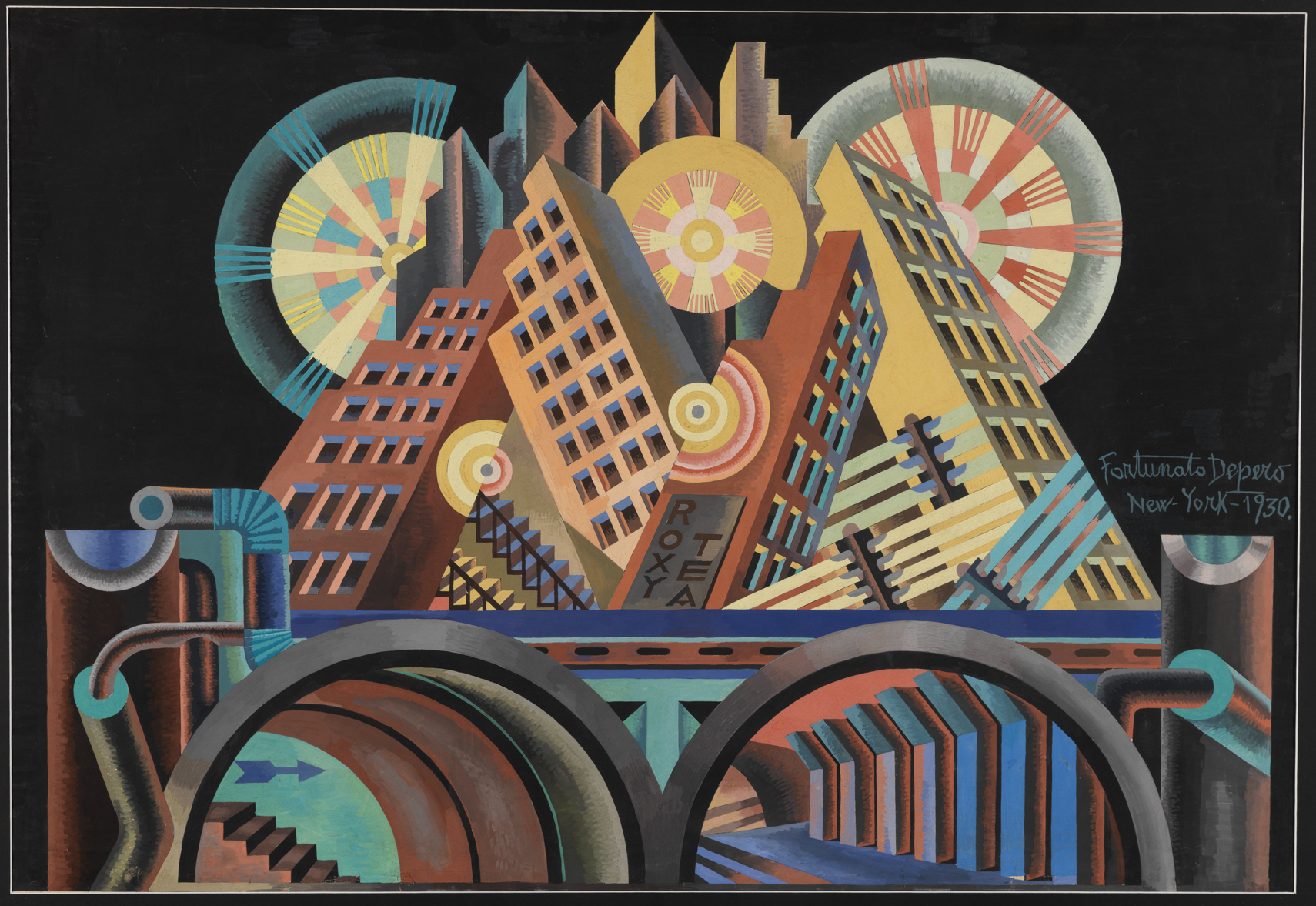
Italian Futurism was officially launched in 1909 when Filippo Tommaso Marinetti, an Italian intellectual, published his “Founding and Manifesto of Futurism” in the French newspaper Le Figaro. Marinetti’s continuous leadership ensured the movement’s cohesion for three and half decades, until his death in 1944.

To be a Futurist in the Italy of the early 20th century was to be modern, young, and insurgent. Inspired by the markers of modernity—the industrial city, machines, speed, and flight—Futurism’s adherents exalted the new and the disruptive. They sought to revitalize what they determined to be a static, decaying culture and an impotent nation that looked to the past for its identity. Futurism began as a literary avant-garde, and the printed word was vital for this group. Manifestos, words-in-freedom poems, novels, and journals were intrinsic to the dissemination of their ideas. But the Futurists quickly embraced the visual and performing arts, politics, and even advertising. Futurist artists experimented with the fragmentation of form, the collapsing of time and space, the depiction of dynamic motion, and dizzying perspectives. Their style evolved from fractured elements in the 1910s to a mechanical language in the ’20s, and then to aerial imagery in the ’30s. No vanguard exists in a void—all are touched by their historical context. The Futurists’ celebration of war as a means to remake Italy and their support of Italy’s entrance into World War I also constitute part of the movement’s narrative, as does the later, complicated relationship between Futurism and Italian fascism.

This exhibition endeavors to convey the spirit of Italian Futurism in all of its complexity. The Guggenheim Museum’s architecture lends itself to the display of this multidisciplinary idiom. Taking its cue from the Futurists’ concept of the “total work of art” (an ensemble that surrounds the viewer in a completely Futurist environment) and their aim to achieve a “reconstruction of the universe,” the presentation integrates works in multiple mediums on all levels of the rotunda. Objects are organized in a roughly chronological order, with filmic components bringing to life some of the movement’s more ephemeral activities, such as performance and declamation. The Futurists were insurrectionary and stridently vocal, and thus Italian Futurism welcomes a certain amount of visual and aural cacophony.

Futurism was punctuated by paradoxes: while predominantly antifeminine, it had active female participants; while calling for a breakdown between “high” and “low” culture, it valued painting above other forms of expression; while glorifying the machine, it shied away from the mechanized medium of film. By 1929, the artists who had denounced traditional institutions saw their leader, Marinetti, become a member of the Academy of Italy. And many of the revolutionary Futurists complied in some way with the Fascist regime. Through a comprehensive examination of Italian Futurism’s full history, the exhibition offers an opportunity to reassess one of the most contentious of modernist movements.

http://exhibitions.guggenheim.org/futurism/

59

Incuneandosi nell'abitato is one of the most famous Futurist aeropaintings. It portrays some buildings seen from above, from the point of view of a pilot who is dangerously 'nosediving' on the city. The point of view is set just behind the pilot, so we can see his head and shoulders and the inside of a cockpit from which one can see outside, not only through the front glass, but also through the side walls and even the ceiling.

Main Principles A New Theorization of the Relationship Between Subjectivity and Objectivity

The Rationalization of Aesthetics: the Straight Line

Analysis This work is emblematic of the strand of aeropainting concerned with depicting reality from an aerial perspective, thus conveying the physical and sensorial experience of flying. This strand emerged in works by Futurist artists, such as Tullio Crali, Tato, Benedetta and Gerardo Dottori, as opposed to that of 'cosmic idealism' developed by Prampolini, Fillia, Mino Rosso, and others. In these works, the artist's subjectivity sees and depicts reality from a new perspective which can be achieved thanks to the human conquest of the skies, accomplished by means of technological progress. This theme holds an immense power of suggestion, because it encapsulates modernity, speed and dynamism, and the idea of overcoming human limits—all themes privileged by Futurist artists. Aeropainting was indeed a new aesthetics developed by the artists of Second Futurism, and theorised by Filippo T. Marinetti, in an attempt to align themselves closely to the values championed by Fascism in their effort towards modernization, of which the celebration of aviation and of the national air force was an important part. In the late 1920s and early 1930s, Italo Balbo and his team had successfully carried out a series of transatlantic flights, thereby uniting Italy with rest of the world to affirm its ascendency and technological power. The regime and Marinetti celebrated him and his enterprises as a symbol of Fascist modernity and triumph. Aeropaintings also often evoke the theme of warfare, constituting another nexus between Fascism and Futurism.

The city we see through the eyes of the artist-pilot is a modern city, made of tall buildings and skyscrapers: the perspective is reversed and so is the relationship between subjectivity and objectivity. The urban environment is depicted through a rationalization of forms: the buildings are cubes; some of them have lines of square holes on their facades, which are the windows. The city thus becomes a set of geometric shapes. The perspective is emphasized to create an extreme sense of dynamism and the impression that the aircraft is extremely close to the buildings, and that a crash is imminent. The audacity and disregard for danger thus conveyed are again emblematic of Fascist as well as Futurist rhetoric.

http://dialecticsofmodernity.manchester.ac.uk/essay/435

56
Cityscape - Tullio Crali (1939) (64.media.tumblr.com)

Futurists saw the world imbued with speed and industrial transformation. Technology and modernity were governing principles of this artistic movement, which sought triumph over the past and conservatism.

Truli Cralli was an Italian painter that portrayed that dynamism and urgency. Trained as a pilot and captivated with a love of speed, his paintings create an urgent sense of acceleration.

Beginning in the 1930s, Crali emerged as both a futurist and aeropainter, but his interests also extended into architecture and theatrical designs.

Crali brings the viewer toward that sense of speed and momentum, while grounding the canvases with a realistic sense of space, created by his architectural training. Throughout the 1930s, Crali showed his work at the Venice and Rome Biennales and other exhibitions throughout Europe. Painted in 1939, this canvas was completed the same year as one Crali's most important works, Incuneandosi nell'abitato.

https://www.invaluable.com/auction-lot/tullio-crali-163-c-de0ofovieu

29
14
submitted 1 year ago* (last edited 1 year ago) by erogenouswarzone@lemmy.ml to c/artporn@lemm.ee

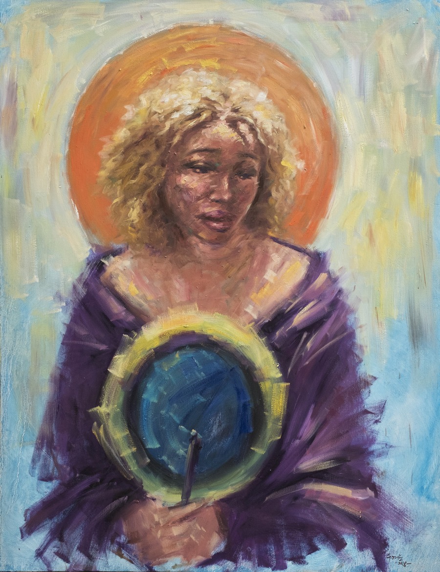
One of the most exciting modern artists I have stumbled across since starting these essays. Obi is a Nigerian artist with impressionist and expressionist tendencies with beautiful execution and style. Here we see she also plays with framing and separation, the photographer's left hand on a camera is separate from the main piece. Also the colors are beautiful, with the red and yellow and touches of blue - when viewed close become apparent, but from a distance blend perfectly and indistinguishably.

29

In the evolution of Mondrian's art, this small work, painted on cardboard in a loose pointillist technique, clearly belongs with the preceding works of 1908, such as Windmill in Sunlight.

In this little sketch, the accent is on entirely different aspects of the pictorial possibilities. Color has by now taken its place of importance in Mondrian's work, and he is no longer concerned with the clearcut contrast of a thing with its surroundings; on the contrary, the divisionist technique enables him to fuse things with their surroundings into a large and convincing unity. And this is what one sees happening in this little picture. The soaring mass of the tower merges with the upward movement of the color of the sky, producing a consonant, vibrating totality of great purity and power.

This year of 1909, in which Mondrian gave such evident proof that he was in the center of the movement for the renewal of painting in Europe, began with a joint exhibition in the Amsterdam Stedelijk Museum of the most recent work of Cornells Spoor, Jan Sluijters, and Mondrian. At that time Jan Sluijters was the leader of the Dutch avant-garde.

Like another Dutch artist Van Gogh, Piet Mondrian is among the foremost leaders of the Dutch avant-garde during his life time. His use of color, his stippling technique, the way in which he could evoke the unity of nature by means of his vivid color, secured him his place. But for Mondrian, as for many a French painter of the same generation, fauvism proved to be a way station on the road to a new style for the future.

https://www.piet-mondrian.org/lighthouse-in-westkapelle.jsp

40

“I went out one morning to look at the Shelton Hotel and there was the optical illusion of a bite out of one side of the tower made by the sun, with sunspots against the building and against the sky,” said Georgia O’Keeffe, recalling the precise moment that inspired her to paint The Shelton with Sunspots. Although her depictions of flowers and the southwestern landscape are powerful and evocative, O’Keeffe painted a group of cityscapes in the 1920s that are no less intriguing.

She married the photographer and dealer Alfred Stieglitz in 1924, and the following year they moved into the Shelton, a recently completed skyscraper. O’Keeffe was fascinated by the soaring height of the building and emphasized its majesty in this painting by rendering it from the street below.

In the glaring light of the emerging sun, the building becomes an abstracted series of rectangles arranged in the center of the composition. Yet the hard edges of the Shelton are softened by the numerous circular sunspots and wavy, flowing lines of smoke and steam, suggesting that despite her urban subject matter, O’Keeffe nevertheless sought to unify man-made and organic forms, just as she would in her southwestern paintings such as Black Cross, New Mexico .

89
submitted 1 year ago* (last edited 1 year ago) by erogenouswarzone@lemmy.ml to c/artporn@lemm.ee

Here we can see van Gogh's style point at something to come later - cubism. Typically his style is longer strokes, ie Starry Night, to convey motion or movement of light. Here however his strokes are short - almost to pointillism, but this predates cubism by nearly 20 years.

23

Pinchon executed this work in a Post-Impressionist style with a subdued Fauve or Neo-Impressionist palette of golden yellows and incandescent blues. The dynamic image of the train in Pinchon's painting is an homage to the emerging industrialized world.

The first railway station of Rouen was built on the left bank in 1843. The government authorized the continuation of the line to Le Havre and Dieppe the same year. It was therefore decided to build a bridge to the end of the Brouilly island (now connected to the Lacroix island), leading to the tunnel under the Côte Sainte-Catherine. The bridge, located in the Rouen metropolitan area, linking Paris and Le Havre, was named the English Bridge because many workers who built it were of English nationality. It is also called the Viaduc d'Eauplet, after the neighborhood where it is located.

The bridge originally consisted of wooden arches resting on piles of masonry. It was located a little further downstream than the existing bridge. It was inaugurated in 1847. A few months after its inauguration, in 1848, two arches on the side of the left bank were set on fire during a riot. It was then rebuilt. In 1856 the wooden arches were replaced by cast iron. This is the bridge that Pinchon painted. These arches proved fragile and it was decided to build a new bridge in 1912. Despite its destruction during the Second World War, the bridge completed and operational in 1914 is still used today.

https://en.wikipedia.org/wiki/Le_Pont_aux_Anglais,_soleil_couchant

42

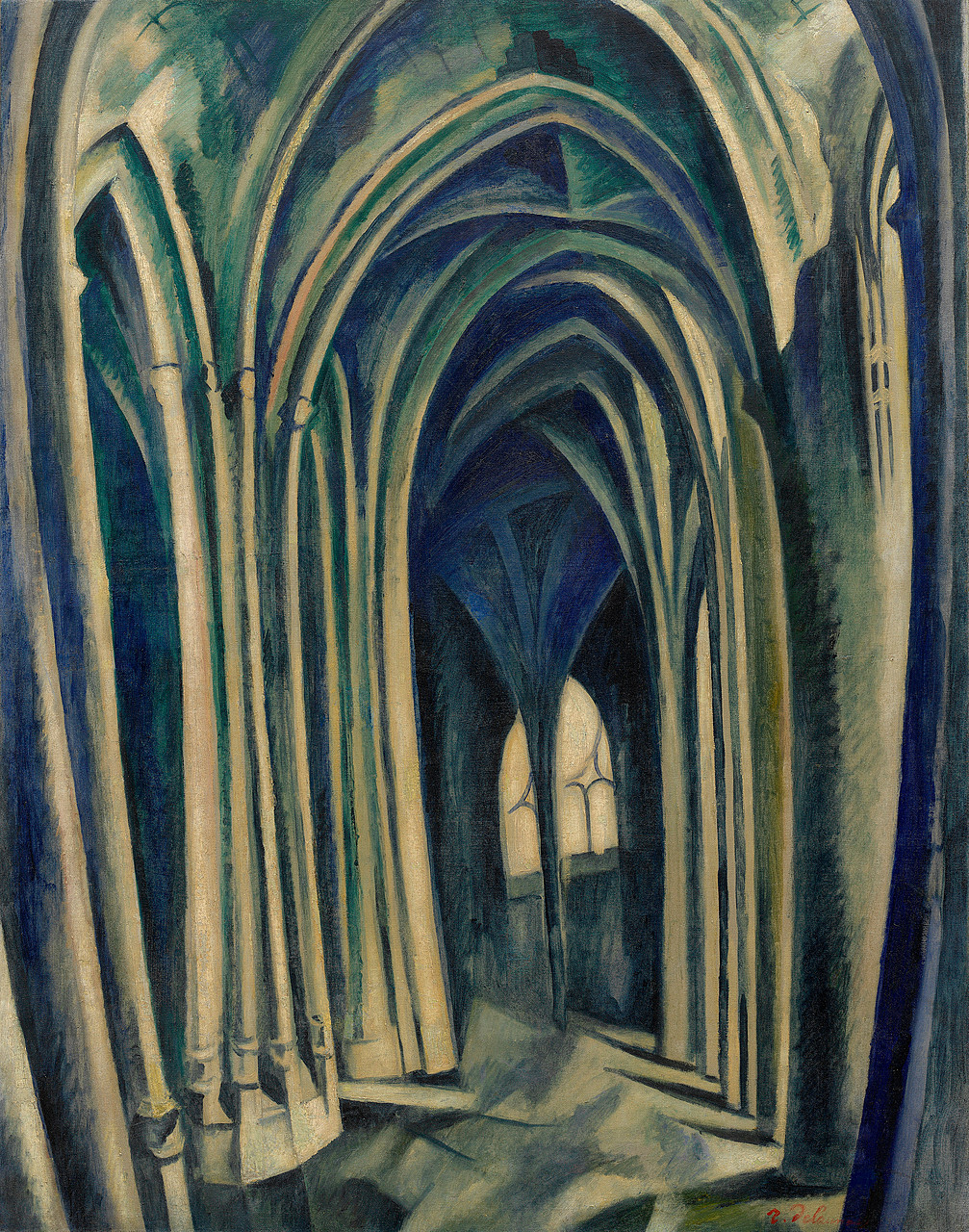
Robert Delaunay chose the view into the ambulatory of the Parisian Gothic church Saint-Séverin as the subject of his first series of paintings, in which he charted the modulations of light streaming through the stained-glass windows and the resulting perceptual distortion of the architecture. The subdued palette and the patches of color that fracture the smooth surface of the floor point to the influence of Paul Cézanne (his work bridged the gap between impressionism & cubism) as well as to the stylistic elements of Georges Braque’s (his work in Fauvism led to cubism) early Cubist landscapes. Delaunay said that the Saint-Séverin theme in his work marked “a period of transition from Cézanne to Cubism.”

Delaunay explored the developments of Cubist fragmentation more explicitly in his series of paintings of the Eiffel Tower. In these canvases, characteristic of his self-designated “destructive” phase, the artist presented the tower and surrounding buildings from various perspectives. Delaunay chose a subject that allowed him to indulge his preference for a sense of vast space, atmosphere, and light, while evoking a sign of modernity and progress. Like the soaring vaults of Gothic cathedrals, the Eiffel Tower is a uniquely French symbol of invention and aspiration. Many of Delaunay’s images of this structure and the surrounding city are views from a window framed by curtains. In Eiffel Tower (painted in 1911, although it bears the date 1910) the buildings bracketing the tower curve like drapery.

The artist’s attraction to windows and window views, linked to the Symbolists’ use of glass panes as metaphors for the transition from internal to external states, culminated in his Simultaneous Windows series. (The series derives its name from the French scientist Michel-Eugène Chevreul’s theory of simultaneous contrasts of color, which explores how divergent hues are perceived at once.) Delaunay stated that these works began his “constructive” phase, in which he juxtaposed and overlaid translucent contrasting complementary colors to create a synthetic, harmonic composition. Guillaume Apollinaire wrote a poem about these paintings and coined the word Orphism to describe Delaunay’s endeavor, which he believed was as independent of descriptive reality as was music (the name derives from Orpheus, the mythological lyre player). Although Simultaneous Windows (2nd Motif, 1st Part) contains a vestigial green profile of the Eiffel Tower, it is one of the artist’s last salutes to representation before his leap to complete abstraction.

Jennifer Blessing

https://www.guggenheim.org/artwork/1017

11

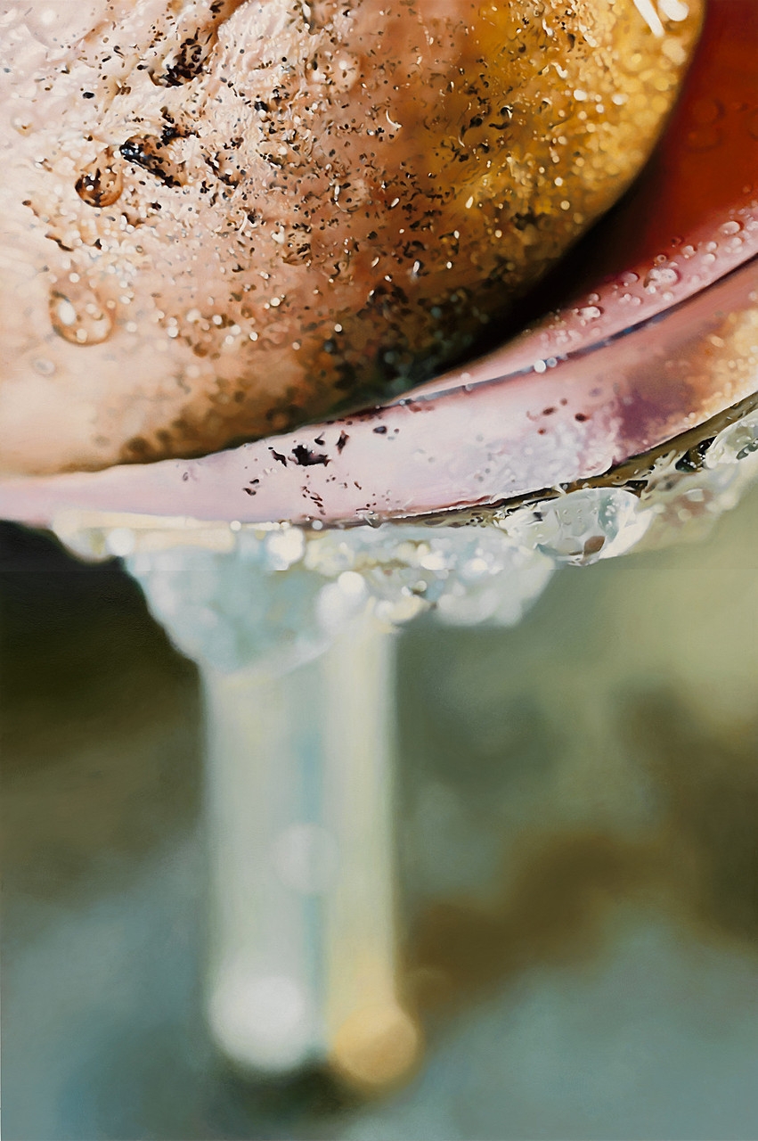
Marilyn Minter’s sumptuous depictions of designer-shod feet—which stalked across billboards in New York’s Chelsea gallery district as part of a public art project in 2006—have become signature images in the artist’s oeuvre. Drawing on the potent erotic charge of the high heel, Minter amplifies its currency as a fetishized sexual signifier by the liberal application of grime and water—making it literally, as well as figuratively, “dirty.” In Dirty Heel (2008), there is a subtle shift in emphasis; the stiletto recedes from view in a haze of shimmering pastels while the besmirched foot is delineated with crisp verisimilitude. These shifting planes of focus are indicative of the photographic underpinnings of the artist’s process, wherein she draws on multiple photographs as she builds up a composite image in luminous enamel paint. Here, the fleshy mass of the heel becomes an isolated anatomical fragment, a trope typical of the pornographic images appropriated by Minter in an earlier series of paintings. Unmoored from the body, scaled up, and intensely cropped, the forms are at first glance barely legible as a figurative image, hovering seductively on the brink of abstraction.

Katherine Brinson

https://www.guggenheim.org/artwork/23145

[-] erogenouswarzone@lemmy.ml 11 points 1 year ago

That's one of the great things about the impressionists - they showed common people just living their lives. That is something that hadn't really been seen before that time. The subject was always some duke or christ up until then.

[-] erogenouswarzone@lemmy.ml 10 points 1 year ago* (last edited 1 year ago)

The motif of death and a maiden began during the black plague. It eerily reminds the viewer that death comes for all, even the young and pure.

Marianne Stokes, however was part of a movement called "Pre Raphael". This began in the late 1800's and saw a resurgence of popularity for Renaisance realism (Itself a resurgence of Classical Realism). At the time, in the late 19th century, art schools were pushing the ideals of Raphael as what artists should aspire to, however, the Pre-Raphaelites believed only the most serious subjects should be painted, and only in the most realistic way. It has been compared to the Emo movement of the late 90's and early aughts in music, literature and film.

Here, in Stokes' work, we see the angel of death visiting a young woman. The angel has the face of a woman, a large departure from renaissance and gothic depictions of Death and the Maiden, where death is a skeleton or other frightening thing. Death seems to be comforting the girl , rather than frightening, with her outstretched wing. There is sadness in both the faces showing even death has a conscious about the fragility of life.

[-] erogenouswarzone@lemmy.ml 9 points 1 year ago

I was old enough to have used Napster before it was terrible.

[-] erogenouswarzone@lemmy.ml 12 points 1 year ago* (last edited 1 year ago)

Here's some others I'd be totally stoked about:

  • Eric Andre (he really needs a breakout role)
  • Leslie Jones
  • Eddie Murphy
  • RuPaul
  • Charming Taintman

Edit: Fucking Terry Crews for both roles!

[-] erogenouswarzone@lemmy.ml 10 points 1 year ago

Good on you for apologizing. Not many people would, but it really is the best form of self-therapy.

[-] erogenouswarzone@lemmy.ml 11 points 1 year ago

Perhaps the duck flew into a window on a building thinking it was more sky? Or maybe it flew into your windshield thinking something similar?

[-] erogenouswarzone@lemmy.ml 11 points 1 year ago

Lol, not to mention Cobalt and other horrors that are lurking in Legacy systems no one has looked at in 50 years.

I'm thinking mainframe terminals, where the character has to be in the right place on the screen in order to store something in RAM.

Even worse, how many systems are still using punch cards? How often do those cards need to be replaced?

view more: ‹ prev next ›

erogenouswarzone

joined 1 year ago
MODERATOR OF