view the rest of the comments
Mildly Infuriating
Home to all things "Mildly Infuriating" Not infuriating, not enraging. Mildly Infuriating. All posts should reflect that.
I want my day mildly ruined, not completely ruined. Please remember to refrain from reposting old content. If you post a post from reddit it is good practice to include a link and credit the OP. I'm not about stealing content!
It's just good to get something in this website for casual viewing whilst refreshing original content is added overtime.
Rules:
1. Be Respectful
Refrain from using harmful language pertaining to a protected characteristic: e.g. race, gender, sexuality, disability or religion.
Refrain from being argumentative when responding or commenting to posts/replies. Personal attacks are not welcome here.
...
2. No Illegal Content
Content that violates the law. Any post/comment found to be in breach of common law will be removed and given to the authorities if required.
That means: -No promoting violence/threats against any individuals
-No CSA content or Revenge Porn
-No sharing private/personal information (Doxxing)
...
3. No Spam
Posting the same post, no matter the intent is against the rules.
-If you have posted content, please refrain from re-posting said content within this community.
-Do not spam posts with intent to harass, annoy, bully, advertise, scam or harm this community.
-No posting Scams/Advertisements/Phishing Links/IP Grabbers
-No Bots, Bots will be banned from the community.
...
4. No Porn/Explicit
Content
-Do not post explicit content. Lemmy.World is not the instance for NSFW content.
-Do not post Gore or Shock Content.
...
5. No Enciting Harassment,
Brigading, Doxxing or Witch Hunts
-Do not Brigade other Communities
-No calls to action against other communities/users within Lemmy or outside of Lemmy.
-No Witch Hunts against users/communities.
-No content that harasses members within or outside of the community.
...
6. NSFW should be behind NSFW tags.
-Content that is NSFW should be behind NSFW tags.
-Content that might be distressing should be kept behind NSFW tags.
...
7. Content should match the theme of this community.
-Content should be Mildly infuriating.
-At this time we permit content that is infuriating until an infuriating community is made available.
...
8. Reposting of Reddit content is permitted, try to credit the OC.
-Please consider crediting the OC when reposting content. A name of the user or a link to the original post is sufficient.
...
...
Also check out:
Partnered Communities:
Reach out to LillianVS for inclusion on the sidebar.
All communities included on the sidebar are to be made in compliance with the instance rules.

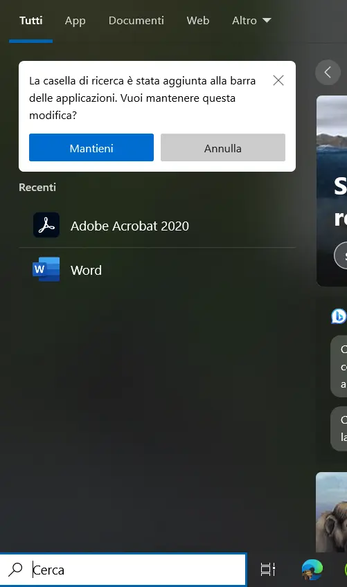
I literally cannot comprehend how you can use windows without the search bar. Its a total clusterfuck otherwise imo.
If you hit start and type, it has the same function
This is what I do since windows 8.1
Thats how i use it too. Is there anything more to it ?
it's a useless duplicate that takes useful screen estate. You can open the start menu, and if you start typing, the search bar appears. It doesn't need to waste 20% of the taskbar for that
But anyway, the search is broken. It gives priority to web searches, so if you want to search "libreoffice", to open "libreoffice writer", it suggests "libreoffice download" which is pointless. I replaced it with "powertoys run" and now i get useful results.
some people don't know that, and it isn't made obvious, so having it by default on is great i think... but, enabling it at random for no reason? that's ridiculous
It's poor UI but also I think it's a sign that the userbase has been coddled too much with things like this. Even Google adding the search bar widget to their homescreen of Android is kind of an illusion since it doesn't need to be shaped that way. But an entire generation has been programmed to type into a little empty field with a search button that they don't think of alternatives anymore.
Windows 8 thru 11 are trying to add sleeker and more intuitive interface skins to be more usable for the masses but the underlying OS is still the same. Accessing additional options that a legacy Windows user uses all the time just takes you back to the old menus. It feels so lazy that each major windows iteration feels like a new skin on top of windows xp/2000 because not much really has changed since then other than the bloat and a few cute features that could've been done with a 3rd party app.
Obviously being a little reductive here but with how windows 11 looks, I would've imagined it being actually different. But as soon as I right click something and view more options, it's clear it's still the same stuff once the old right click menu pops up from underneath.
Aaah i see what you mean even though i dont really care about taskbar real estate off with its head.
Even if you hide the search bar, you can hit the windows key and start typing your search query. The search bar doesn't have to constantly take up screen real estate in the taskbar.
Hence why I always hide it on my systems.
Yeah didn't know that the function you are describing is the exact way i use it
Whether I want to open a document I open once a week, or a program that I use every day, the search takes a minimum of 10 seconds to turn out a result, after first consulting its server for Firefox websites. It is useless beyond useless.
Idk about docs and stuff but for apps the win button-appname-return sequence is pretty much a matter of 1-2 seconds for me