18
Why won't my switch look like an actual switch?
(lemmy.world)
Home Assistant is open source home automation that puts local control and privacy first. Powered by a worldwide community of tinkerers and DIY enthusiasts. Perfect to run on a Raspberry Pi or a local server. Available for free at home-assistant.io
It's not what you're asking for because you literally want to have the "more information" as your card but I agree it can be annoying having all sorts of tapping and stroking needed to achieve something simple, like turning on a light.
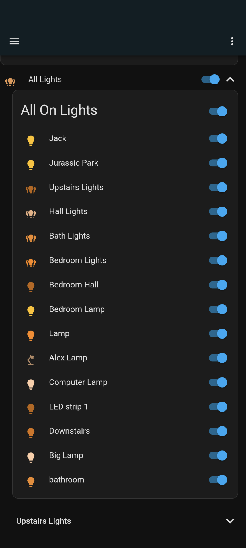
So I present this
I used https://github.com/thomasloven/lovelace-fold-entity-row along with "auto-entities" and a lot of time playing in yaml to make these cards, but once I had one made for lights, it was easy to just copy it and switch the entities out to make one for switches and media players.
Basically it's all the ON devices, followed by a fold out for each floor, which then has fold outs for each room on the floor.
I don't use it a lot anymore but it's still there, one line in my Dash
Edit, this is obviously with the one line unfolded, it all folds up under "all lights" and the switch for all the lights
It is not quite what I had in mind, but I'll still poke around, because I see a lot of YAML in my future...
What I was after was having a switch just like the one shown in the screenshot as a card in the Dashboard. All I can add is a button that changes the color. I know I can YAML it, but it still feels weird that an obvious nice solution is not readily available.