827
It's surprising that no one has thought of it first.
(lemmy.world)
1. Be civil
No trolling, bigotry or other insulting / annoying behaviour
2. No politics
This is non-politics community. For political memes please go to !politicalmemes@lemmy.world
3. No recent reposts
Check for reposts when posting a meme, you can only repost after 1 month
4. No bots
No bots without the express approval of the mods or the admins
5. No Spam/Ads/AI Slop
No advertisements or spam. This is an instance rule and the only way to live. We also consider AI slop to be spam in this community and is subject to removal.
A collection of some classic Lemmy memes for your enjoyment
I once suggested a similar project at our company. One of our products is labelled in braille. For technical reasons it was the easiest way to drill holes in the front plate and stick a transparent plastic insert through from the back.
My suggestion was to add a few blue LEDs behind it to light up those braille dots. It would have been meaningless for the intended user - but it would have looked way cool!
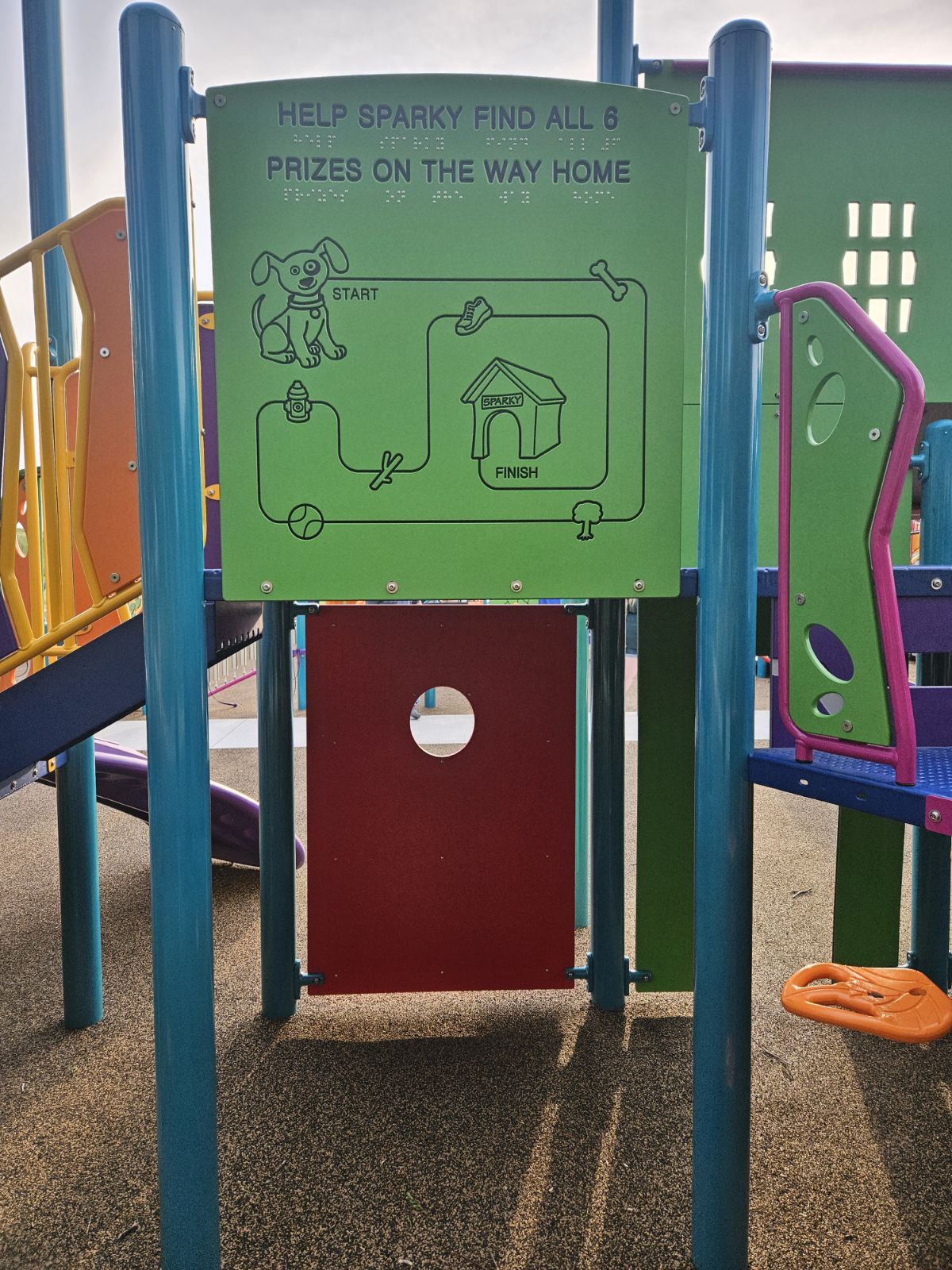
I often think of this sign I saw at a small children's playground with braille on it hung 6 feet in the air with no way to reach it.
I think of the sign that says "hot surface do not touch" with accompanying braille.
Yep. That one was made by a guy who made all kinds of warning plates for their plant, and legal & corporate requirements were that every sign has to have braille on it. I don't think the department requesting that sign from their sign-making-department had this on their screens...
There's also no way for someone who needs Braille to actually DO the "puzzle". The other words don't have Braille, the map appears to be flat. Terrible design.
Nah the black parts of the sign are recessed. You can see from the lighting.
Still, there should be Braille for the text too.
Surely they could have made that a little more challenging than having a straight line?
Maybe the builder just mounted the panel the wrong way? It serves as a wall for the platform behind it.
There's a different printing on the other side too.
I'd like to think of that as supplementary design.