1511
you are viewing a single comment's thread
view the rest of the comments
view the rest of the comments
this post was submitted on 18 Aug 2024
1511 points (99.1% liked)
Technology
83146 readers
1053 users here now
This is a most excellent place for technology news and articles.
Our Rules
- Follow the lemmy.world rules.
- Only tech related news or articles.
- Be excellent to each other!
- Mod approved content bots can post up to 10 articles per day.
- Threads asking for personal tech support may be deleted.
- Politics threads may be removed.
- No memes allowed as posts, OK to post as comments.
- Only approved bots from the list below, this includes using AI responses and summaries. To ask if your bot can be added please contact a mod.
- Check for duplicates before posting, duplicates may be removed
- Accounts 7 days and younger will have their posts automatically removed.
Approved Bots
founded 2 years ago
MODERATORS

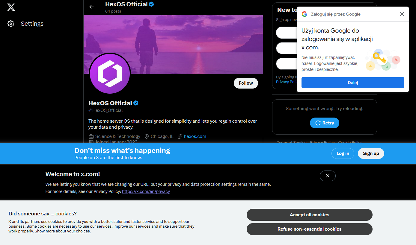
I have a very hard time believing that these companies are unaware of how auful this shit makes their webpages.
If this were a competent company, I'd say that they're entirely aware of it and how fucking awful it is, but that there's a mandate coming from somewhere that the page MUST include x, y and z and so they add x, y and z but usually try to at least make the site usable.
This being Twitter, though, I'm sure it's because a screaming man-child threw a sink at someone and told them to do it or they'll be fired and so they did it in the most half-assed obnoxious way they could manage.
Common language used to dismiss bad decisions like this:
1 - Oh, did you turn off cookies or clear your cache? Sorry about that.
Pretty sure you just triggered every developer and/or person who had to sit through a product meeting.
Though you missed the last bullet point: Our user surveys showed that people would actually prefer these changes
NGL, I was feeling very uncomfortable myself by the end of typing said list. Is it hot in here? I need to lie down.
It's intentional, they want you logged in so they can track what you're doing
iT’s bEtTeR iN tHe aPp
Ughhhhhhhhh 😩
Anyone can make a good website. It takes a real engineer to make a horrible website that people will use just enough while suffering.
That's a very good quote.
Inspired from the quote “Any idiot can build a bridge that stands, but it takes an engineer to build a bridge that barely stands.”
Source: Unknown
If you ever want to read anyone’s tweets somewhat chronologically or see someone’s latest tweet, you’re gonna create an account.
Tweets as view on people’s profiles are totally scrambled (presumably to thwart LLM-feeding scrapers).
I do a lot of my browsing from an iPhone 11. At least twice a day, a page will crash and reload halfway through whatever article I was trying to read. I get it’s a few generations old, but since when do you need state of the art tech to view what should be a static page.
It's diminishing customer experience creep, except the company doesn't understand what the user data means. They run A/B tests of different layouts, seeing what kind of feedback each gets to learn more about design choices and users. Each version should get its own feedback and then that data is compiled by data scientists into actionable feedback, things that can be done to improve the website in the direction the company thinks is an "improvement".
Twitter abandoned those data scientists with the initial layoffs. There is no one to tell them what works and what impacts the customer experience, which is why each time the internal question of "how do we open up for engagement?" they answer it the same way, "Use existing user bases by linking their account to Twitter." The result is several login requests all looking for the same cookie.
It's lazy or inexperienced management. Knowing the type of person Elon hires, it's probably both.
Oh they're aware, they just don't care 99% of the time.
I barely see them pop up, if they do it's for a fraction of a second before a browser extension nukes them.
Well, unless you're a nerd, you only see those messages once
on top of what others have said - directing you to the app and login - it’s also likely just that teams don’t talk and make decisions that solve their local issue without too much for the whole, and then say “ugh team x solved this so inelegantly! we were forced to do our thing that wasn’t as nice!”
I mean, they kinda don't. Companies are entities made out of policies guiding how people split up objectives into smaller parts. The more people involved and the more indirect it is, the less coherent it gets
Legal says you need one popup for compliance. Marketing or analytics say you need more users to log in. Elon wants to remind people to call it Twitter.
By the time it filters through managers to the devs, they probably know it'll be a horrible experience, but what are they going to do? It's not their job. They'll get brushed off. There might even be a compelling reason to do it in this way - with this in particular, annoying and intrusive popups are malicious compliance with the EU cookie laws. But everyone seems to be doing it this way - that's probably what legal is going to recommend rather than interpreting the law themselves
So the problem is the structure. If you want a hierarchy of obedient replaceable cogs, you've made sure no one sees the full picture