20
African Union joins calls to end use of Mercator map that shrinks continent’s size
(www.theguardian.com)
“It’s [the Mercator projection] the world’s longest misinformation and disinformation campaign, and it just simply has to stop.”
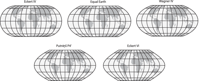
No matter how we cut it though, all 2D projections will have some kind of distortion. They opted to preserve area, while the Mercator preserves angles. Arguably it is less important today to preserve angles, as we have automatic navigation systems. There are some alternatives that also preserve the area: https://upload.wikimedia.org/wikipedia/commons/7/76/The-Equal-Earth-compared-to-similar-equal-area-pseudocylindrical-projections.png
Right. What people need to understand that any globe put on a flat surface will be distorted. Their proposal is just as distorted as the Mercator, just in area vs angles as you stated.
The Mercator is a propaganda campaign to make Christian countries look big and powerful. Ask yourself why is it only “Christian” countries that are distorted.
Edit: should have put this /s
I'm going to be honest, this just looks utterly useless for any country that isn't south africa, and ESPECIALLY useless for any country in the northern hemisphere.
Like, yes, sure, you've made all the country's areas roughly equal, but also every single country that isn't south africa is a distorted, warped mess that looks nothing like its actual shape.
Look at parts of europe- every country is a COMPLETELY USELESS shape. Three quarters of them have been turned into diagonal lines. How the fuck is that useful? Europe is the worst area in that regard, but by no means the only one.
It makes it literally useless as a map.
Every country looks distorted and warped based on your lifetime of experience looking at mercator projection. Every country looks warped and distorted when compared to globes. We learn geography on a flat surface which is inherently distorted because we live on a round surface
Actually, fun fact, the entire point of the Mercator projection is that it DOES maintain shapes/angles, just not scale. It's a nautical map, it's for sailing. That's why when you look at a mercator map and a globe, the countries look about the same, just potentially different sizes- because that's literally the point of it.
Who actually uses it as a map though? It's usually only seen briefly in apps, or in various symbols, or on a classroom wall. As a symbol, having the rights sizes would be a significant improvement. In an app, people will zoom in anyway, so at least they'd passively see the correct proportions when zooming out, instead of getting a false impression. In a classroom, it would seem all that more importantly to not give false impressions to kids.
The problem with that is that it gives a completely incorrect idea of what an individual country looks like, in a way that gives a false impression to kids about what the countries even look like. Suddenly they have to look at one map, and recognize a country, and then look at a zoomed in, more accurate map, and recognize it in a completely different shape. To be frank, most people's geography knowledge is already bad enough- doubling the amount of shapes they need to learn is basically a non-starter.
For classroom instruction, a globe should be being used anyway- that's the gold standard. Why go through all the work and effort of introducing a worse solution, that doubles the amount of studying, and is made completely useless when it can be replaced by a $10 globe?
Is learning the shapes of countries really all that important? I would have thought by the time the shape matters, you're looking at/learning the details of the country, at which point you're not looking at a map of the entire world anymore anyway.
Yes? The shapes of countries- and their relation to other countries around them- is literally the most important part of learning geography in some respects, because of how much that shape is influenced by- and has been influenced by- the surroundings, the socioeconomic and sociopolitical history, etc etc.
Ok come up with something that's better and just as practical.
They did. They are specifically advocating for the Equal Earth projection.
I mean everything is approximately to scale i guess, but the further east or west you get from Europe/Africa the more bent things get. Including the area that 75% of the worlds population live.
Well yeah, every map projection has to mis-represent something. In this case they're arguing that presenting area is more important than presenting angles. Outside of long-distance travel on ships and planes, which are not using general-purpose world maps, nobody is navigating with a world map, so I think that they're probably right here. It seems more important to me to understand the relative size of Africa to other landmasses than it is to know that the Korean peninsula is actually a few degrees off of being straight north of Borneo
Me when someone calls my pp smol
We should encourage the use of more globes to represent world maps.
Like, seriously. Almost all maps are viewed on a computer screen, all computers easily have the ability to display a sphere and rotate it
Kinda hard to fit a globe inside a school book, or any book
It's kinda easy to have globes in school though. Doesn't need one per student.
I really like the Dymaxion projection.
I prefer to unfold a map to read it, as opposed to doing origami just to figure out where I'm going.
16th century? Huh I would have expected a far more accurate version would have been made and accepted long ago.
Especially since during all the centuries since then accurate navigation was needed, even around Afrika, and not make journeys last far longer by keeping an incorrect map.
Nautical navigation is where the Mercator map is actually the most useful. Any straight line drawn in it stays true and any angles are preserved. That's why every nautical chart is done using a Mercator projection. It's just not so great when blown up to the size of the world, but that was never really it's intention.
It was intentional as propaganda. During the Cold War, it made the U.S.S.R. look bigger and more of an imposing threat to the west.
It was intentional as propaganda. During the Cold War,
Nope. It is hundreds of years older that that.
Beat me to it. Except it's more like 25 years. Now get off my lawn.
Like completely, or just as a default?
It's uniquely the best option if you like using compass bearings.
Which, at a global scale, is important in your life when exactly? The only time I move at a global scale I'm flying, and then the projection makes it look like my pilot doesn't know how to fly in a straight line.
Since the advent of widespread GPS, a lot less. It's historically interesting, and is still used as a backup by some ships, but it's not really necessary the way it was in the age of sail when it became the projection.
Again, if they just want to switch to something more balanced as a default when you just want to point at things on a map, that's entirely reasonable.
The simple fact is no map projection will be perfect or do anyone "justice".
You're flattening out a sphere to a flat rectangle. A lot of compromises have to be made. So go with the one that functions best for navigation.
Well a rectangle gives you easy direction, true north is always up. But you can map very accurate maps that are not rectangle. They just make navigation a bitch
A community for discussing events around the World
Rule 1: posts have the following requirements:
Rule 2: Do not copy the entire article into your post. The key points in 1-2 paragraphs is allowed (even encouraged!), but large segments of articles posted in the body will result in the post being removed. If you have to stop and think "Is this fair use?", it probably isn't. Archive links, especially the ones created on link submission, are absolutely allowed but those that avoid paywalls are not.
Rule 3: Opinions articles, or Articles based on misinformation/propaganda may be removed.
Rule 4: Posts or comments that are homophobic, transphobic, racist, sexist, anti-religious, or ableist will be removed. “Ironic” prejudice is just prejudiced.
Posts and comments must abide by the lemmy.world terms of service UPDATED AS OF OCTOBER 19 2025
Rule 5: Keep it civil. It's OK to say the subject of an article is behaving like a (pejorative, pejorative). It's NOT OK to say another USER is (pejorative). Strong language is fine, just not directed at other members. Engage in good-faith and with respect! This includes accusing another user of being a bot or paid actor. Trolling is uncivil and is grounds for removal and/or a community ban.
Similarly, if you see posts along these lines, do not engage. Report them, block them, and live a happier life than they do. We see too many slapfights that boil down to "Mom! He's bugging me!" and "I'm not touching you!" Going forward, slapfights will result in removed comments and temp bans to cool off.
Rule 6: Memes, spam, other low effort posting, reposts, misinformation, advocating violence, off-topic, trolling, offensive, regarding the moderators or meta in content may be removed at any time.
Rule 7: We didn't USED to need a rule about how many posts one could make in a day, then someone posted NINETEEN articles in a single day. Not comments, FULL ARTICLES. If you're posting more than say, 10 or so, consider going outside and touching grass. We reserve the right to limit over-posting so a single user does not dominate the front page.
We ask that the users report any comment or post that violate the rules, to use critical thinking when reading, posting or commenting. Users that post off-topic spam, advocate violence, have multiple comments or posts removed, weaponize reports or violate the code of conduct will be banned.
All posts and comments will be reviewed on a case-by-case basis. This means that some content that violates the rules may be allowed, while other content that does not violate the rules may be removed. The moderators retain the right to remove any content and ban users.
News !news@lemmy.world
Politics !politics@lemmy.world
World Politics !globalpolitics@lemmy.world
For Firefox users, there is media bias / propaganda / fact check plugin.
https://addons.mozilla.org/en-US/firefox/addon/media-bias-fact-check/
