168
I'd be really interested to see this broken down into carbon output by corporations vs individuals, and by the top 1% in wealth vs. everyone else - I bet it would be quite telling.
I'd be really interested to see this broken down into carbon output by corporations vs individuals, and by the top 1% in wealth vs. everyone else - I bet it would be quite telling.
Ah, time for my daily “chart that would be better as a table”.
At least this time the visuals make sense
I'm sorry, I'm sorry, but I can't cope with Turkey being the only country not written in English in this.
Their English name is officially Republic of Türkiye
What number is the letter 'ü' in the English alphabet?
21.5
Very topsy-turvy world where European countries can be "coffee exporters" and claim better environmental practices than the countries they exploit
What coffee-producing country is higher than the European countries on that chart?
NGL. One of the few times I'm proud to be British. Plenty more work to go though.
Ayyyy, just said the same thing lol

Damn, can't remember the last time I was proud of the UK for something lol
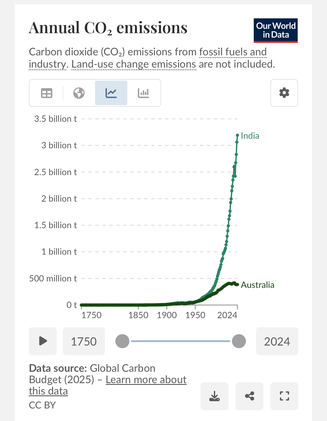
this is why i hate per capita, Australia is listed 3rd and India last despite Australia’s co2 emissions going down and India’s increasing by over 5 Australia’s in the last 20 years
Planet doesn’t care about per capita
If it wasn’t per capita, we’d just be looking at population size graphs. It is useful information and shows what is possible. We should be looking at metrics like CO2 per unit of gdp also. It’s not just people, it’s industry. Some of chinas emissions are really other countries emissions, offshored for China to produce. China profits from it, of course.
If it wasn’t per capita, we’d just be looking at population size graphs
I duno about that, largest countries in the world including EU:
Some of chinas emissions are really other countries emissions, offshored for China to produce. China profits from it, of course.
Agreed, I've complained about Europes false green economy when it outsources manufacturing to China, including but not limited to
China was by far the largest supplier of solar panels, accounting for 98% of all imports
https://ec.europa.eu/eurostat/web/products-eurostat-news/w/ddn-20251009-2
For a population as large as Europe it's disappointing their aren't more battery and solar panel manufacturers
The problem is that EU can't compete on price. However, as they are long term it is not as much of a risk to install foreign technology that is not necessary to internet connect.
The EU is reducing, which is why per capits is important. We can see what is possible. Clearly the USA is not doing well. China has made huge inroads in green energy and I think it's a combination of wanting to be at the forefront of new technology and a need for energy security.
As it stands, china is about triple the EU, while manufacturing for them. The USA is just burning carbon for no reason as they no longer manufacture. This will worsen until ai bubble pops. They have quite a bit of nuclear power though. Their oil based economy is just too ingrained. Similar to Saudi Arabia. Why bother reducing when oil is cheap.
I fully expect tariffs in carbon pricing to be the next trade tariff globally. Whyake the hard cuts that cost.more on your internal market when the competition does it cheaper and doesn't care about environmental effects. It forces incentives to do the right thing and prevents the externalization of costs.
There is a massive issue with adjusting for trade though. If you just imagine a country lets call it Green, which has no emissions, and a another country Black, which is fully run on dirty fossil fuels. Now when both countries trade, the Green country imports emissions and the Black ones are lowered. It can be that dirty processes have been outsourced to the Black country or you can just have the Green country do things better.
When you take the EU and China you can see both. There are absolutely dirty processes outsourced to China, but at the same time things like electricity are dirtier in China then in the EU.
Now when both countries trade, the Green country imports emissions and the Black ones are lowered
Yeah I'm saying it's the opposite, the green country is outsourcing dirty work to the dirty country
I didn't downvote you btw
Yeah I’m saying it’s the opposite, the green country is outsourcing dirty work to the dirty country
Then the Green countries emissions increase for any import from the Black country, when you adjust for trade. The issue is that it is any import and not just dirty outsourced ones.
Say the Green country sells a 1000 chairs to the Black one and the Black country also sells a 1000 chairs to the Green one. Then you still have an increase in emissions, when you adjust for trade, in the Green country and falling emissions in the Black one. I certainly would not call that outsourcing emissions, as both countries could have just kept their chairs. This sort of trade happens all the time in the real world. You for example can buy German cars in Japan and Japanese cars in Germany.
This is how a net goods exporter like the EU, can have an increase in trade adjusted emissions.
So your complain is that the chart lacks a time axis, not that it's per-capita?
It matters.
The planet can sustain 10x more people if they live like people in India vs Saudi Arabia or UAE....
It's funny you want to focus on a factor of 5, though. Especially when they still come in dead last after a 5x increase. The average person on earth contributes about 4 tons of GHGs. First world nations are 4x-5x that.
You're right. They're pushing the blame toward the people. As if the people of Saudi Arabia have any real say over industry choices.
Then why compare countries? Countries defined by arbitrary lines are just that. If you want to compare by arbitrary lines, then correct comparison would be to to compare a District in India and entire Australia. You could lower emissions of any country by splitting it into smaller pieces. You can reduce Australia's emissions even more by declaring that every Australian is a separate country, every David, John, Peter in Australia will have many times lower emissions than entire country of India, consisting 1.3 billion people.
I mean, Aussies are punching above their weight with emissions still while they have made incredible progress on the energy transition and generally have good policies.
One notable thing Australia needs to work on is coal use which is high, in the coming years this will start to drop off massively since Australia is still the lucky country when considering the next generation of energy production.
The graph is good, and soon you'll be able to see Australia drop down the list of countries in a very satisfying way.
Ah, fair point fair point.
This shows that data can be very misleading. Both India and China have huge rural subsistence farming populations that produce virtually no emissions
Yes, and yet the difference between them is a factor of 4.
Now, I don't know this source. And I'm always sceptical of infographics. Does this include the fact that many other countries have their manufacturing in China?
I think this is probably a case where the median gives a far more complete picture than the average.
Discussion of climate, how it is changing, activism around that, the politics, and the energy systems change we need in order to stabilize things.
As a starting point, the burning of fossil fuels, and to a lesser extent deforestation and release of methane are responsible for the warming in recent decades:

How much each change to the atmosphere has warmed the world:

Recommended actions to cut greenhouse gas emissions in the near future:

Anti-science, inactivism, and unsupported conspiracy theories are not ok here.