176
submitted 11 months ago by carrylex@lemmy.world to c/memes@lemmy.ml

cross-posted from: https://lemmy.world/post/17714161

Template

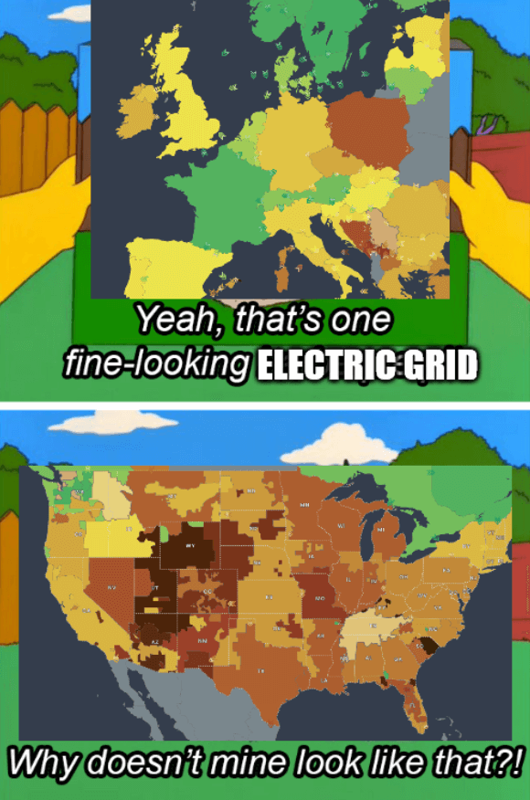
Source - The colors of the grids represent CO2 emissions

The title is a reference to the 2021 Texas power crisis

top 13 comments
sorted by: hot top controversial new old
[-] worldwidewave@lemmy.world 16 points 11 months ago

Did they merge Belarus and Ukraine on this map? Also Poland’s out here trying to be American.

[-] rockerface@lemm.ee 14 points 11 months ago

Belarus was actually always Ukrainian territory, historically...

I mean, if that excuse works for russia, why not us?

[-] Glitterbomb@lemmy.world 4 points 11 months ago

Im still partial to the 1957 borders agreed upon in the board game RISK.

[-] Shiggles@sh.itjust.works 10 points 11 months ago

You can see a faint border - they’re just both gray, I assume for no data like Kaliningrad and Albania.

[-] linkhidalgogato@lemmy.ml 4 points 11 months ago

Poland is actually trying to be Amerikkkam, they are obsessed. They even tried going for the extreme racism.

[-] Cysioland@lemmygrad.ml 3 points 11 months ago

Poland loves her coal

[-] supertrucker@lemmy.ml 5 points 11 months ago

In terms of area, aren't the size of the various American grids roughly the same size as the ones that comprise the individual countries in Europe?

[-] Codeviper828@lemmus.org 2 points 3 months ago

Yes, for a sense of scale, Pennsylvania (rectangular one in the top right) is about the size of England

[-] Krafting@lemmy.world 4 points 11 months ago

So sad that they don't have data for most of africa btw

this post was submitted on 19 Jul 2024
176 points (95.8% liked)

Memes

51520 readers
2013 users here now

Rules:

  1. Be civil and nice.
  2. Try not to excessively repost, as a rule of thumb, wait at least 2 months to do it if you have to.

founded 6 years ago
MODERATORS