195
All you need to know about twitter!
(thelemmy.club)
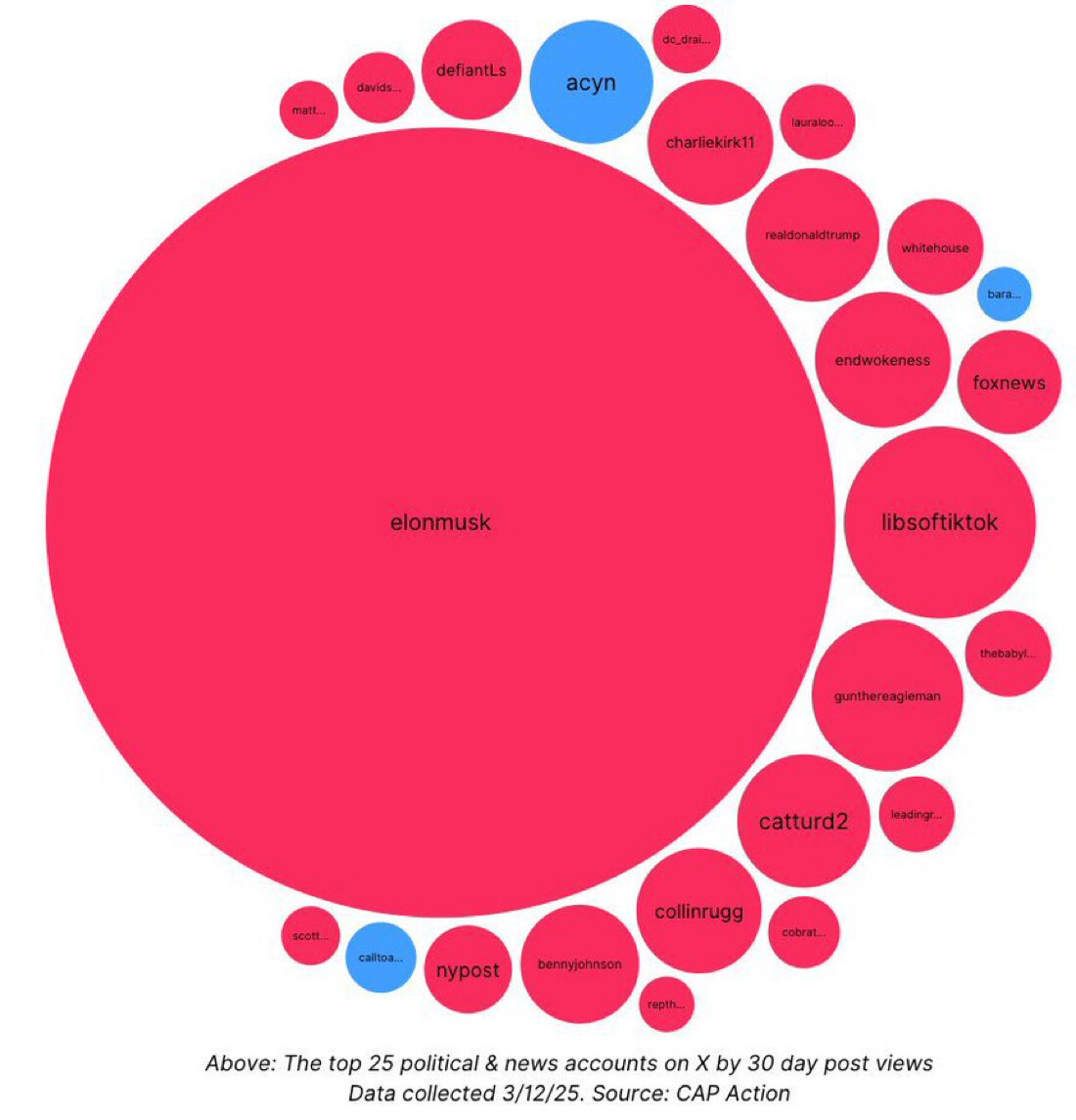
How is a “top” account measured? The obvious answer might be number of followers, but isn’t everyone following Musk by default? Something like total amount of non-bot, non-obligatory influence would be interesting.
But ultimately, who cares, lol. Haven’t signed on to Shxitter in probably 10 years.
Says at the bottom it's by "30 day post views"
And wow, I knew it was bad, but not this bad. Holy shit.
Still, I wonder about the non-bot, non-obligatory follow version of this beautiful data
I was less wowed by the size of the Elon Musk bubble and more wowed/worried by all but 3 of the other bubbles being red. From the ones I know, I'm assuming red means right wing.
Yeah… not exactly beautiful data presentation here if you have to assume something so basic about a visualization.
Oh yeah, so it does!
What a cesspool.
Isn't this to be expected when seemingly all lefties have left the platform?
Alternative title: All 25 accounts that still use Twitter
Wow it’s so egregious, this is a good graphic.
A place to share and discuss visual representations of data: Graphs, charts, maps, etc.
DataIsBeautiful is for visualizations that effectively convey information. Aesthetics are an important part of information visualization, but pretty pictures are not the sole aim of this subreddit.
A place to share and discuss visual representations of data: Graphs, charts, maps, etc.
  A post must be (or contain) a qualifying data visualization.

  Directly link to the original source article of the visualization
    Original source article doesn't mean the original source image. Link to the full page of the source article as a link-type submission.
    If you made the visualization yourself, tag it as [OC]

  [OC] posts must state the data source(s) and tool(s) used in the first top-level comment on their submission.

  DO NOT claim "[OC]" for diagrams that are not yours.

  All diagrams must have at least one computer generated element.

  No reposts of popular posts within 1 month.

  Post titles must describe the data plainly without using sensationalized headlines. Clickbait posts will be removed.

  Posts involving American Politics, or contentious topics in American media, are permissible only on Thursdays (ET).

  Posts involving Personal Data are permissible only on Mondays (ET).
Please read through our FAQ if you are new to posting on DataIsBeautiful. Commenting Rules
Don't be intentionally rude, ever.

Comments should be constructive and related to the visual presented. Special attention is given to root-level comments.

Short comments and low effort replies are automatically removed.

Hate Speech and dogwhistling are not tolerated and will result in an immediate ban.

Personal attacks and rabble-rousing will be removed.

Moderators reserve discretion when issuing bans for inappropriate comments. Bans are also subject to you forfeiting all of your comments in this community.
Originally r/DataisBeautiful