[-] Zeus@lemm.ee 4 points 8 months ago

i doubt it, i don't see why an icon pack would have a systemd service. probably something to do with moonlight [nvidia]

still, thank you for introducing me to a new* icon pack

[-] Zeus@lemm.ee 3 points 1 year ago* (last edited 1 year ago)

jpegxl actually has pretty good support - affinity, photoshop, gimp, krita, etc. all support it fine

it's only chrome/electron that's holding it back (even firefox supported it until chrome dropped support). i don't think it's lazyness

i have no love for gif (hence i use apng), but all the other alternatives are either videos so show controls by default, not widely supported, or webp. i realise webp is objectively the better format for most things, but i still argue it's existence is a net negative effect

webp may be open (although actually i'd argue it isn't, the licences for the decoder and the format itself are both very woolly), but as it's actively contributing to enshittification by holding back truly open formats i'd say that doesn't really matter

[-] Zeus@lemm.ee 3 points 1 year ago* (last edited 1 year ago)

now whilst i know why people like webp, maybe we could stop using formats owned by google..

until jpegxl becomes viable (which it mainly isn't because it compete[s/d] with webp), lets stick to nice formats not owned by tech giants, like apng^?^

[-] Zeus@lemm.ee 3 points 1 year ago* (last edited 1 year ago)

i don't think that's necessarily falling for it, it's appreciating it for what it is. i personally don't see the nothing as equivalent to oneplus[^1], but if it was the modern equivalent to the op1 or op3 i think it'd be worth getting. i have no brand loyalty to 1+ (i doubt i'll ever buy another 1+ phone) but damn if the op1 wasn't the best value for money phone i ever bought.

[^1]: the only similarity is the "close-to-stock" rom as far as i can see, and oneplus didn't even do that until all the issues with cyanogen

[-] Zeus@lemm.ee 3 points 1 year ago

it glides as softly as a cloud!

[-] Zeus@lemm.ee 3 points 1 year ago* (last edited 1 year ago)

i think they are the original source, after a bit of a skim of 00s russian magazines

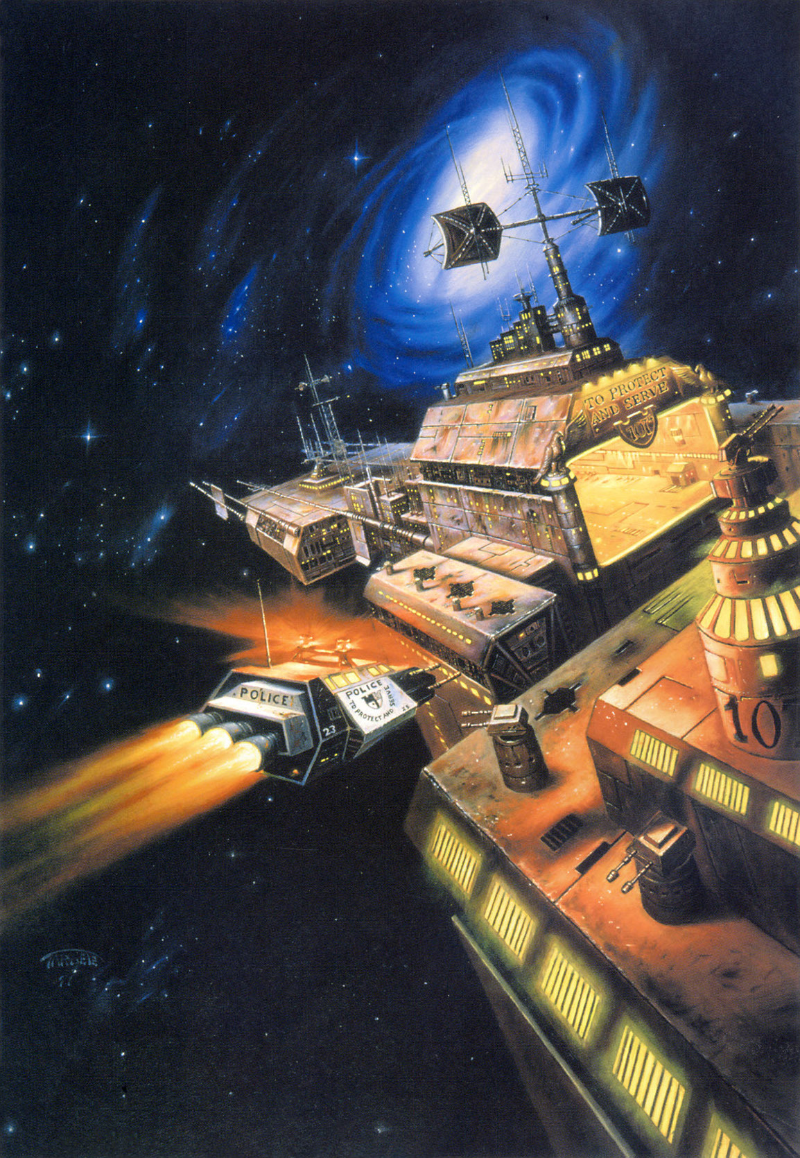
that page says "for the magazine 'populjarnaja mechanika'", and credits dmitri choybolsan (Дмитрий Чойболсан). it's not on the linked portfolio page, but it kind of matches his style(-ish) and it was used for the cover of 2008/№ 11:

now i can't find anywhere to read it to see cover credits, but i'm inclined to believe it

(are you just trying to see what you can get away with credit-wise, by the way?)

[-] Zeus@lemm.ee 4 points 1 year ago* (last edited 1 year ago)

yeah you're right, but i'm not (just) being funny when i said that - lemmy.world had only just started when i joined (10 days), still had the old (much nicer) icon and no banner, etc. it had 188 users / month, compared to .ml's (at the time) 1.8k and lemm.ee's (current, according to the above infographic) 3.7k...

actually this is incredible how fast it grew

1
submitted 1 year ago by Zeus@lemm.ee to c/gameart@sopuli.xyz

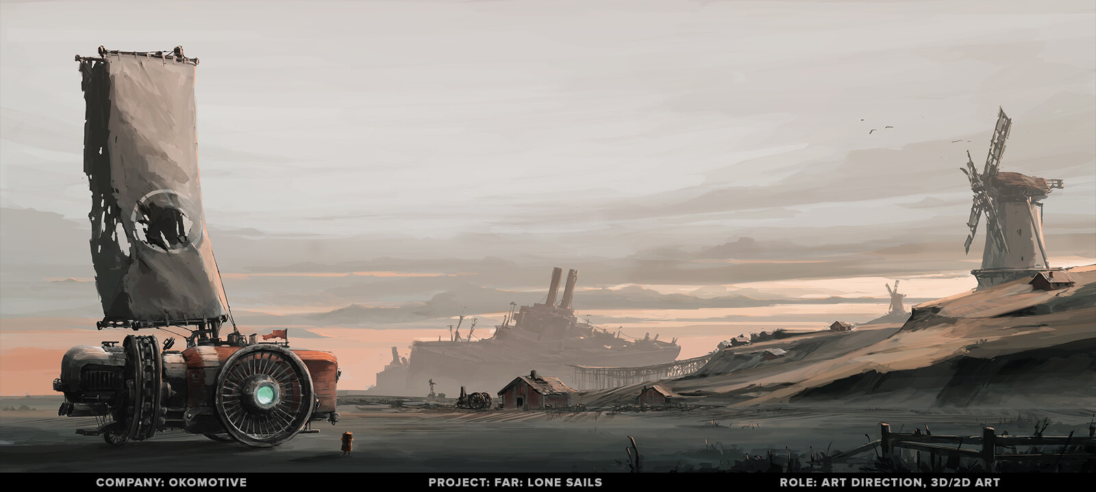
image 1: artstation site || artstation page

image 2: artstation site || artstation page

image 3: website (the website is slightly broken, alternative link)

12

image 1: artstation site || artstation page

image 2: artstation site || artstation page

image 3: website (the website is slightly broken, alternative link)

8
submitted 1 year ago by Zeus@lemm.ee to c/imaginaryportals@lemm.ee

Concept for the Vex Warp Gate at the end of the Gate Lord mission.

artstation site || artstation page || blogspot

3
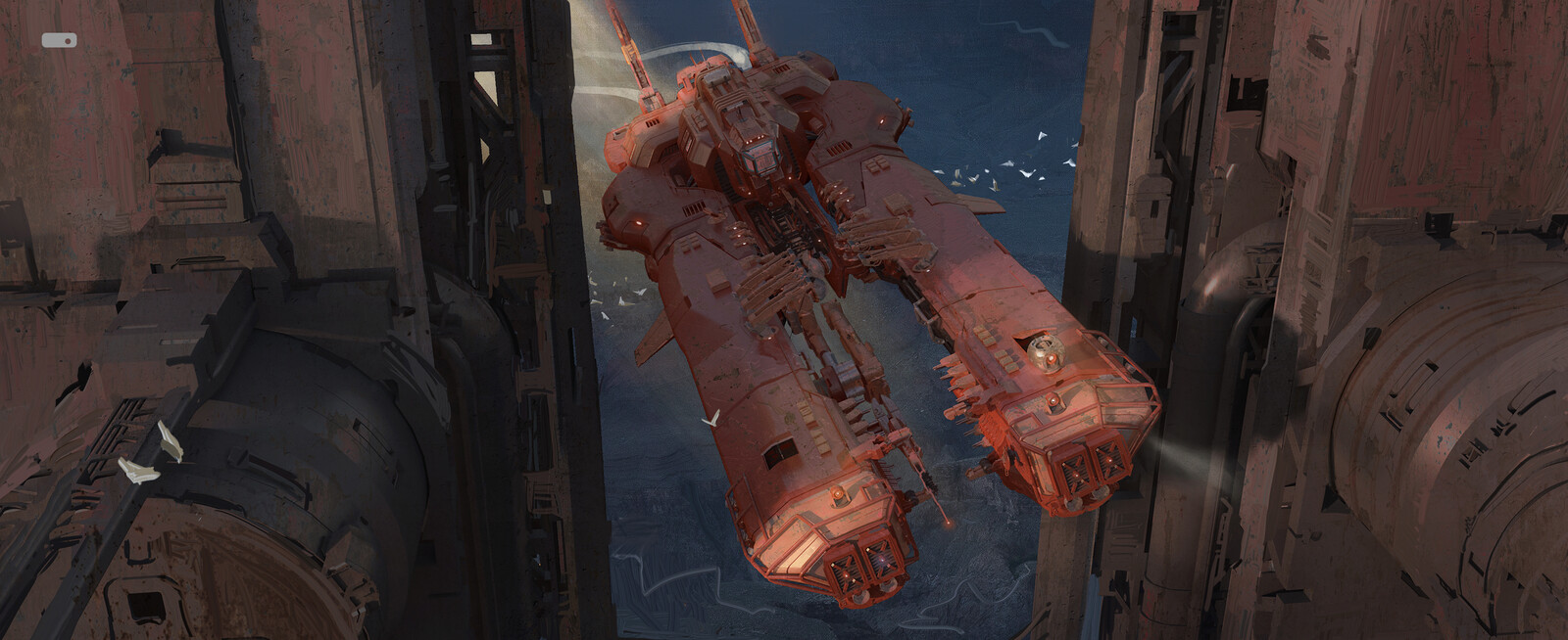
submitted 1 year ago* (last edited 1 year ago) by Zeus@lemm.ee to c/imaginarystarships@lemmy.world

the title is conjecture - it was used for the cover of star precinct (isfdb/sfe)

source

artist's website || artstation

2
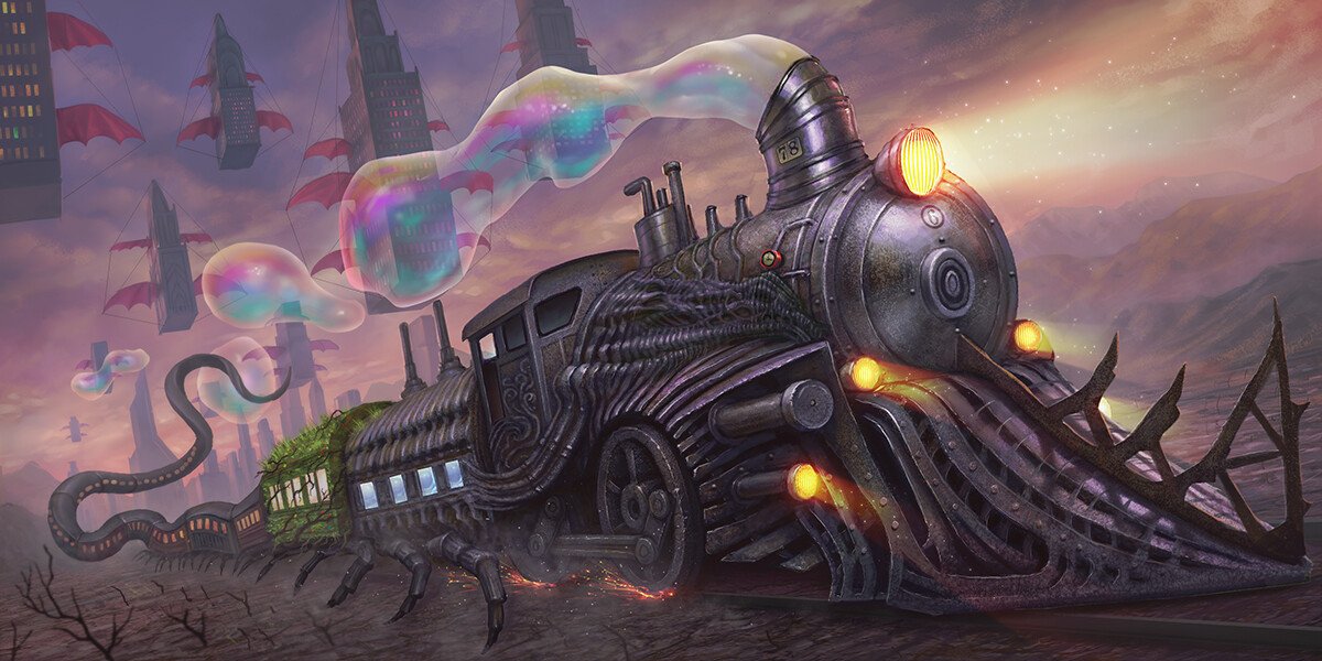
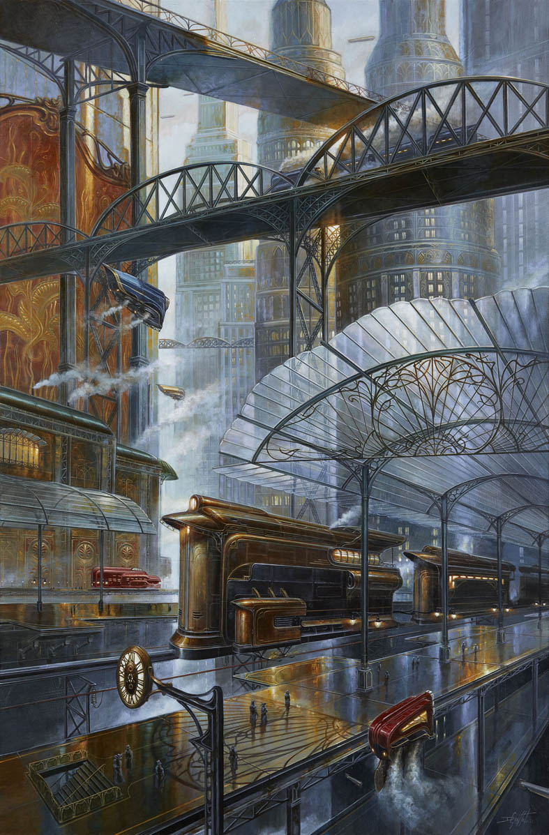
"Train" by Martin de Diego (cdnb.artstation.com)
submitted 1 year ago by Zeus@lemm.ee to c/imaginarytrains@lemm.ee

what an imaginative title...

2018 illustration for “Invisible sun” RPG board game.

artstation site || artstation page

there's also a version with smoke instead of bubbles:

31
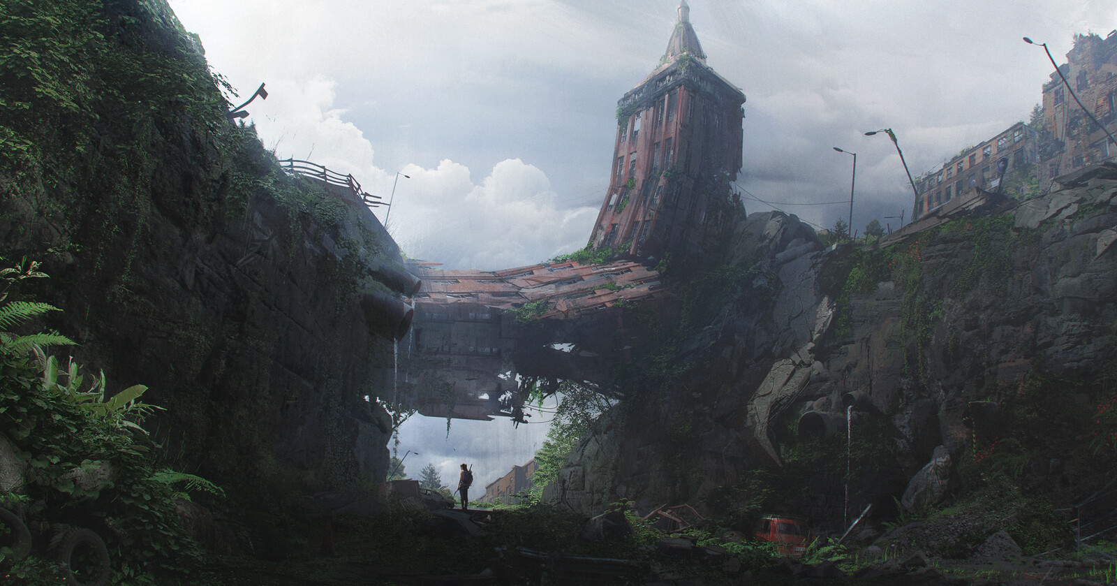
"NEW BRIDGE" by Pablo Dominguez (cdnb.artstation.com)
3
submitted 1 year ago by Zeus@lemm.ee to c/imaginarytrains@lemm.ee
1
"Coming through" by mark zhang (cdna.artstation.com)
10
"desert finding" by mark zhang (cdna.artstation.com)
12
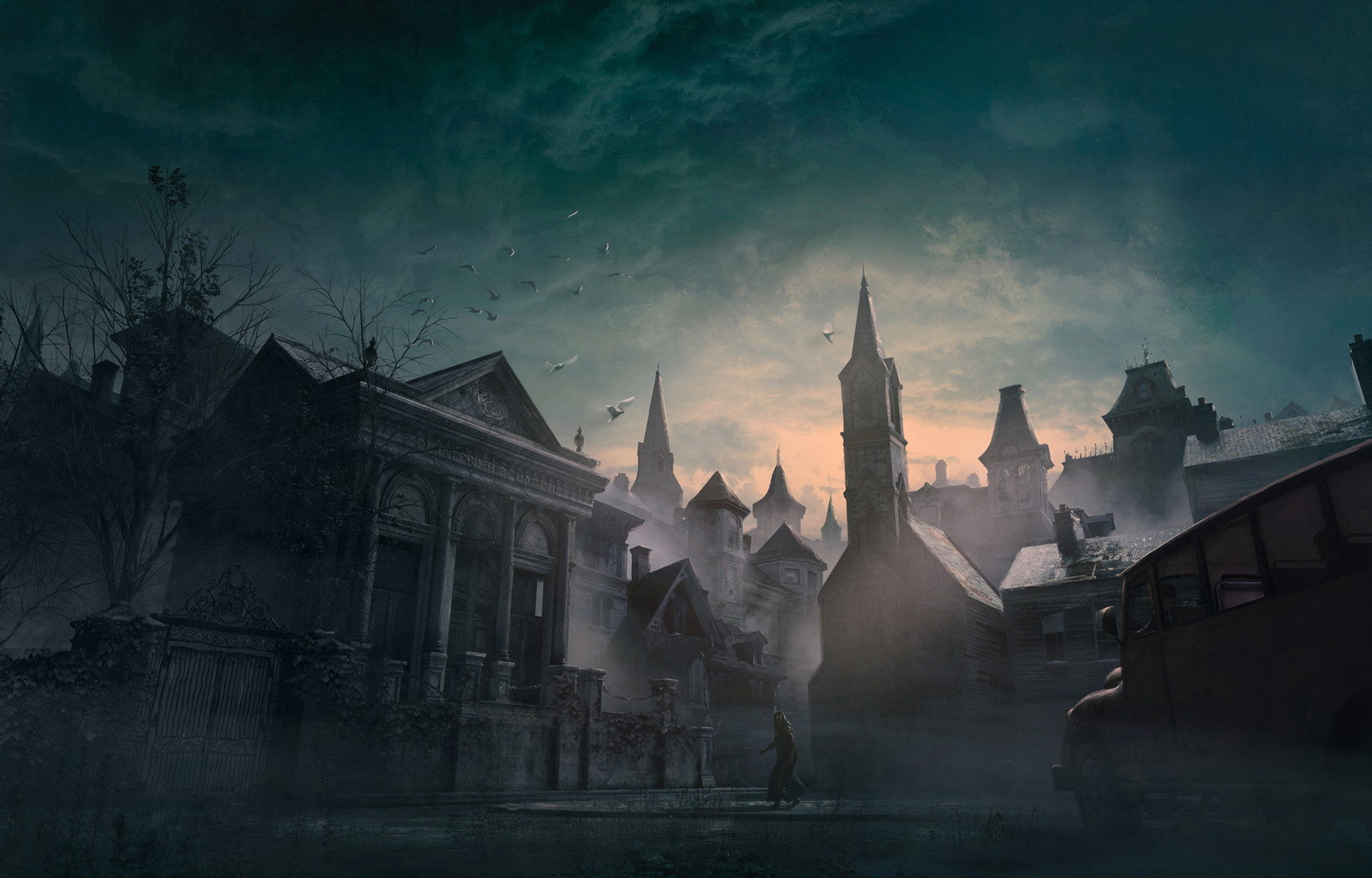
submitted 1 year ago* (last edited 1 year ago) by Zeus@lemm.ee to c/imaginarydegradation@lemm.ee

website || artstation page

Shadow over Innsmouth illustartion.

57
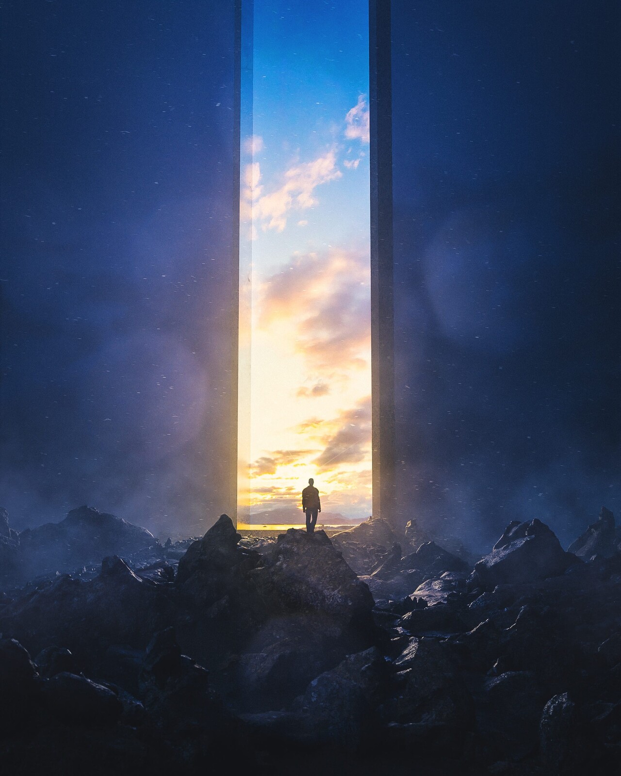
"ESCAPING REALITY" by Max Hay (cdna.artstation.com)
submitted 1 year ago by Zeus@lemm.ee to c/imaginaryportals@lemm.ee
6
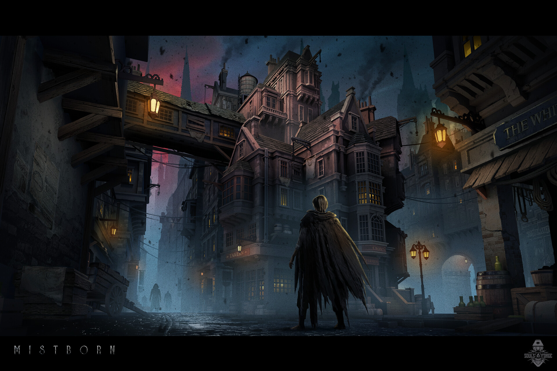
submitted 1 year ago* (last edited 1 year ago) by Zeus@lemm.ee to c/imaginarydegradation@lemm.ee

concept art for a great-looking mistborn game, but i think it may unfortunately have been quietly cancelled as there's been no word since 2021 and the website is down

it's a different image to the other posts, but it's from the same artstation project so i'm cross-posting it for transparency

cross-posted from: https://sffa.community/post/58266

cross-posted from: https://sffa.community/post/15176

Source

[-] Zeus@lemm.ee 3 points 1 year ago* (last edited 1 year ago)

(Edit: actually, I think it may be do BOTH of those things now that I read my conversation with the dev again)

yeah, the thread was hard to follow due to people talking about different concepts without realising. i feel like that would need to be clarified before implementing one (or both[^hopefully not])

Stage 1: Tagging and Presets (Community and Instance, no User defined Tags allowed)

Stage 2 (not sure if I’ll do that): Filtering, Cosmetics? (Border, Text Color)

yeah this seems fine (although cosmetics seems like a late stage issue to me, but meh)

I think backend wise not worrying about that is fine for now, the separation of tags per community can be achieved by filtering tag AND community ID in the filter, which could just be hidden from the user or displayed, there’s a separate discussion to be had about the filter features. Point is not separating these tags per community shouldn’t limit their filterability because community id’s already exist. Plus by not splitting them up in the backend general tags can be used across instances a lot more easily.

Subscribing to tags in a community could then work similar to that filter, again the issue would be how to make the UI bearable but backend wise should be no problem to implement.

i'm not surprised, that makes sense. as an aside: there are community id's? like, uuid's? or does he mean just comm@instan.ce which is, i guess, an id?

For the stage 3 to be implemented (if anyone decides to implement this AT ALL) we will need to wait for weeks at best and months at worst. Now this makes it hard for me to decide how to proceed with my communities because the path of the tag system is not yet clear and I need to decide NOW which communities should be separate and which should become more general.

in my (irrelevant) opinion, separate communities are better. it's a paradigm that everyone knows, rather than some nebulous proposal that 1) may not be implemented 2) may be lacking features (rss etc.) 3) will almost certainly be more complex to use. also you could merge them at a later date and add links to the archived versions in the sidebar. not really optimal, but it is a solution

adding them all together won't prevent spam (although i guess it would make it easier for people to block..). there will be the same volume of posts, just all in one place. i have been trying to avoid flooding local though. i have a whole folder of art to add to these subs. although to be honest, i've no sympathy with the op. browse subscribed if you don't want to see irrelevant posts. if you browse all, be prepared to see posts you have no interest in

Edit: I talked with the dev, it will take months to reach stage 3. And I realised just now that not all content on c/imaginaryaviation will be vehicles which means that I will need to a create a new sub called c/imaginarylocomotion to be able to fully capture both of the subs.

ah yes, convoluted and intermingled subs. fun

[-] Zeus@lemm.ee 3 points 1 year ago

how odd. firefox does tend to play better with gtk desktops though, unfortunately

[-] Zeus@lemm.ee 3 points 1 year ago

you mean this tickbox?
"always ask where to save files" tickbox on firefox

that's weird, i just tested and it works for me (debian, kde 5.27.5, ffx v113)

[-] Zeus@lemm.ee 4 points 1 year ago

my dude, i haven't booted into windows in ages. but that proves my exact point: it might save one time if ones workflow involves a lot of tasks that can be scripted. if ones workflow is "launch photoshop; browse the web for inspiration; draw for a bit; close photoshop.", it won't save any time. especially due to the hassle of getting photoshop working, or learning a new app like gimp or krita.

[-] Zeus@lemm.ee 3 points 1 year ago

depends how much you value your time. if you've nothing to do or just like fucking about with your os in your spare time then sure, linux is free. if you're, say, a freelance graphic designer and actively losing money whilst trying to learn the foibles of a new os, and just fixing the bullshit that win & mac do by default; then it's decidedly not

view more: ‹ prev next ›

Zeus

joined 1 year ago
MODERATOR OF