Well many of these games did look better in CRT monitors: https://www.tumblr.com/crtpixels/700962490988773376/damn-uhhhhhh-this-one-really-did-some-numbers-huh
What an awesome set of examples. Thanks for sharing.
Great resource and explains so much with pretty solid examples. Thanks for sharing! I used to PC game on my Dell (Sony), flat CRT for years, and then an IBM Trinitron too until I moved to a pure laptop for a bit (17" Vostro) and eventually on to LCD.
Until 2013 I used to play Wii on a 36" Philips CRT, even though the other room had a larger plasma.
Here is how I was set up back then.
Now that we have 4k HDR displays, tools are starting to popup to accurately emulate the CRT look and feel. 1080p wasn't enough to catch all the subtle details, but we are finally there. Kinda cool to see the age of CRT never fully died.
I wonder if there's a way to emulate the old CRT displays. My brother built an arcade cabinet, but it's got a modern monitor in it so the graphics don't quite look right.
There are some very convincing shaders that work really well to emulate the look. I sold my consoles long ago and may have a faulty memory but the right shader looks just like I remember.
OLED is as close as you can get for response times and color depth. It lacks some subtle glow and blending that you get with CRTS
There are some hardware scalers that work really well. But most that offer good compatibility with a wide range of older consoles cost about as much as a complete high end pc to run an emulator on.
I find myself unfocusing my eyes all the times when drawing to check if the shading looks the way I want it to.
Does that help?
It does for the things I draw ¯\_(ツ)_/¯
Get a crt tv. The graphics still suck but they are better and much more nostalgic
I just hated the gray area of gaming hardware where it still should have just been pixel style art, but they tried making it look realistic.
So many PS1-era games look so bad it hurts the experience. While SNES games like Link to the Past and Chrono Trigger look great even today.
Even without the hardware limitations, there was so much jank to PS1 games. Like we had an idea of what a 3D game could be, but we were no where near where we are today. Controls are all over the place. It was the wild west. Alien Resurrection was the first time we had left stick to move and right stick to look, and it felt bizarre at the time. It's probably the only FPS from the era that's still playable.
ALttP and Chrono Trigger are some of the best designed, highly polished titles on the system, though. We have to remember that while everyone harps on FF4 and FF6, Chrono Trigger, Super Metroid, Mega Man X, A Link To the Past, Bahumut Lagoon, Donkey Kong Country, etc. as if they defined the quality of the SNES library, we're looking back through nostalgia tinted goggles and those games in fact... didn't. They were the exceptional outliers in, as ever, a wide field of mediocrity.
What I'm saying is, there are a lot of gonk-ass games on the SNES. A lot. We just selectively don't remember them anymore because they were crap.
For every one of the gems above there were ten or twenty of the likes of Pugley's Scavenger Hunt, Cliffhanger, Pit Fighter, Mario is Missing, Revolution X, Bebe's Kids, Rise of the Robots, Captain Novolin, Double Dragon 5, Ren and Stimpy, Chester Cheetah... Bill Laimbeer's Combat Basketball... etc., etc. And that's just the North American titles. There was some wonky niche shit released in Japan that could have just as well been on the original NES.
No one is talking about how good the games are, here. Just how they looked. Mario is Missing was a shit game, but the graphics and art style still look absolutely fine and dandy to play. Same for Ren & Stimpy and any of the other games on your list I recognize. The games were bad, but not the looks. Hence why people absolutely love a pixel art fame like Stardew Valley or Terraria but no one is playing games that look like WWF Smackdown! For PS1.
You're telling me that the likes of Pit Fighter...
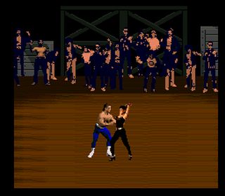
...And Revolution X...

...Or Pugsley's Scavenger Hunt...
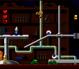
...Or Bill Laimbeer's Combat Basketball...

Deserve to be held up visually and remembered fondly next to the likes of Chrono Trigger? They really aged better than the best of the early PS1? Yeah. No. These games not only played like ass, they looked like ass, too. Even for their time. That's my point. The ones that weren't outright offensive were just plain old bland.
The operative word in pixel art is "art." Just because something is 2D does not mean it automatically needs to be revered to the exclusion of earlier or later titles or visual styles. What we got out of these games visually is a direct result of what was put in by the designers, and in the majority of cases what was put in was not very much.
Mario Is Missing is an exceptional case because it manages to have worse spritework than Mario World, a game which it directly ripped off for its sprites. And any sprites did did not directly copy (minus a couple of pallete colors, for some reason) wound up looking like these chumps:
![]()
Edit: I forgot Captain Novolin. Really, how could I? I mean, this.
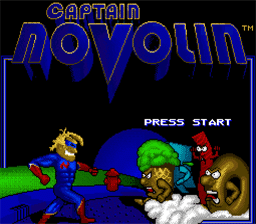
Come on.
They're saying that a lot of the contemporary cutting edge 3D graphics of the PS1 era looked ugly. But they did it to be cutting edge.
However, if they'd stuck to more traditional art styles (e.g, as could be seen in games like Chrono Trigger), then the games could've still looked good today.
They're not saying all SNES games look better than all PS1 games. They're saying that we had the capability to make games that still look good today, and we had that capability for years before the PS1 came out. They chose not to use that capability to be cutting edge. And the other commenters are lamenting that.
Of course, I can't blame them for pushing 3D graphics back then. Especially because they would've needed to practice with them before they could get better. Late PS1 games had some decent looking 3D, IIRC.
Yep.
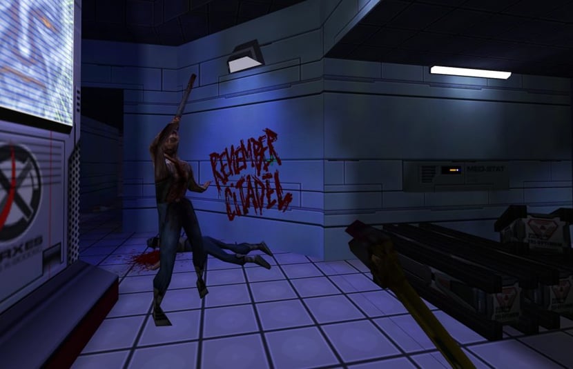
Our young minds could barely handle those dozens of terrifying polygons!
This is why you use emulation to enhance it, then it becomes the game that was in your mind, also crt shaders.
I just saw a video of someone playing the original Final Fantasy VII via emulation with “4K” rendering of the character models and such, but seeing them juxtaposed against the original backgrounds didn’t look right and made my brain upset. In cases like this, I think it’s possible to have too much enhancement, and our brains are happier filling in the missing detail.
AI upscaled backgrounds have been done for 7, give it a try
Bro @ThePicardManeuver is revisiting his childhood
That's why I play 2D games. They used to look even better than now (because of CRT).
I feel similar going back to the PS3/Xbox 360 era when so many games had that piss/shit filter. Ex. Grand Theft Auto 4 and Resident Evil 5
Star Wars Episode 1: The Phantom Menace comes to mind
For a counter-example, DragonHeart is unironically solid CGI that still kinda' holds up.
Sure, the task was very different, but George brought those challenges on himself.
This reminds me of the last time I watched the film Event Horizon. The CG scenes look SOOOO BAD! It's been one of my favorite horror movies since I first saw it as a teenager in the late 90s, and I still love it, but I had no memory of that shitty fake looking cg lol Thankfully that's not a huge part of the movie
Modern games with simplified graphics have a similar phenomena. Battlebit is a good example, after awhile your brain stops noticing the blocky models.
Stylized art is so much longer lasting than attempts to be cutting edge. It's the reason why Windwaker looks better now than the other Zelda games of its era.
Same with something like Cruelty Squad. Feels like an assault on your eyes at first but it's amazing how quick you can get used to it making it feel "normal".
Might and magic III
F-19
Thief
That new Chinese AI is hitting different!
Gaming
!gaming is a community for gaming noobs through gaming aficionados. Unlike !games, we don’t take ourselves quite as serious. Shitposts and memes are welcome.
Our Rules:
1. Keep it civil.
Attack the argument, not the person. No racism/sexism/bigotry. Good faith argumentation only.
2. No sexism, racism, homophobia, transphobia or any other flavor of bigotry.
I should not need to explain this one.
3. No bots, spam or self-promotion.
Only approved bots, which follow the guidelines for bots set by the instance, are allowed.
4. Try not to repost anything posted within the past month.
Beyond that, go for it. Not everyone is on every site all the time.
Logo uses joystick by liftarn
