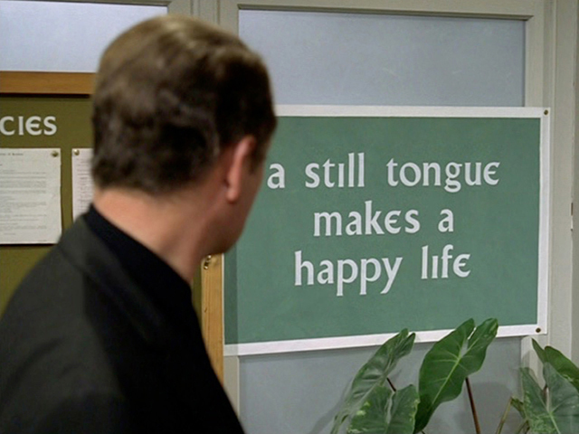
I think it's the serif font, more than the lack of capitalization, that weirds me out.
Imagine if it was a handwriting font? “Live, Laugh, Stop”
stop...
🎀𝓢𝓽𝓸𝓹🎀
The only stop sign where rolling through real slow is probably fine
Legally speaking, it's not DOT compliant and unenforceable. So you don't have to stop at all. And if you want to, you can actually file a complaint and have it taken down. Traffic control signs must be approved and provided by the city/county.
Anecdotal: I filed a complaint when neighbors erected a speed limit sign in our neighborhood and put a camera on it. They were told to take it down or it will be forcefully removed and they'll be fined for the time and labor involved. It was removed about two weeks later.
How do you presume to know what legal jurisdiction this sign is in?
~no,~ ~stop~
I think this is a Chik-Fil-A parking lot stop sign—the branding is spot on.
EDIT: Actually, I think I recognize the surroundings, too. This is the Chick-Fil-A off Hobbs Rd in Huntsville, Alabama: https://maps.app.goo.gl/fod76mqmB7sNhEqE7
Sync immunity.
Hail jdawson
You did good, PipedLinkBot just did better.
Why did PipedLinkBot think Google Maps was a YouTube video?
Here is an alternative Piped link(s):
https://maps.app.goo.gl/fod76mqmB7sNhEqE7
Piped is a privacy-respecting open-source alternative frontend to YouTube.
I'm open-source; check me out at GitHub.
Sovereign Citizens will have a field day with this.
SovCits have field days with pretty much any rule they don’t like. They’re prime examples of why we need to be removing warning labels on everything; they’re an end result of far too little chlorine in the gene pool.
Not only lowercase, but serifed as well.
I read something about this recently but I can’t remember where or find the article at the moment.
These are sometimes installed at high-risk intersections. At these locations, it is thought that people become accustomed to seeing ordinary stop signs, fail to notice them, and fail to stop.
The idea is that drivers unconsciously notice something is different and so these signs gain attention, hopefully restoring the original purpose of the sign.
This upsets me.
submissive ass sign
Those ones are optional
stahp.
Aren't signs like these out up by a private entity, like an HOA? I think the law is that a public and legally enforceable sign is all caps and these are legally distinct enough that they can't be confused for public signs (hence the lack of capitalization) but still communicate the intent.
These signs are also unenforceable so you're free to disrespect them if that's how you feel.
Iirc they're still treated as stop signs by insurance companies in the event of an accident
"or whatevs" written in tiny font underneath, indistinguishable by passing drivers - as designed.
Some say it wasn't a good idea to make Becky (age 16) a city planner, but she sure is capable.
Stop….. you know… if you want to and stuff.
Cursed serif.
that's the future liberals want for our country
I love it.
Self driving cars gonna have trouble with that one
reminds me of signs in The Village from The Prisoner

That looks like a beautiful modernised gaelic typeface.
I hate it.
stop
stop
I think this sometimes happens on private property. Not sure though.
Mildly Interesting
This is for strictly mildly interesting material. If it's too interesting, it doesn't belong. If it's not interesting, it doesn't belong.
This is obviously an objective criteria, so the mods are always right. Or maybe mildly right? Ahh.. what do we know?
Just post some stuff and don't spam.

