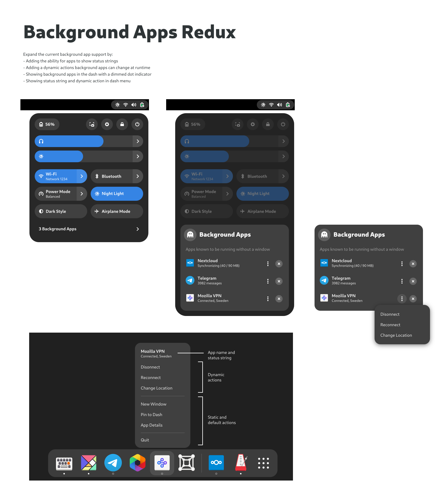
This is exactly what it needed to be from the start!
and looks like indicators with extra steps.
lets just hope it can actually work as a propay tray this time.
Isn't this pretty much a systray design mockup now?
well yeah thats how gnome shell will enhance their background apps section in the corner menu. Currently all you can do is summon the application from the background into focus. This implementation will hopefully replace the need for https://extensions.gnome.org/extension/615/appindicator-support/
I don't believe so. With appindicator you're 1 click away from the apps menu. With this solution you're 3 clicks away
Appindictator is an extension. There'll likely be an extension which adds them to the top bar.
This implementation of background apps seems to pretty close to current systray implementations, so I hope those others will finally be replaced.
Tho it only works with Flatpak or apps that use portals. It'll not replace appindicator soon
This is the most annoying thing imo. I like the new proposal… but I want to know all my apps that are in the background. I won’t without other extensions still. I just want things to just work lol.
What's the benefit in replacing one extension with another in order to achieve the same thing? Real progress would be an option in the default Gnome shell to show the background apps directly in the top bar without any additional clicks.
I don't think so. The extension adds support for systrays in an unsafe manner, and after years of that not existing in GNOME (unsafety being a reason), why should it change after some design mockups?
What I could see happening is that now some devs start discussing a new systray API and in the end that would be implemented natively. Hopefully not hidden behind 3 clicks tho lol
I don't disagree that the systray is a UX nightmare, but what do you mean by "unsafe"?
Okay so apparently I partially misunderstood and not all current systray implementations are unsafe. Some are, but the biggest reason is that it's all a mess, pretty well explained in this reddit comment: https://www.reddit.com/r/gnome/comments/172wftq/why_no_system_tray_by_default/k3zg58t/
Basically, the current implementation is old and insecure in many ways. Gnome isn't completely against the idea (they even have mockups for how it would look like) and there are discussions about creating a better framework for it, but progress is slow.
Here are a few links about it: * https://blog.tingping.se/2019/09/07/how-to-design-a-modern-status-icon.html * https://pagure.io/fedora-workstation/issue/264
PS: For exiting apps like Steam, if you're using them as Flatpaks, you can set them to not be able to run in the background to begin with and to exit when you close the window. That can be done either with the command line or with the Flatseal, a usefull app to manage Flatpak "permission".
It just works with portals, tho
However, yes, it's pretty much systray. What I don't understand is why don't show icons on the top bar
Yes it's a system tray with extra steps. It's taken 15 years for GNOME developers to still not understand this. I think they're are trolling us.
The 3k unread telegram messages are making me uneasy
Gnome
The GNOME Project is a free and open source desktop and computing platform for open platforms like Linux that strives to be an easy and elegant way to use your computer. GNOME software is developed openly and ethically by both individual contributors and corporate partners, and is distributed under the GNU General Public License.
