1
26
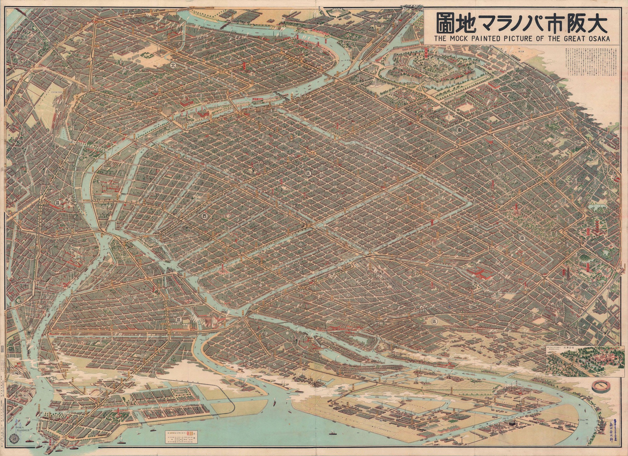
Map of Osaka, Japan, 1920s
(media.piefed.social)
Map showing frequency of red hair across Europe. Five color-coded ranges: red (over 10%) concentrated in Ireland and Scotland, orange (5-9%) in parts of UK and northern Europe, brown (2-4%) in Scandinavia and Germany, darker brown (1-2%) in central Europe, and darkest brown (under 1%) in southern Europe. Shows clear north-south gradient with highest concentrations in Celtic regions.

cross-posted from: https://startrek.website/post/37179551
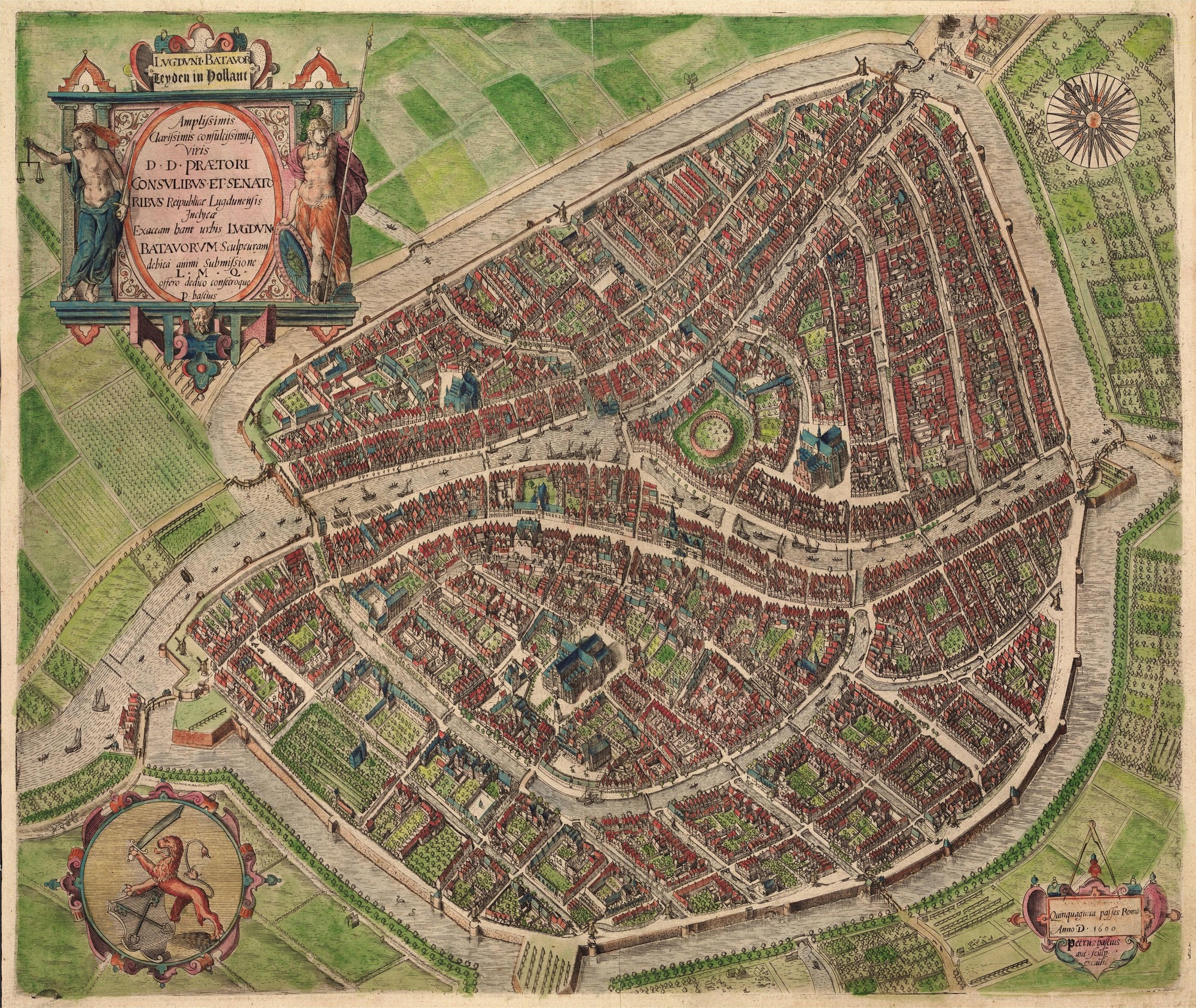
Map Lie

For the map enthused!
Rules:
post relevant content: interesting, informative, and/or pretty maps
be nice


