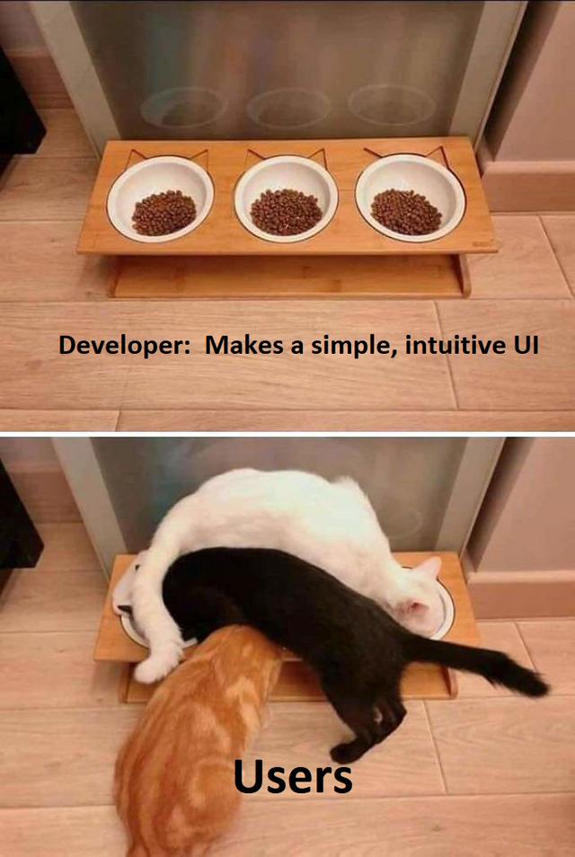
I do QA for a living. If that's the end result, it wasn't intuitive. 😅
"The only intuitive interface is the nipple. After that, it's all learned." — traditional 20th-century folk wisdom.
Some babies have to be taught to nurse...
I'm pretty sure that won't stand in the way of somebody inventing a square bottle nipple and blaming the users for not using it properly.
I agree to a point, but users also do some weird stuff that you just can't predict sometimes.
And that's precisely why QA still exists and why it shouldn't be the devs. And yet, you'll still wind up with weird situations, despite your best efforts!
Yeah.
Any good software developer is going to account for and even test all the weird situations they can think of ... and not the ones they cannot think of as they're not even aware of those as a possibility (if they were they would account for and test them).
Which is why you want somebody with a different mindset to independently come up with their own situations.
It's not a value judgment on the quality of the developer, it's just accounting for, at a software development process level, the fact that humans are not all knowing, not even devs ;)
And some of that is because some users have been trained on some other bad UX.
and this is an incredibly valuable reason to have a technically simple UI, because it fundamentally limits the amount of stupid shit people can do, without it being the fault of the designer.
If they tried opening the door the wrong way, the door is wrong.
This is very perfectionist. Let me install my doors the way it's comfortable or pleasing. Where I see a knob I'll reach. And where I see a "pull" sign I pull, or get contex clues.
There is research for everything, let's say it's more comfortable to push and the knob is on the right side for me. I could spend way more time and effort than thia desrves to apeal to that study, "I have great UX", I'd tell myself. But then I'd show this product on some eastern market where they read in "reverse" and it'll not be comfortable nor "100% natural" for them. Meaning, I'd fail, my UX'd be horrible for half the planet.
This might be worth for universal things, that are already researched and you don't need to spend years and a kidney to figure out. Like maybe how are "next", "cancel" and "back" buttons are next to each other. But I mean.. just copy the most recent you used.
You might have noticed at some point that for knobs are universally at the same height and same for light switches in houses that don't suck.
there's a difference between trying to open a door from the hinged side, vs designing a door that has 14 different deadbolts, and three latches on it.
One of those is user error, the other is designed complexity generally being a hindrance to the user.
Maybe you need better signage. Maybe you need to reverse the direction of the door. Maybe you could automate the door. Or maybe the user is just fucking stupid. 😄
The philosophy is that the user's intuition is never wrong because that's what we're trying to accommodate.
Also, if you have to post a sign, it's probably broken by design. Users don't read.
To be fair all "users" got what they wanted so... Success?
"Ugh, it works, but it was overly complicated to get what I needed."
yeah who the fuck made this meme? A web programmer?
actually, i would like to counter this. Developers often times put together shitty UIs that are hard to navigate (mostly because UI design is bad and we've been living with floating WMs for the past 30 years so nobody knows any fucking better for some godforsaken reason)
But it's no fault of the user for using a shitty interface if it was designed to be used in that manner, by the person who built it. This is why so many people like CLI, it's impossible to fuck up. You can use it wrong as a user, but that's because it has specific syntaxing. It's designed to only be used in that one manner, where as most graphical applications are designed to be "generally applicable" for some reason, and then when a user uses it in a "generally applicable" manner, somehow that's now the wrong way to use it?
People screw up CLI's all the time (looking at you Google Cloud). They (used to) insist on using my installed python which automatically upgrades and breaks the CLI. Good job python. Good job Gcloud.
i'm not sure that's a CLI problem, sounds more like an application problem from what i'm hearing.
I'd argue floating wms are more intuitive and some can still tile pretty well if you want that
floating WMs are intuitive, but the problem is that they're an incredibly mediocre solution, and the way that problems are often solved around one, is just entirely asinine. Let's build ten different ways to do the same thing, now we have 10x the code to build and maintain, and it's 10x more confusing to the end user who probably won't know about half of them, because 90% of our documentation is redundant!
Tiling WMs have significantly less issues with this, because they often have a very strict set of management rules, and only those. Nothing more.
I've actually worked with a genuine UX/UI designer (not a mere Graphics Designer but their version of a Senior Developer-Designer/Technical-Architect).
Lets just say most developers aren't at all good at user interface design.
I would even go as far as saying most Graphics Designers aren't all that good at user interface design.
Certain that explains a lot the shit user interface design out there, same as the "quality" of most common Frameworks and Libraries out there (such as from the likes of Google) can be explained by them not actually having people with real world Technical Architect level or even Senior Designer-Developer experience overseeing the design of Frameworks and Libraries for 3rd party use.
Im a developer and I should not be allowed to wing it with UI/UX design.
Yes you should. I think most comments here are about products that have millions of users where it's actually worthwhile spending all that extra time and money to perfect things.
For most development, it isn't worthwhile and the best approach is to wing it, then return later to iterate, if need be.
The same goes for most craftsmanship, carpentry in particular. A great carpenter knows that no-one will see the details inside the walls or what's up on the attic. Only spend the extra time where it actually matters.
It triggers me immensely when people say "I could have made a better job than that" about construction work. Sure maybe with twice the budget and thrice the time.
Exactly. I'd also like to add, look at Google stuff their ui / ux is routinely horseshit. So don't tell me there are ui/ux gurus out there GIGAchading user interfaces.
A lot of this shit is trial and error and even then they still fuck it up.
Make it accessible, make it legible and then fine tune it after.
Does anyone have the template for this meme?
Damn every day it gets worse to find images u can embed... Tried more than 10 before, half is gone, other half redirects to site/post... Anyway here's one without the text:

Thanks a lot!
I ain't no programmer, but I was a toolmaker and ME that designed machines to be used in factories. I learned to not be surprised at how operators could find new and interesting ways, (sometimes dangerous), run the machines I designed and built. They did things I never would have dreamed possible or meant with them.
This triggers me to my very core.
I have one you should love. And by that I mean hate.
Over a decade ago I was installing some equipment I designed, training the operators, etc. There were electrical and software components to the system, and it was used to test products coming out of final assembly.
The very first thing that happened was the operator taking the stapled-together stack of detailed instructions I gave them, dropping it on the work bench, and using it as a mouse pad to start aimlessly clicking around.

Ah yes, the cable kitties. First the orange one approached the food from the front, and all was well and simple if a little diagonal. Then the white one approached from the left. Now it could have gone around and kept things tidy, but that's not how cable kitties work. It walked right over the orange cable kitty's head and started eating. Then when the black cable kitty came from the right, there was only one food socket left. Now this cable kitty could have gone around, but cable kitties always take the shortest path. Up and over the black cable kitty went, and thus the tangle of cable kitties was complete.
Programmer Humor
Post funny things about programming here! (Or just rant about your favourite programming language.)
Rules:
- Posts must be relevant to programming, programmers, or computer science.
- No NSFW content.
- Jokes must be in good taste. No hate speech, bigotry, etc.
