source: https://en.wikipedia.org/wiki/List_of_countries_by_total_health_expenditure_by_type_of_financing
image alt text:
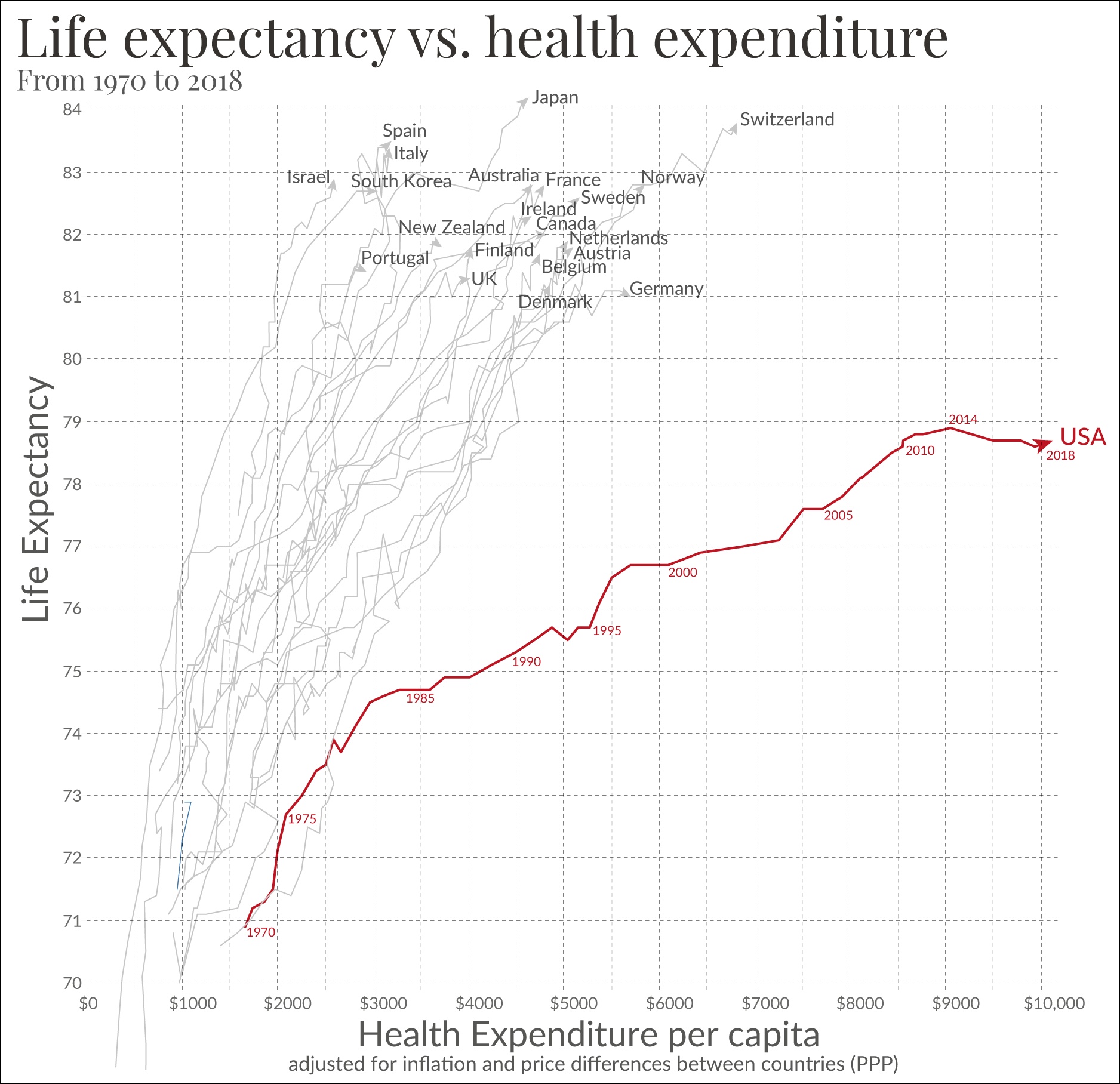
A graph plots life expectancy vs healthcare spending for various countries from 1970 to 2018. The horizontal axis of the plot is "health expenditure per capita," and the vertical axis is "life expectancy." Most of the countries follow similar paths over time, and have similar life expectancies by 2018, but America begins to veer sharply to the right at around 1980, with rapidly increasing healthcare costs and slower life expectancy growth than the other countries. By 2018, life expectancy in America is years lower than any other country on the list, at around 78.5 years, and health expenditure per capita is much higher than any oher country on the list, at around $10,000. All other plotted countries have life expectancies in the 80s and per capita healthcare expenditures thousands of dollars lower than America's. Spain, one of the best examples, has a life expectancy of almost 84 years, and a health expenditure per capita of around $3,000.


